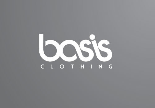
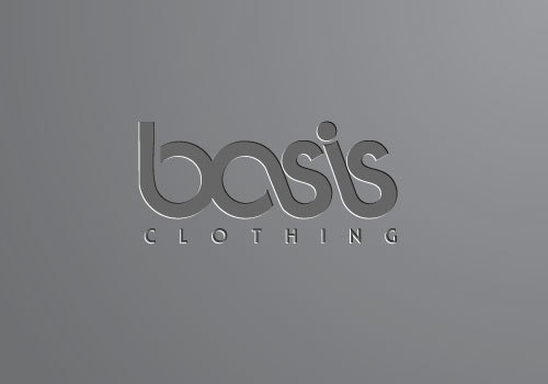
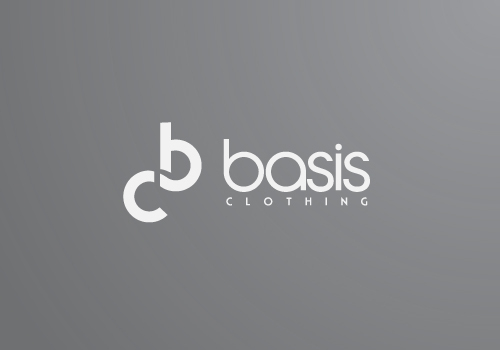
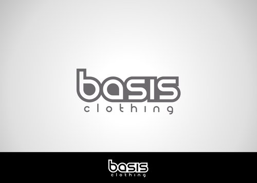
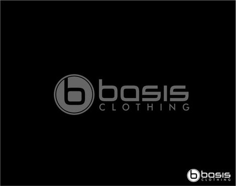
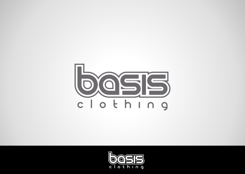
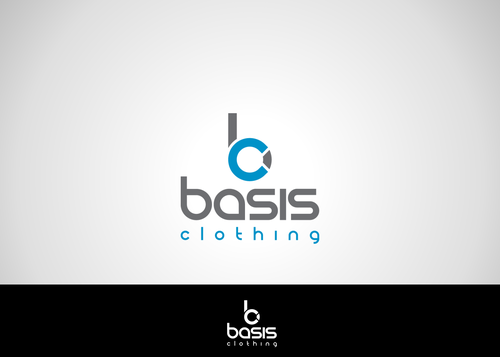
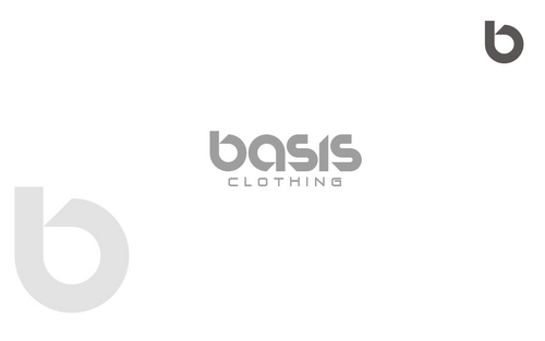
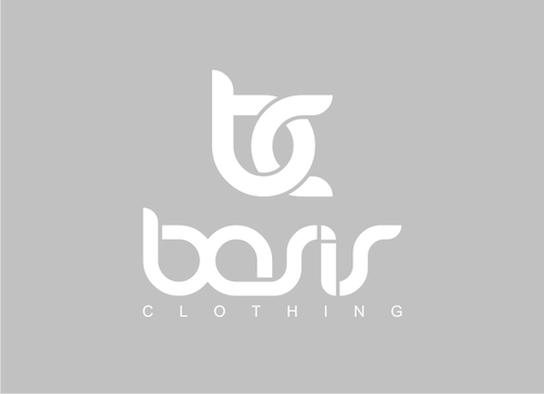
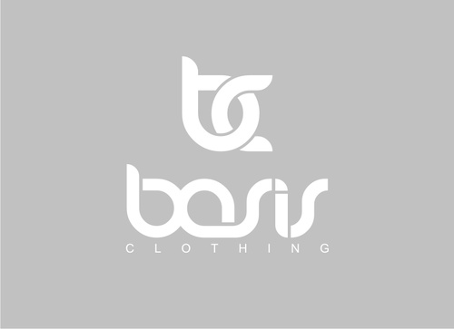
SALES / SUPPORT : +1-877-525-5646   |  


Basis Clothing

Basis Clothing

Contest Holder KeenanTheSavage ?

Last Logged in : 4666days10hrs ago

Concepts Submitted

182

Guaranteed Prize
150
Winner(s)

1

A Logo, Monogram, or Icon veildAll design entries can be viewed by other designers.
tick_gray

Live Project

tick_gray

Deciding

tick_blue

Project Finalized


Project: Basis Clothing
Industry: Apparel Logo
Contest Launched: Jul 02, 2011
Selected: 1 winning design from 182 concepts
Winning Design by: logoon
Close Date: Jul 12, 2011


Basis Clothing - Apparel


Awarded as a winner
Project Report    

Sort by:


#180

#146

#145

#62

#60

#54

#51

#29

#28

#27

#144

#56

#44

#38

#37

#9

#7

#64

#57

#43

#40

#35

#23

#182

#181

#179

#178


Creative Brief


Basis Clothing

Basis Clothing

No

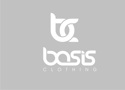
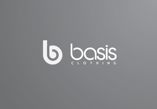
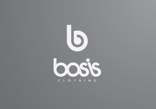
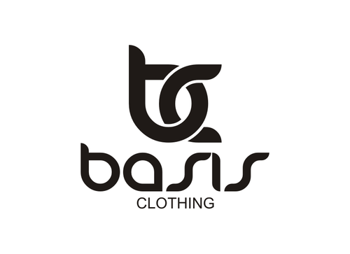
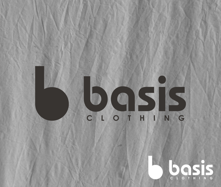
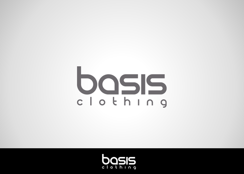
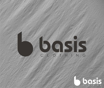
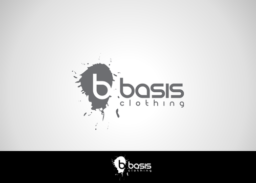
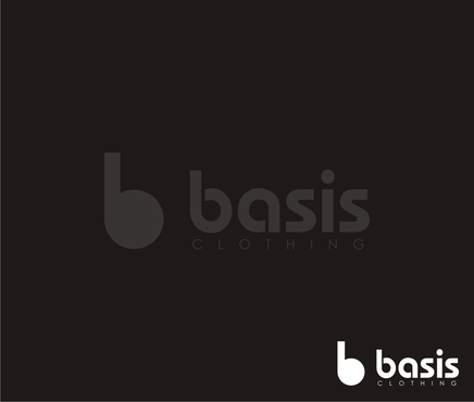
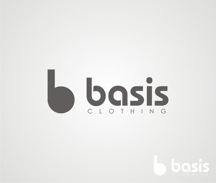
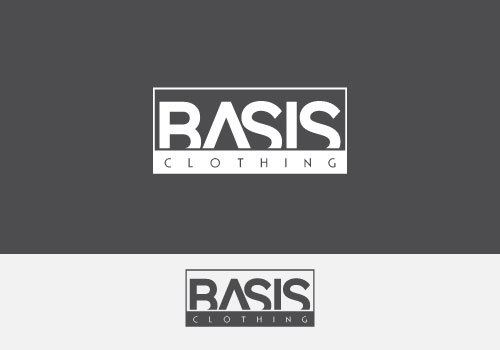
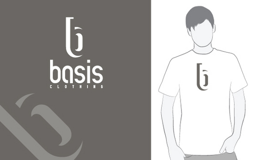
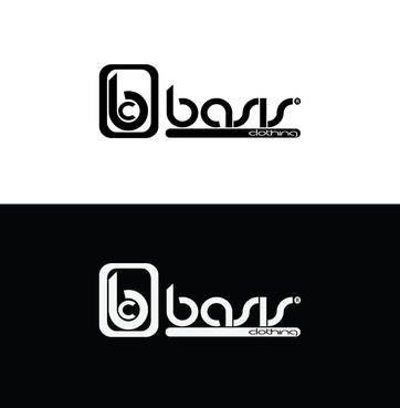
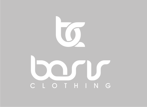
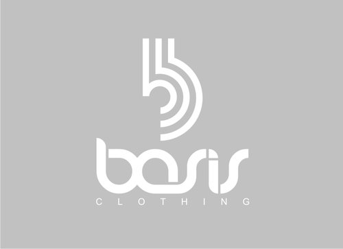
Basis Clothing is a new clothing store that I am planning on launching this summer. I am going to use this logo on our website as the logo image, business cards, and even t-shirts and sweatshirts that we will sell! In addition to just the text "Basis Clothing" in the logo, if you could incorporate some sort of symbol or icon, or something that would help brand our site better, I would very much appreciate it. It's not necessary, but I think it would be cool to see.

Apparel

Logo Type
Logo Type

Symbolic
Symbolic


Clean/Simple
Sophisticated
Modern
Industry Oriented

No real ideas for colors. I like dark colors like black, grey and blue, so that's kind of what I'd lean to, but if you come up with something cool that has some bright colors in it, I'd be more than happy to check it out!

not sure

http://tinyurl.com/3ftf8jo - I really like this logo, except I think that the font is a little forgettable and too simple. The style though is still something I enjoy as well and the icon is clean and something I would like in the design.

http://www.logofaves.com/2008/11/panda/ - I really like the font used in this logo

http://www.logomoose.com/logo-design/pixope/ - Like the font, and the symbol that they use.

Also, some words that I would associate with Basis Clothing is "skateboarding, snowboarding, hip, modern, typography" if that helps at all

Related Contests


private logo
$250
Prize Money
13
Concepts
Logo Project
$200
Prize Money
36
Concepts
Expedite Project: logo for a fashion boutique
$200
Prize Money
91
Concepts
Logo for Fitness/Apparel Company
$205
Prize Money
75
Concepts

Discussion


Comments

  • July 11, 2011 5:45 PM
    KeenanTheSavage KeenanTheSavage
      Project Holder
    I'm torn between the font in #145 and #146

    Like Icon 0   DislikeIcon 0
  • July 11, 2011 4:54 PM
    KeenanTheSavage KeenanTheSavage
      Project Holder
    #139 I like the design and the icon, although the "C" in the icon is a little cut-off in my opinion and should be a little more elongated (if that makes sense)

    Like Icon 0   DislikeIcon 0
  • July 10, 2011 11:32 AM
    KeenanTheSavage KeenanTheSavage
      Project Holder
    #51 my favorite of the new ones that you posted, I like the color scheme, and what you did with the "B" #54 #55 #56 #57 really like the font used in all of these, although I like #54 the best. Nice and simple. #62 while I don't really like the font used in the word "basis", I LOVE the logo you created with the "B" and "C". I mean I really, really like it.

    Like Icon 0   DislikeIcon 0
  • July 08, 2011 6:17 PM
    KeenanTheSavage KeenanTheSavage
      Project Holder
    #35 like the font here, and I really like the icon you created with the "b" #37 #38 I really like these, man. The font, letter spacing, and icon are great. Well done. #40 I like the font here, although the letters are a little sharp and I don't know if it would really suit the logo #41 #42 don't really like the fonts used here, they're a little too abstract. #43 #44 #44 I really like the fonts used in both of these logos, although I like the icon used in #44 out of these.

    Like Icon 0   DislikeIcon 0
  • July 08, 2011 1:18 AM
    KeenanTheSavage KeenanTheSavage
      Project Holder
    #30 #31 I don't know if I'm too fond of the font used here, although I do like the the little icon used in #31 #32 #33 nice font, although I think the word spacing could be a little bit closer. I am digging the style though for sure

    Like Icon 0   DislikeIcon 0
  • July 08, 2011 1:13 AM
    KeenanTheSavage KeenanTheSavage
      Project Holder
    #26 this is by far my favorite of the ones that you've done. I like the transparency and the letters together. #25 perhaps a little too simple, but I do like the little icon that you made #27 #28 #29 dude I'm loving these. I really like the background used on #27 but am also intrigued by the styling of the font on #28. I also like how you made a little space on the "b"

    Like Icon 0   DislikeIcon 0
  • July 06, 2011 2:34 PM
    KeenanTheSavage KeenanTheSavage
      Project Holder
    #21 #22 I like the font used for both of these, although I like the color scheme and (b) in #22 quiet a bit better. #23 I'm not very fond of the font used here and in #14.

    Like Icon 0   DislikeIcon 0
  • July 05, 2011 6:45 PM
    KeenanTheSavage KeenanTheSavage
      Project Holder
    #14 I'm not really into the font and colors used here #15 like the design, interesting use of a backward "S" in the word "Basis" #17 #18 I don't think that I really like the font used here although I prefer the latter of the two #19 #20 I like both of these, although I don't know if they represent what the company is. It seems a little too rough and rugged.

    Like Icon 0   DislikeIcon 0
  • July 04, 2011 1:17 AM
    KeenanTheSavage KeenanTheSavage
      Project Holder
    #11 It took me a minute to notice a change but I do like how you cut out the "A" in the word "Basis". Definitely makes it better and easier to read than the previous version. #12 Italicized "B"... I like it, but I'm definitely gonna have to think on whether I like this one or #11 more. #13 I like the design, although I think that it's a little too sharp and "techy" if you know what I mean.

    Like Icon 0   DislikeIcon 0
  • July 03, 2011 1:53 PM
    KeenanTheSavage KeenanTheSavage
      Project Holder
    #6 I really like this. Looks super original, and I can definitely see this on a t-shirt or hat that we could actually sell. #7 #9 I like both of these as well. The missing bottom of "Basis" is really appealing to me. Again, I can easily see this on a piece of clothing. I really think the dark colors used in the image compliment the logo very well.

    Like Icon 0   DislikeIcon 0
  • July 03, 2011 12:57 PM
    KeenanTheSavage KeenanTheSavage
      Project Holder
    #4 The font and style of this is a little too "techy" in my opinion, and I don't think this is something I would use for the logo. #5 I really like the abstract font here, and I think that this originality would really help brand the site and make us more recognizable to people. Well done.

    Like Icon 0   DislikeIcon 0
  • July 03, 2011 10:28 AM
    KeenanTheSavage KeenanTheSavage
      Project Holder
    #1 I'm interested in seeing how this looks with the text above not in italics above but I do like the font for "clothing" below, and the fact that it's in a gray box. #2 Really digging this one, the clothing on the side, and the half-skateboard below. My favorite of the three without a doubt.

    Like Icon 0   DislikeIcon 0
  • July 02, 2011 1:15 PM
    KeenanTheSavage KeenanTheSavage
      Project Holder
    Note: I also like the logo over at "http://rootclothing.com/" the font is very appealing in my opinion as is the style.

    Like Icon 0   DislikeIcon 0