SALES / SUPPORT : +1-877-525-5646   |  


Bleem Family Chiropractic Logo

Bleem Family Chiropractic

Contest Holder bleemdc ?

Last Logged in : 1934days3hrs ago

Concepts Submitted

104

Guaranteed Prize
300
Winner(s)

1

A Logo, Monogram, or Icon veildAll design entries can be viewed by other designers.
tick_gray

Live Project

tick_gray

Deciding

tick_blue

Project Finalized


Project: Bleem Family Chiropractic Logo
Industry: Medical Logo
Contest Launched: Oct 04, 2011
Selected: 1 winning design from 104 concepts
Winning Design by: ACEdesign
Close Date: Oct 11, 2011


Bleem Family Chiropractic Logo - Medical


Awarded as a winner
Project Report    

Sort by:


#102

#20

#32

#31

#13

#24

#22

#21

#86

#83

#82

#81

#80

#79

#78

#77

#76

#75

#74

#73

#72

#66

#61

#51

#50

#49

#48

#47

#46


Creative Brief


Bleem Family Chiropractic Logo

Bleem Family Chiropractic

We get results.

No

Currently seeking a Chiropractic office logo. We also provide Acupuncture services.

Medical

Logo Type
Logo Type

Symbolic
Symbolic

Initials
Initials


Clean/Simple
Industry Oriented
Traditional
Local/Neighborhood
Fun

Stone, plum, green, grey, blue? Really anything but tons of black and hot pink. Rich colors vs primary colors.

not sure

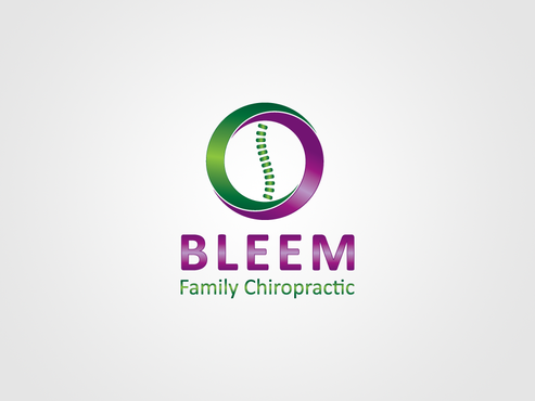
We are open to the use of a spine in the logo but it's not necessary.

Related Contests


Logo for surgical practice/clinic
$200
Prize Money
33
Concepts
Logo for Medical Device Company
$200
Prize Money
125
Concepts
Logo enhancements for dental distributor
$200
Prize Money
129
Concepts
Logo for a MILITARY CHILDREN'S HOSPITAL
$350
Prize Money
115
Concepts

Discussion


Comments

  • October 14, 2011 9:24 AM
    bleemdc bleemdc
      Project Holder
    THANK YOU all so much for all your hard work. We will recommend you and this site to our friends. It's been a good process. The Bleems

    Like Icon 0   DislikeIcon 0
  • October 10, 2011 1:34 PM
    bleemdc bleemdc
      Project Holder
    Anyone want to switch up the font for us? We have the designs we are enjoying marked. Also, designer83, I would like to see another color combo. You all are getting close! How do we do the grey scale or two color combo as well? Anyone?

    Like Icon 0   DislikeIcon 0
  • October 10, 2011 11:47 AM
    bleemdc bleemdc
      Project Holder
    ufjari: What are the other options on your combo designs? Does it show another option? I'm new to this. Forgive me. Thank you.

    Like Icon 0   DislikeIcon 0
  • October 10, 2011 8:55 AM
    bleemdc bleemdc
      Project Holder
    ufjari: #22 Can we take the curly B off the front of B and replace it with something? I don't have an idea. I wish I could help. I like the Green and Gold Bleem Chiropractic part but not necessarily the curly B at the front. Thank you!

    Like Icon 0   DislikeIcon 0
  • October 10, 2011 8:44 AM
    bleemdc bleemdc
      Project Holder
    ACEdesigns: Can we put the black lettering of 19 on the 18 design? (put it with the blue multicolored tree) Just in case? Thanks!

    Like Icon 0   DislikeIcon 0
  • October 07, 2011 4:10 PM
    bleemdc bleemdc
      Project Holder
    I want to give feedback but don't want to nit pick. If you need more suggestions or ideas from our end, let me know. Thank you.

    Like Icon 0   DislikeIcon 0
  • October 07, 2011 4:10 PM
    bleemdc bleemdc
      Project Holder
    tatiana: 13 has promise. Can we change the color combo? Thank you!

    Like Icon 0   DislikeIcon 0
  • October 07, 2011 4:08 PM
    bleemdc bleemdc
      Project Holder
    ACEdesign, is there to add the third color in the tree? Similar to your other work? Orange? Maybe another color scheme all together. I wish I was an artist to help but That's why I have you. Thank you!

    Like Icon 0   DislikeIcon 0
  • October 07, 2011 8:53 AM
    bleemdc bleemdc
      Project Holder
    ACEdesign: I like the two toned font. Would you consider it on #9? Also maybe another style font just in case? Thank you so much.

    Like Icon 0   DislikeIcon 0
  • October 06, 2011 3:14 PM
    bleemdc bleemdc
      Project Holder
    Love the use of color in 4. The font may be a little dainty. I wish I could say that one is right on at this point however I am loving your ideas for the logo.

    Like Icon 0   DislikeIcon 0