Brand logo/monogram/symbol
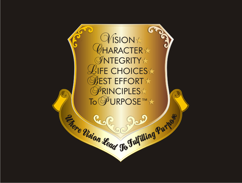
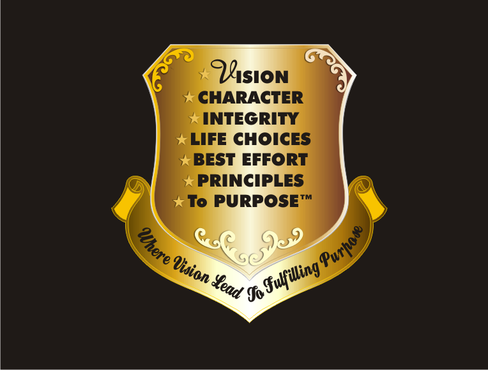
VISION, CHARACTER, INTEGRITY, LIFE CHOICES, BEST EFFORT, PRINCIPLES To PURPOSE™, PURPOSE
|
Contest Holder
ptppub
?
Last Logged in : 5195days12hrs ago |
Concepts Submitted
37 |
Prize Money
750
|
Winner(s) | A Logo, Monogram, or Icon |
|
Live Project
Deciding
Project Finalized


Creative Brief
Brand logo/monogram/symbol
VISION, CHARACTER, INTEGRITY, LIFE CHOICES, BEST EFFORT, PRINCIPLES To PURPOSE™, PURPOSE
Where Vision Lead To Fulfilling Purpose
Yes
It's about having vision with character and integrity in your life.
Inspiration for design comes from http://ctr.concordia.ca/archives/is130100/7/Coat%20of%20armsfull%20view.GIF
http://en.wikipedia.org/wiki/File:Coats_of_arms_of_the_Kingdom_of_Egypt_and_Sudan.png
Inspiration for colors:
www.principlestopurpose.com
For text: Black script type fonts
Communications and Media
Symbolic
![]()
Abstract Mark
![]()
Illustrative
![]()
Unique/Creative
Sophisticated
Modern
Traditional
Serious
Illustrative
Masculine
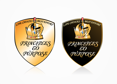
Black, Gold, Tan (see website www.principlestopurpose.com)
3
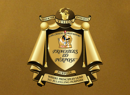
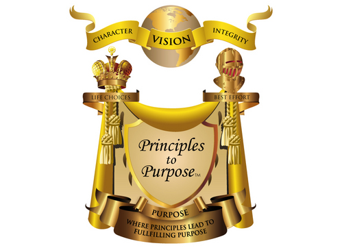
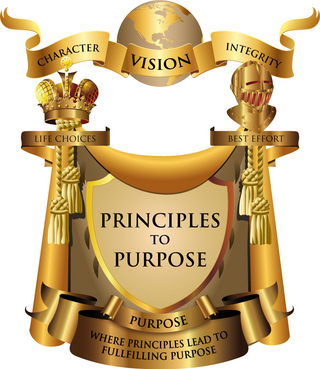
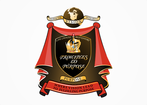
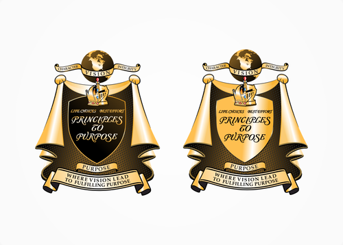
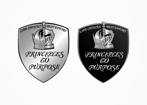
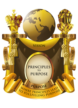
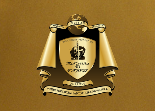
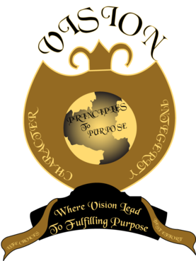
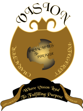
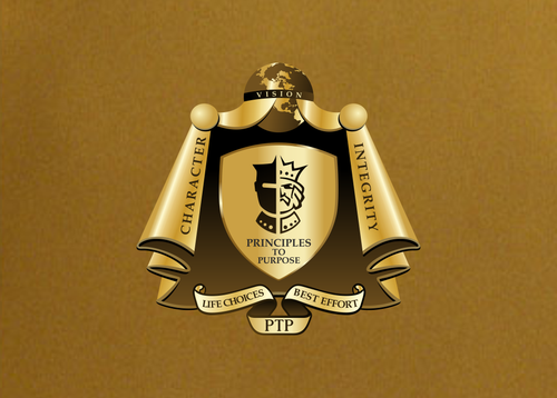
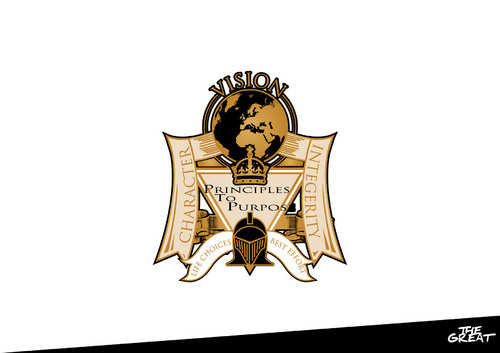
The vision is a coat of arms over a shield with the following characteristics:
The top has a gold globe (earth) with the word "VISION" and two draperies/banners (or something) that drape from the middle (or sides) of gold globe with the words "CHARACTER" (left - written upwards) and "INTEGERITY" (right - written downwards). These draperies would drape over (see CofA Kingdom of Egypt - No bows/puffs on this level) a gold half crown (full size no open spaces - left) and gold half knight's helmet (full face close - right) that are placed together as one. The gold crown/helmet sits on top of a gold (perhaps the sky background of site) shield (inverted triangle) with black trim and words inscribed "PRINCIPLES To PURPOSE" (the "T" in "To" placed under "R" in "PRINCIPLES", and "P" in "PURPOSE" place under "o" in "To" - and possibly have the 1st letter in each word larger (or other characteristics) to emphasize PTP).
I would like drapery coming from the back of crown/helmet with the words "LIFE CHOICES" (left-side coming from crown and written upwards on the diagonal before it drapes vertically) and "BEST EFFORT" (right-side coming from helmet and written downwards with left-side specifications) draped around the shield. Something to consider, is a more royal looking puff/bow on the crown's side and officer's tassel on the knight's side to further distinguish the two sides, if it's not too much of distraction or break-up the symmetric flow. What this signify is that the choices/decisions come from the king/queen side, and the execution of those decisions come from the knight's side.
Additionally, I would like the drapery/CofA to fill in the white/empty spaces around the shield and bottom banner (see Concordia). And the shield placed in the CofA (see Kingdom of Egypt) which will show the inside of the CofA, and the word "PURPOSE" placed on the bottom of CofA. I also would like to see a variation of the drapery reaching the bottom of shield and probably less puff/bow (see CofA Kingdom). Finally, a banner with black outside trim below the shield with the tagline: Where Vision Lead To Fulfilling Purpose (see Concordia).
Related Contests