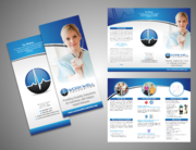
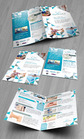
Brochure for Sleep Testing Services
Somnocor
|
Contest Holder
cdoucette
?
Last Logged in : 2981days20hrs ago |
Concepts Submitted
52 |
Guaranteed Prize
199 |
Winner(s) | Marketing collateral |
|
Live Project
Deciding
Project Finalized
Project: Brochure for Sleep Testing Servic ...
Industry:
Medical Logo
Contest Launched:
Feb 20, 2014
Selected:
1
winning design from 52 concepts
Winning Design by:
Achiver
Close Date:
Mar 05, 2014


Creative Brief
Brochure for Sleep Testing Services
Somnocor
Medical
Patient, doctors
Medical look -- more blue than green. It needs to be very corporate and have a clean and crisp design.
Related Contests