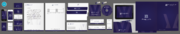
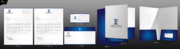
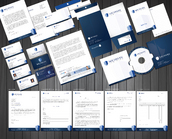
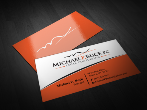
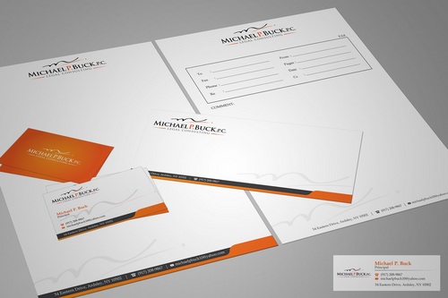
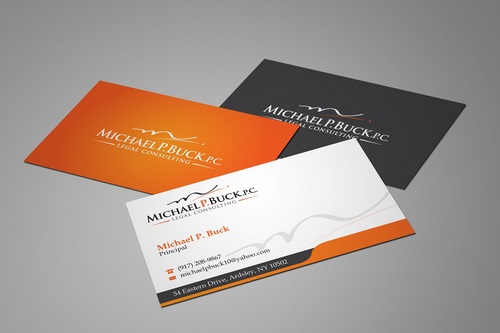
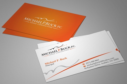
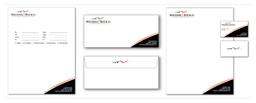
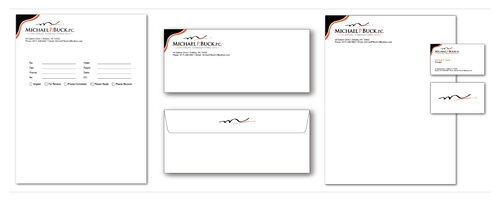
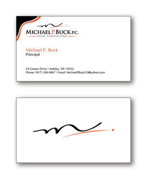
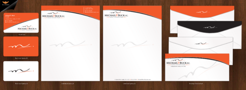
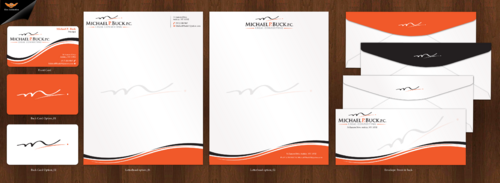
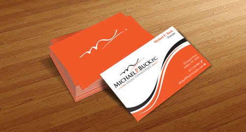
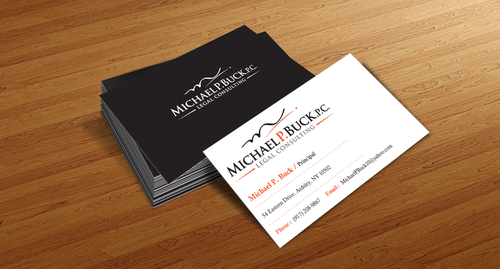
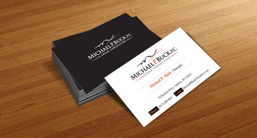
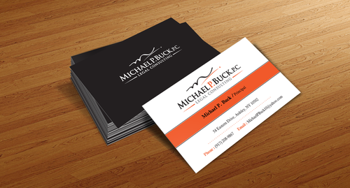
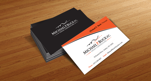
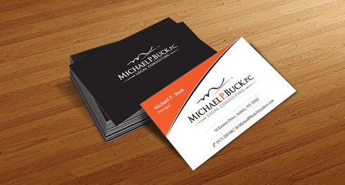
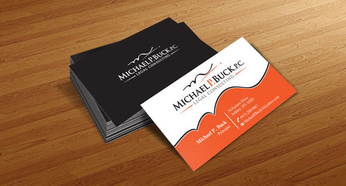
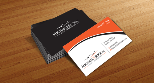
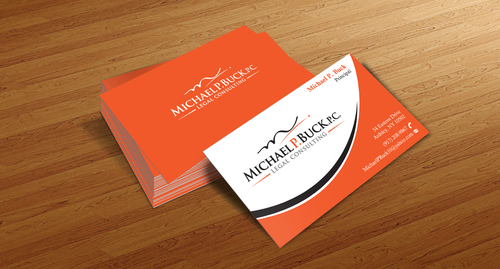
Business Cards and Stationary
Law Firm
|
Contest Holder
mptbuck
?
Last Logged in : 5052days4hrs ago |
Concepts Submitted
180 |
Prize Money
100
|
Winner(s) | Business Cards and Stationery |
|


Creative Brief
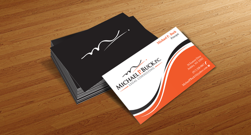
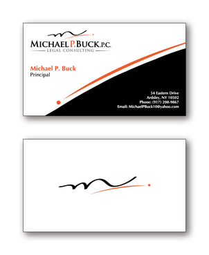
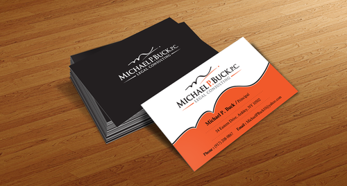
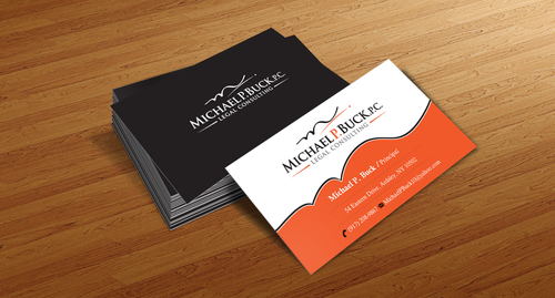
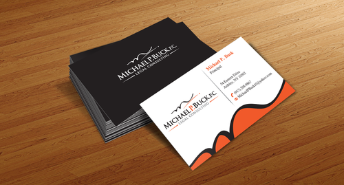
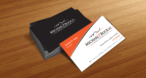
Business Cards and Stationary
Law Firm
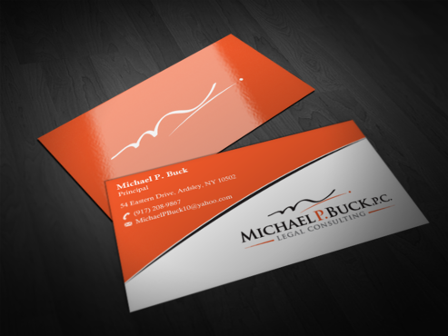
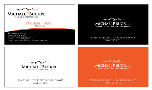
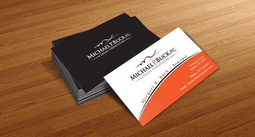
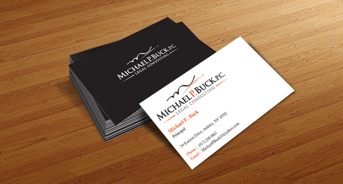
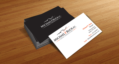
I need double sided standard sized Business Card [3.5" x 2"]
Use same font as used in my logo
Cutting-Edge
Corporate
Modern
Professional
Michael P. Buck
Principal
54 Eastern Drive Ardsley, NY 10502
(917) 208-9867
MichaelPBuck10@yahoo.com
I do not do litigation, so please no "scales of justice", "court buildings" or "gavels", etc. The services are mainly transaction. Clean, crisp look please.
Logo. I would like to see the use of different colors, shading and backdrops while featuring the orange color.
Law
Related Contests