Business cards - Yoga Instructor
Petite Lotus Yoga
|
Contest Holder
petitelotus
?
Last Logged in : 2187days2hrs ago |
Concepts Submitted
74 |
Guaranteed Prize
150 |
Winner(s) | Business Cards and Stationery |
|
Live Project
Deciding
Project Finalized


Creative Brief
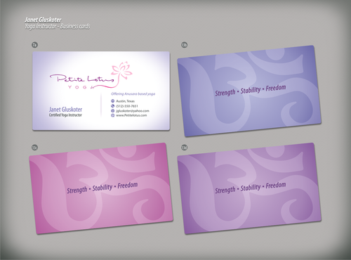
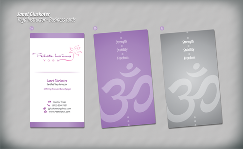
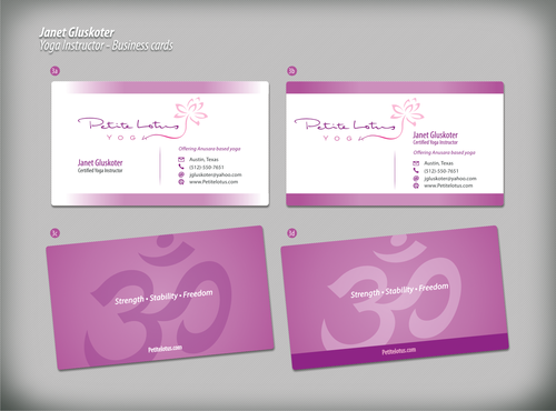
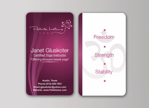
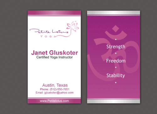
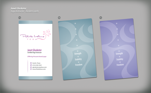
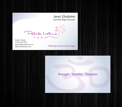
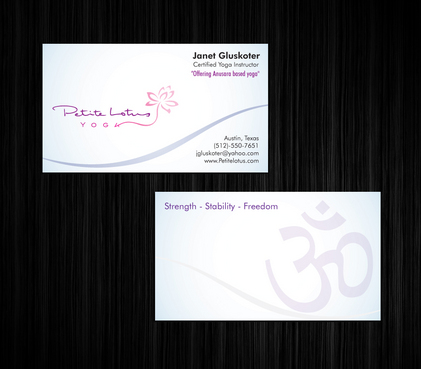
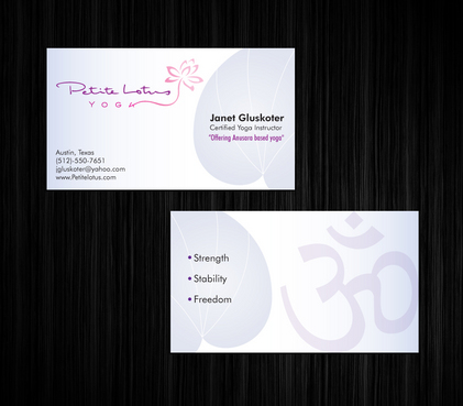
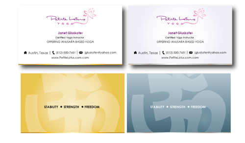
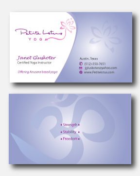
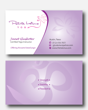
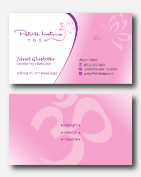
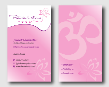
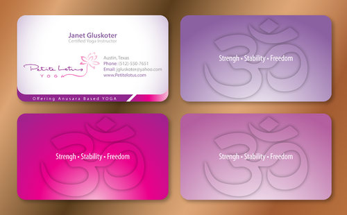
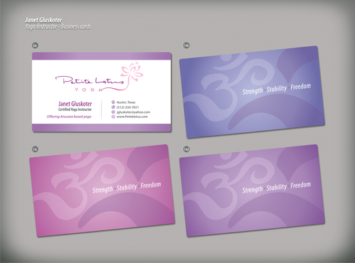
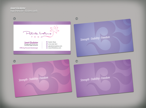
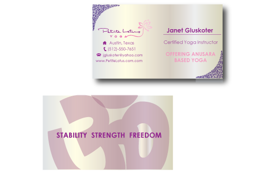
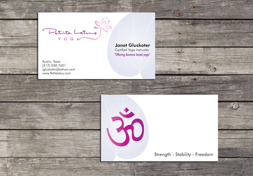
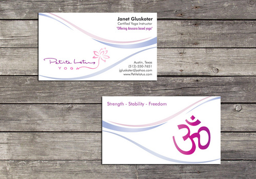
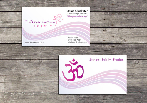
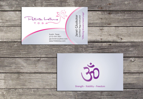
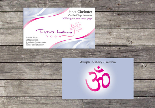
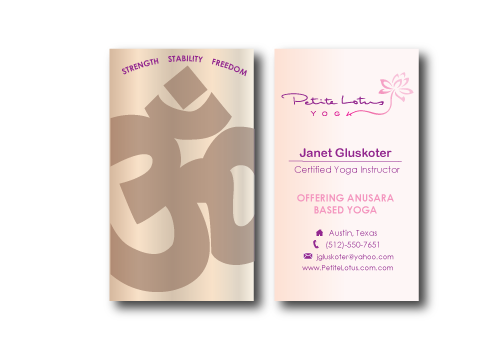
Business cards - Yoga Instructor
Petite Lotus Yoga
I need double sided standard sized Business Card [3.5" x 2"]
Use same font as used in my logo
Use fonts that you feel work well with the logo and style of card
Modern
Simple
Bright & Fun-filled
Janet Gluskoter
Certified Yoga Instructor
Austin, Texas
(512)-550-7651
jgluskoter@yahoo.com
www.Petitelotus.com
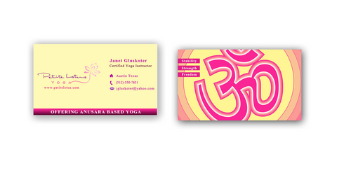
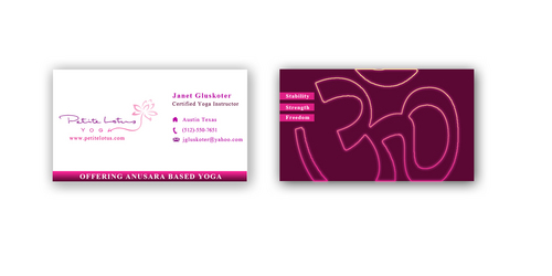
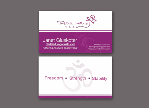
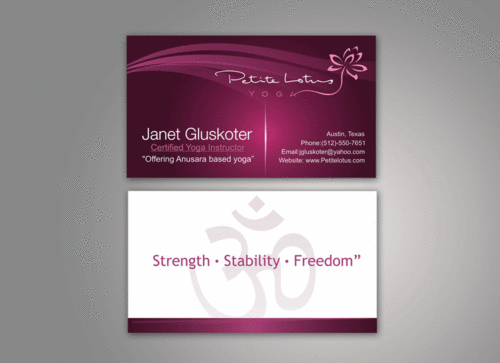
The front should include the "Pettite Lotus Yoga" logo that we have uploaded. Also - we would like to include "Offering Anusara based yoga" on the card as well. perhaps just below the title "Certified Yoga Instructor"
we would like to have the "Ohm" symbol on the back of the card and the words "Strength - Stability - Freedom". here is a link for a sample of the symbol. http://www.openyourchakras.com/ok.htm We are thinking the Ohm symbol can fill the entire back (even going off the edges) and the text on top.
Salon & Spa
Related Contests