Business Logo
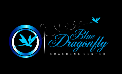
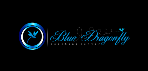
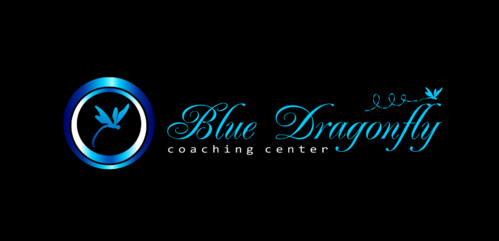
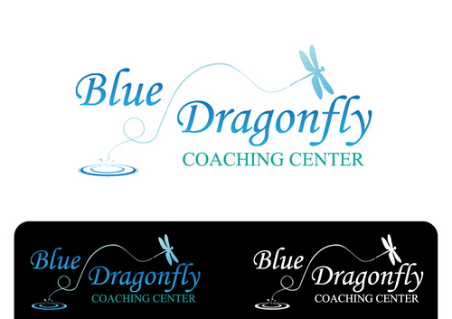
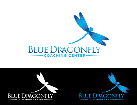
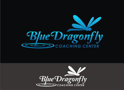
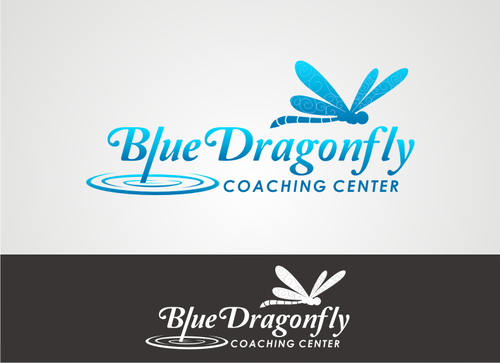
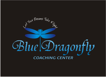
Blue Dragonfly Coaching Center
|
Contest Holder
joanhodel
?
Last Logged in : 4172days22hrs ago |
Concepts Submitted
191 |
Guaranteed Prize
300 |
Winner(s) | A Logo, Monogram, or Icon |
|
Live Project
Deciding
Project Finalized


Creative Brief
Business Logo
Blue Dragonfly Coaching Center
Let Your Dreams Take Flight
Yes
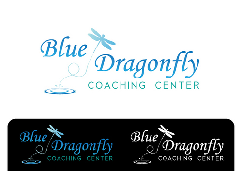
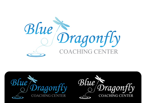
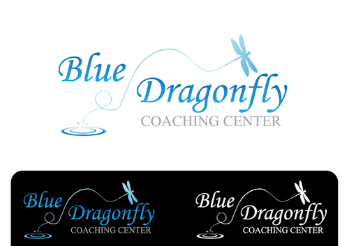
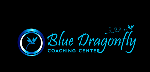
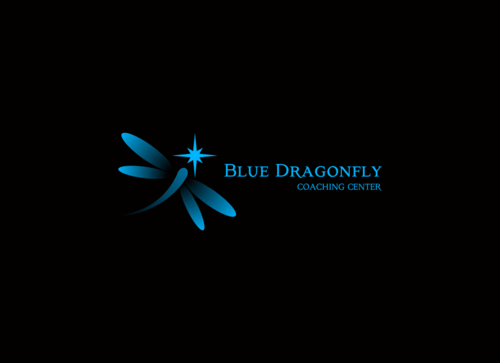
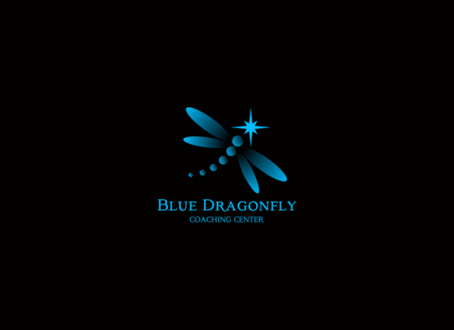
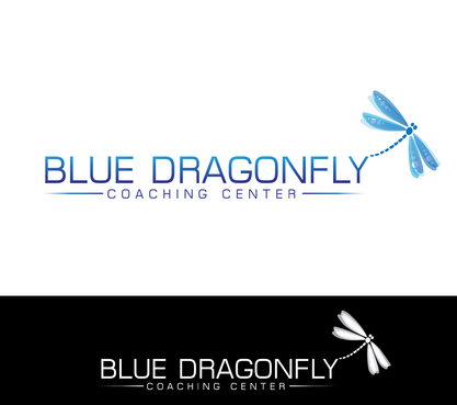
I am seeking a logo that conveys transformation and freedom. I think sharing a little bit about dragonflies will help you develop what I am looking for. Dragonflies spend most of their lives living underwater as mud colored insects that blend into their environment and attack when frightened. Eventually their bodies change and they are forced to leave the water, or die. They shed their skin one final time and discover they have wings - but they are dependent upon the sun to dry them before they can fly. Once dried they never fold their wings again. They are iridescent, reflecting the light wherever they go.
My company is a life-coach business, working from the perspective that we are divine beings having a human experience and the only path to happiness is the inward journey of discovering our authentic selves - and living from that place, which is transformational.
The official name of my business is: Blue Dragonfly Coaching Center, LLC. I am uncertain if I need all of that in the logo, legally, or if Blue Dragonfly Coaching would suffice.
I would LOVE a logo that captures the sense of possibility, freedom, soaring, and ultimately transformation.
Thank you.
Health
Symbolic
![]()
Abstract Mark
![]()
Illustrative
![]()
Unique/Creative
Outdoors/Natural
Illustrative
Feminine
The dragonfly needs to be blue, as iridescent and brilliant as possible. I'm uncertain of the other colors but tend to think simple and natural would be good. I am open to brighter colors but need to see them first.
not sure
I kind of see a dragonfly soaring upward from a pond. I am really open to your ideas! I have seen a dragonfly logo for another coaching company that had a dragonfly emerging from a heart, which was really cool - but already taken. I think simple is better than cluttered.
Related Contests


