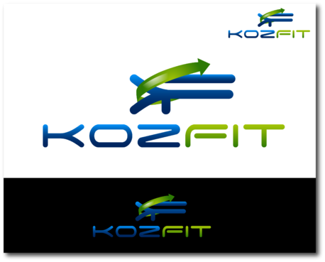
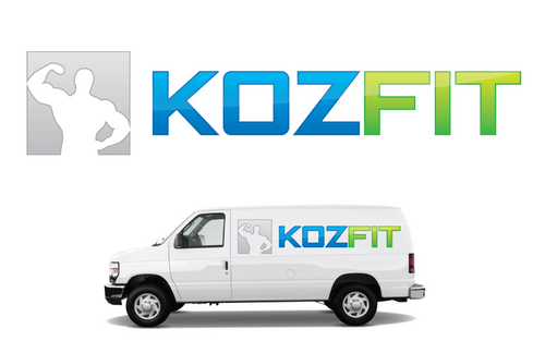
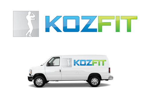
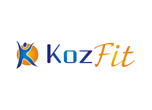
SALES / SUPPORT : +1-877-525-5646   |  


Business Logo

KozFit or KF

Contest Holder KozFit ?

Last Logged in : 4384days22hrs ago

Concepts Submitted

55

Guaranteed Prize
300
Winner(s)

1

A Logo, Monogram, or Icon veildAll design entries can be viewed by other designers.
tick_gray

Live Project

tick_gray

Deciding

tick_blue

Project Finalized


Project: Business Logo
Industry: Health Logo
Contest Launched: Feb 17, 2012
Selected: 1 winning design from 55 concepts
Winning Design by: dany96
Close Date: Mar 02, 2012


Business Logo - Health


Awarded as a winner
Project Report    

Sort by:


#47

#29

#28

#4

#46

#32

#19

#50

#39

#37

#36

#33

#23

#22

#18

#11

#6

#52

#27

#26

#20

#15

#14

#13


Creative Brief


Business Logo

KozFit or KF

Yes

We are starting an online fitness company and need a design that expresses fitness with a modern twist. The design will be used to brand our company and must clean and simple yet express health and nutrition.

Health

Symbolic
Symbolic

Abstract Mark
Abstract Mark

Initials
Initials


Cutting-Edge
Unique/Creative
Clean/Simple
Modern
Masculine

we like the colors blue and green, but are open to others if they fit the design well.

2

We are looking for a logo to brand our company around, and have nothing to specific in mind. We hope to see a wide variety of options, but mostly want our logo to express fitness and health with a modern or abstract twist.

Related Contests


 logo for re-branding new nursing facility
$400
Prize Money
184
Concepts
Fresh, modern looking logo for Physical Therapy studio
$199
Prize Money
175
Concepts
Logo for eating disorder treatment program
$200
Prize Money
54
Concepts
Logo for new Rehab company
$275
Prize Money
223
Concepts

Discussion


Comments

  • February 23, 2012 4:12 PM
    KozFit KozFit
      Project Holder
    Draft #4/Draft #19 by Dany96, could you please use the same logo without the orange circle background?

    Like Icon 0   DislikeIcon 0
  • February 22, 2012 10:46 AM
    KozFit KozFit
      Project Holder
    Thank you to all the designers, these are a great start! My only comment, as the Project Holder, is that the designs seem to have a soft or feminine look, and the company is envisioning a logo that might display a little more masculinity or toughness. Keep up the creativity! -KozFit Team

    Like Icon 0   DislikeIcon 0