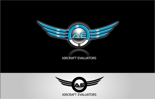
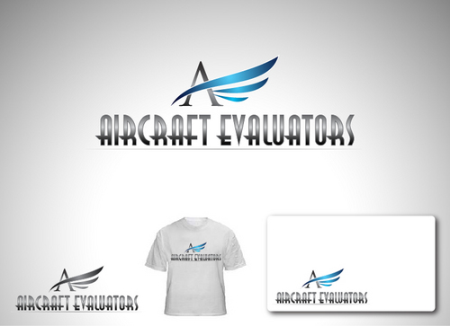
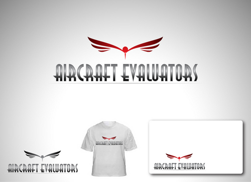
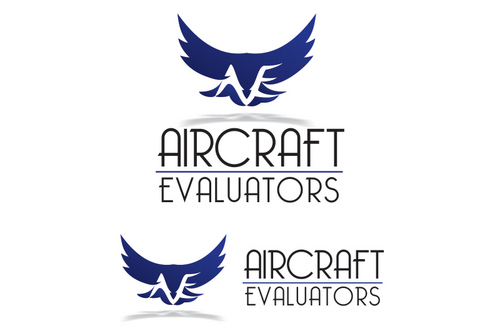
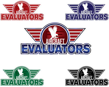
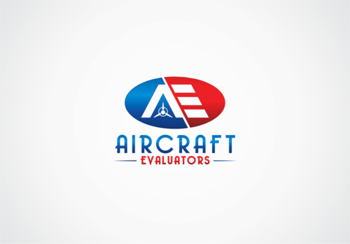
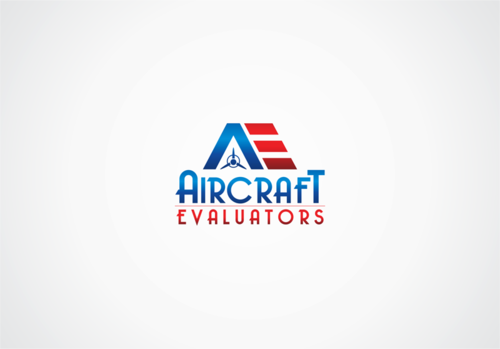
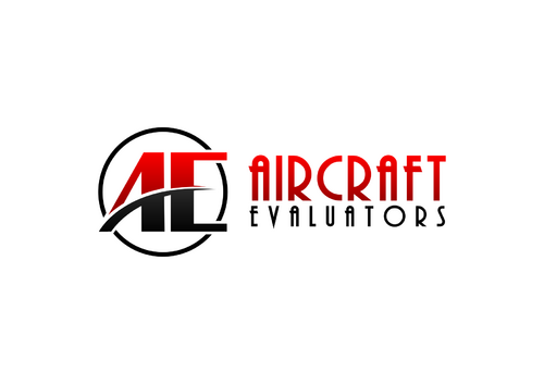
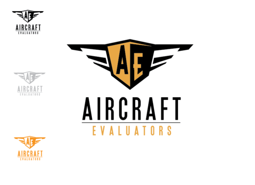
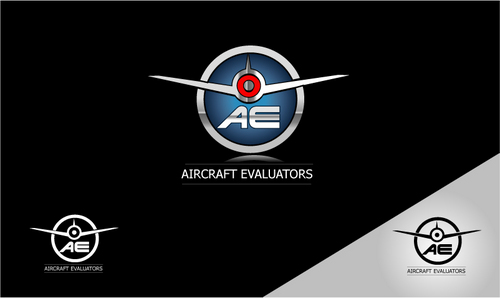
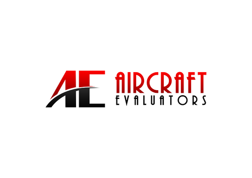
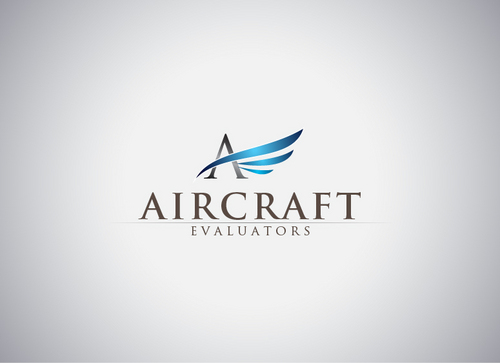
Business Logo - Aircraft Evaluators
Aircraft Evaluators OR AE
|
Contest Holder
AircraftEval
?
Last Logged in : 5007days8hrs ago |
Concepts Submitted
113 |
Guaranteed Prize
400 |
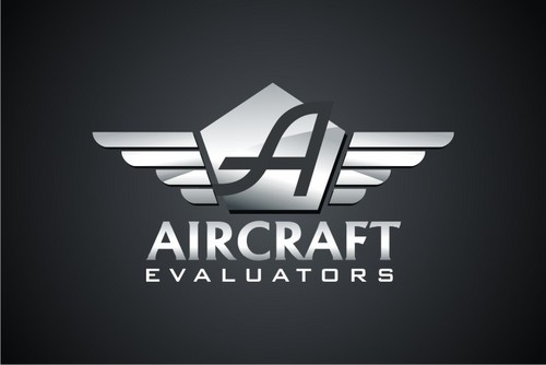
Winner(s) | A Logo, Monogram, or Icon |
|
Live Project
Deciding
Project Finalized


Creative Brief
Business Logo - Aircraft Evaluators
Aircraft Evaluators OR AE
Yes
This company appraises aircraft (Airplanes, Helicopters, Jets, etc;) This will be used on letterheads, appraisal reports, website, and business cards.
My current website is ( www.AircraftEval.com ) I don't have any current logo, but this will give you a sense of what kind of business it is.
Aviation
Abstract Mark
![]()
Illustrative
![]()
Web 2.0
![]()
Cutting-Edge
Unique/Creative
Clean/Simple
Sophisticated
Serious
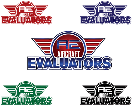
Blue, Red, Black, Silver
not sure
I like the classic 1930's era of aviation, back when gas was cheap and the thought of flying was almost romantic and elegant. If the design could be modern with a classic 'birth of aviation' undertones.
Think of the movie 'The Aviator' with the shiny, silver streamlined airplane.
Related Contests