SALES / SUPPORT : +1-877-525-5646   |  


Business Logo for PurpleStork

PurpleStork

Contest Holder PurpleStork ?

Last Logged in : 4500days15hrs ago

Concepts Submitted

50

Guaranteed Prize
275
Winner(s)

1

A Logo, Monogram, or Icon veildAll design entries are veiled from other designers till the end of the contest.
tick_gray

Live Project

tick_gray

Deciding

tick_blue

Project Finalized


Project: Business Logo for PurpleStork
Industry: Art Logo
Contest Launched: Dec 16, 2011
Selected: 1 winning design from 50 concepts
Winning Design by: amioster
Close Date: Dec 23, 2011


Business Logo for PurpleStork - Art


Awarded as a winner
Project Report    

Sort by:


#44

#47

#46

#45

#38

#29

#41

#40

#39

#7

#1

#42

#37

#36

#35

#34

#33

#31

#30

#28

#27

#26

#16


Creative Brief


Business Logo for PurpleStork

PurpleStork

No

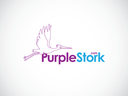
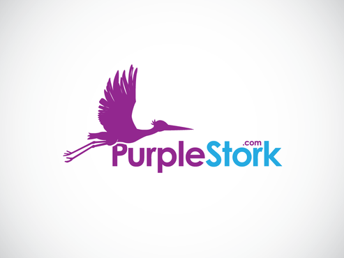
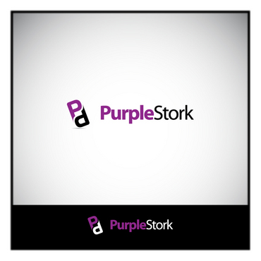
This is to be the new logo for www.purplestork.com, an online custom photo card design company. We make birth announcements, holiday cards, etc and wish to expand.

Art

Symbolic
Symbolic


Clean/Simple
Sophisticated
Modern

It should contain purple.

2

Related Contests


Arabic Calligraphy Logo
$300
Prize Money
137
Concepts
logo for a fine gardening company
$200
Prize Money
107
Concepts
Logo for a design company
$250
Prize Money
82
Concepts
Logo for an Interior Designer based in Los Angeles
$325
Prize Money
458
Concepts

Discussion


Comments

  • December 23, 2011 9:44 AM
    PurpleStork PurpleStork
      Project Holder
    Thank you everybody so much for your submissions, even if I didn't choose yours they are all great and it has been a pleasure working with you. I am going to go with one of amiosters designs so hopefully the rest of you can now focus on other prospective clients and best of luck to you! Amioster - I'm still working out which version will work best so bear with me. If you happen to be online at the moment let me know through a message so we can discuss the designs, thank you.

    Like Icon 0   DislikeIcon 0
  • December 21, 2011 6:56 AM
    PurpleStork PurpleStork
      Project Holder
    dany, thanks for your resubmission. We do like the way you kept the .com in our name but same as the other guys, we need a more simplified design that implies a stork instead of being a stork if that makes sense.

    Like Icon 0   DislikeIcon 0
  • December 21, 2011 6:54 AM
    PurpleStork PurpleStork
      Project Holder
    Thank you all for your submissions so far. As far as designs #9-15, we don't want the baby included anymore, just the stork, thank you. #2,3,4,7 & 8 are on the right track. We like the reduced amount of lines in 2 & 3, although 3 might resemble the WaWa symbol too much. The font in 2 & 3 however is not what we're looking for. We love the simplicity of the neckline in #4, is it possible to simplify the wing more and maybe only "suggest" it's feet if you get our meaning. The key is we want people to understand what it is in as few lines possible. We really want to avoid a cartoon stork image. #7 same with you, love where you're going with the stork in flight but would like to see less lines if possible. Also we want to stay away from too feminine a look, especially in the wording, so that font doesn't work for us nor do the extra curling lines. #8 the body looks great, the wings need to be simplified. Also keep that green in for your next design, we'd like to see it again. We will be using the image of the stork both with and without our company name so it has to be able to stand on it's own as a recognizable symbol for our company. Be careful not to integrate it too far into the wording. Also we are pretty certain we wish to keep the ".com" with "PurpleStork" so keep that in mind. Once again thanks a lot for your work so far and keep it coming, we are sure you guys/girls will be able to come up with the perfect design for us in no time!

    Like Icon 0   DislikeIcon 0
  • December 18, 2011 12:31 PM
    PurpleStork PurpleStork
      Project Holder
    dany96 Thank You for your submission. We would like to see the stork be more full-bodied instead of so skinny. Could we see a stork that is more of an outline, a suggestion of a stork instead of being as solid as this one. We are thinking the shape should be implied and the body itself hollow.

    Like Icon 0   DislikeIcon 0