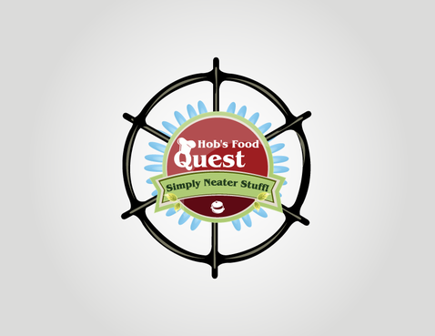
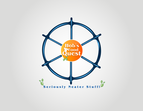
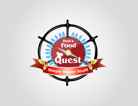
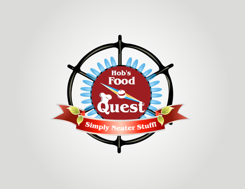
Business Logo - Hob's Food Quest
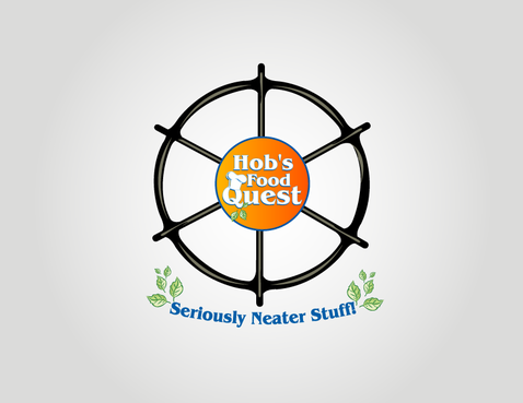
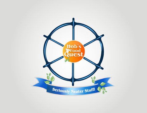
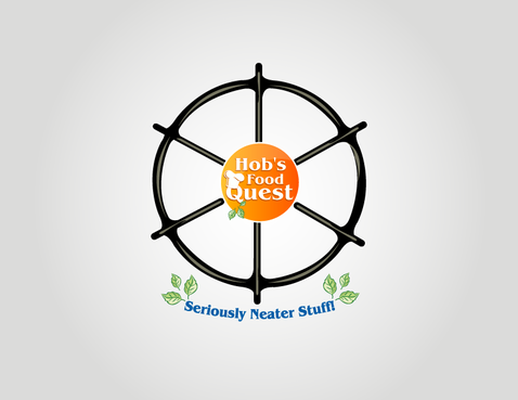
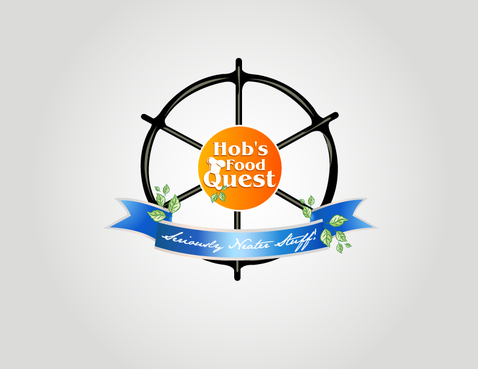
Hob's Food Quest
|
Contest Holder
wetzel
?
Last Logged in : 5353days2hrs ago |
Concepts Submitted
151 |
Guaranteed Prize
350 |
Winner(s) | A Logo, Monogram, or Icon |
|
Live Project
Deciding
Project Finalized

Creative Brief
Business Logo - Hob's Food Quest
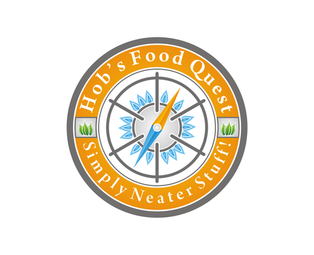
Hob's Food Quest
Simply Neater Stuff!
Yes
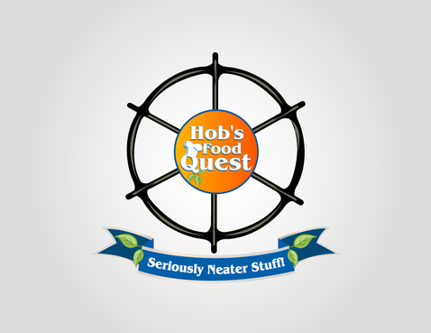
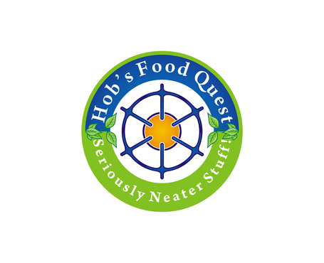
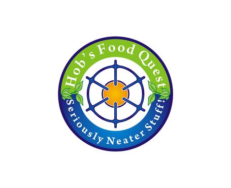
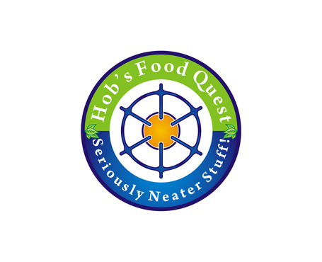
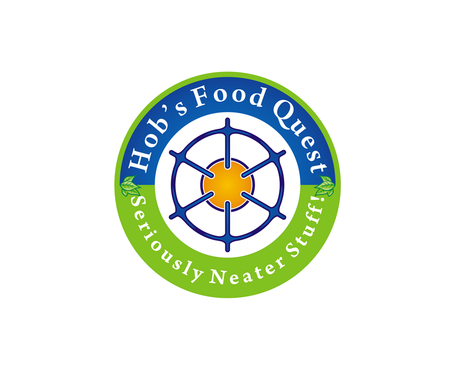
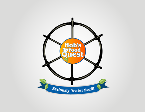
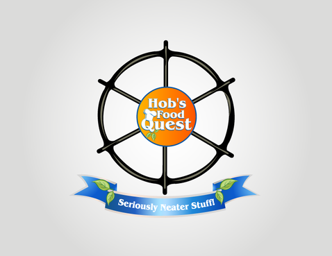
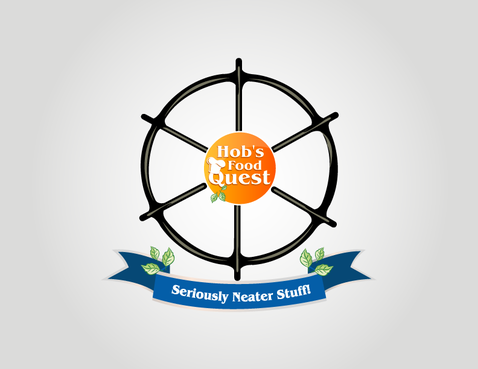
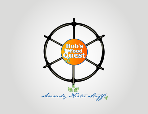
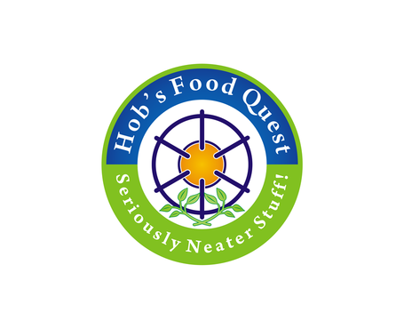
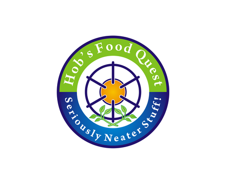
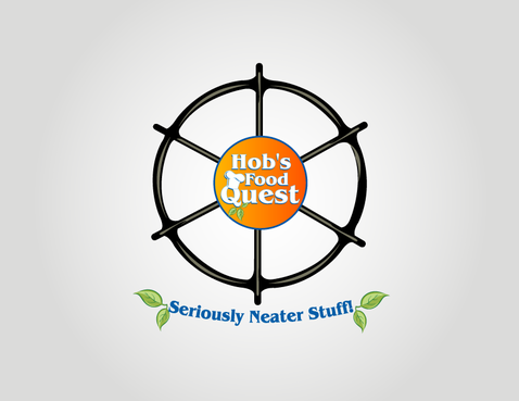
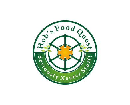
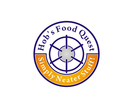
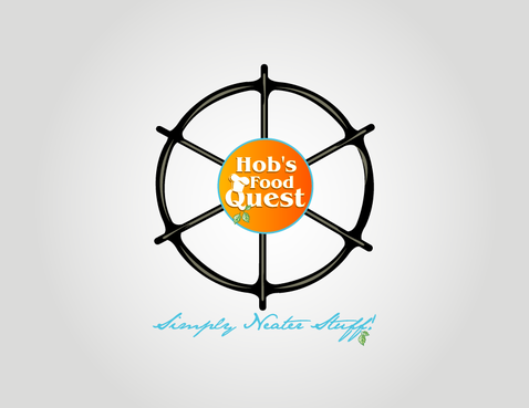
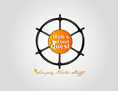
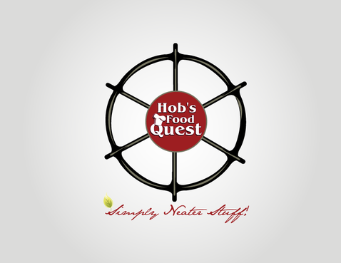
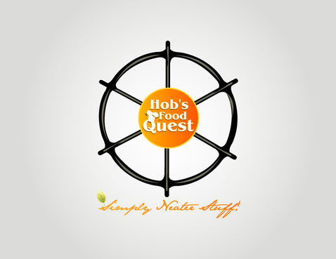
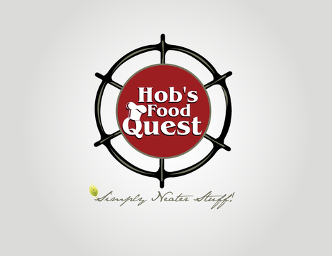
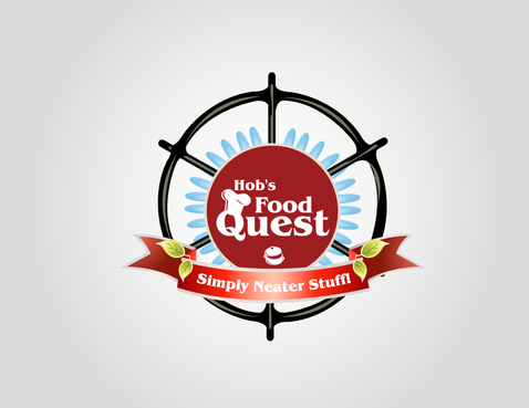
Hob’s Food Quest (HFQ) is a specialty food supplier that designs and markets refreshingly different and affordable prepared foods and food ingredients that are not already in the mass market. HFQ products are high quality and made with traditional methods and ingredients – no artificial flavors, preservatives or “industrial” ingredients (eg, xanthan gum, nitrates, etc.) are used; they are unique and better by design. The name “Hob” has 2 meanings: (1) a nickname for the founder of the company and (2) a British culinary term meaning cooktop or burner. The “Quest” of this company is to offer consumers distinctively different foods at affordable prices – similar to the Trader Joe’s philosophy.
Food
Symbolic
![]()
Illustrative
![]()
Unique/Creative
Sophisticated
Traditional
Fun
Illustrative
We would like 2-4 colors in the logo: (1) Warm food colors for the company name and tagline, possibly Hob’s facial features (if used) and possibly the captain’s wheel (if used) such as brown, orange and/or gold and (2) the gas burner and possibly compass (if used) could be either black or dark blue.
3
The following comments build upon those already provided above. We are partial to round type logos such as Starbucks and Arm and Hammer. The logo/symbol/illustrative image should incorporate the company name (Hob’s Food Quest) and 2-3 circular images: (1) gas burner, (2) compass or captain’s wheel and (3) possibly Hob’s wire rims, nose and moustache. The tagline can go under the symbol/image or be put in a banner. We also have some preferences about the font used for the lettering. We like the following fonts offered by MyFonts.com: Tasty, Mercurius, Dream Lover, FDI Tierra Nueva, Santa Cruz, Roy Hand, Tribute OT, Ricotta Script, Quickscript and Summer Nights.
To provide specific examples of the images described above, we have posted 5 images at the following megashare.com sites:
Frontal picture of Hob the founder:
http://d01.megashares.com/dl/4f28baa/DSC00503.JPG
Side picture of Hob the founder:
http://d01.megashares.com/dl/2c1f9e1/DSC00510.JPG
Image of hob (gas burner):
http://d01.megashares.com/dl/d8ea0c2/DSC00502.JPG
Captain’s wheel:
http://d01.megashares.com/dl/5a15f45/bxp26748.jpg
Compass:
http://d01.megashares.com/dl/8d2f0fc/Compass.jpg
Related Contests


