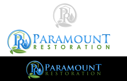
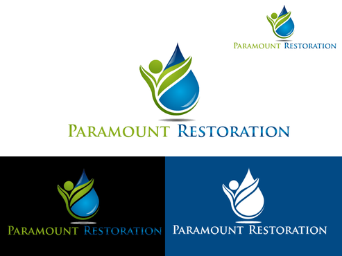
Business logo, Paramount Restoration
Paramount Restoration/ PR
|
Contest Holder
beeohbee1972
?
Last Logged in : 2721days10hrs ago |
Concepts Submitted
80 |
Guaranteed Prize
300 |
Winner(s) | A Logo, Monogram, or Icon |
|
Live Project
Deciding
Project Finalized
Creative Brief
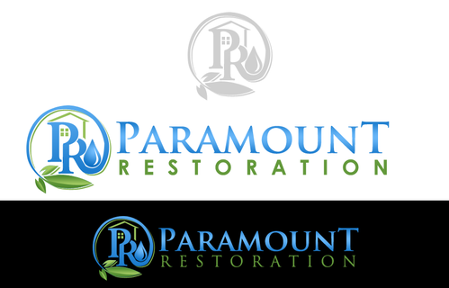
Business logo, Paramount Restoration
Paramount Restoration/ PR
No
We do Water and Mold restoration. We are a 24/7 emergency flood/disaster response company. We extract water from flooded homes or businesses. We also remove and remediate mold from homes or businesses. (prdry.com is our website. Its not running yet)
Environment
Logo Type
![]()
Abstract Mark
![]()
Initials
![]()
Cutting-Edge
Modern
High Tech
Serious
lol I didn't Know this was on here. Sorry for being redundant. Blue and green I guess. Again we are at your site because we have NO IDEA of what we want. But we are sure after seeing your projects that we will be WOW'ED
not sure
again, I really dont want to use a rain/fire drop. Seems everyone has sort of that. I want this logo to be different but recognizable.
Related Contests