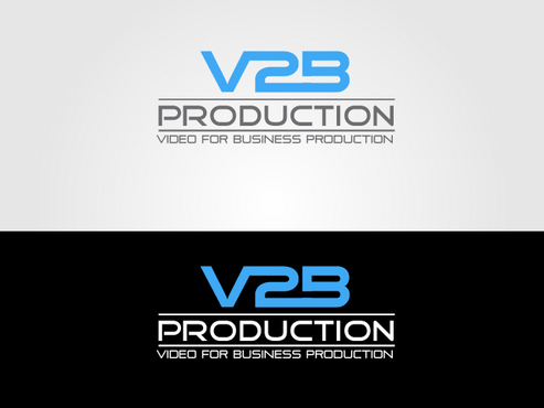
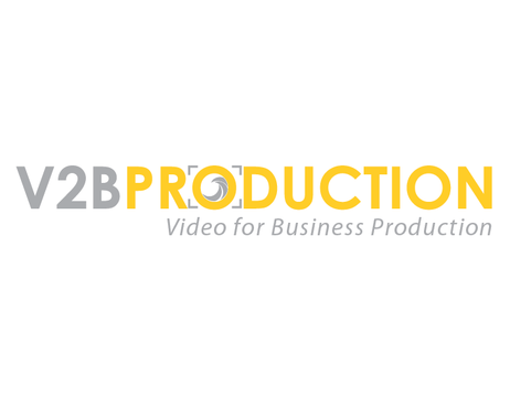
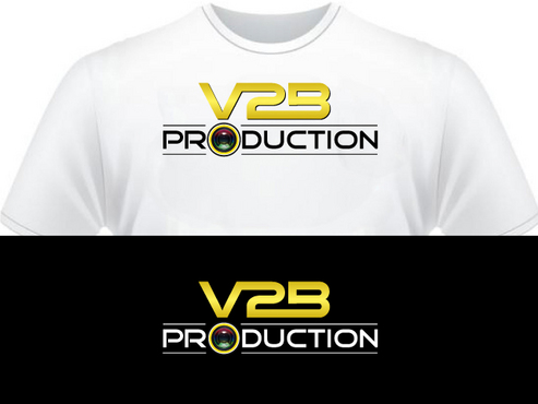
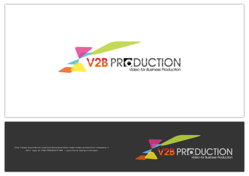
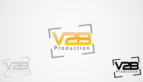
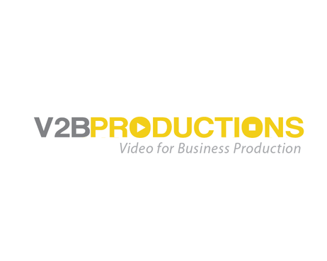
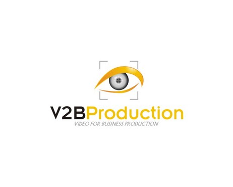
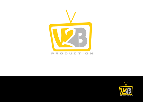
Business Logo Video Production Company
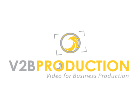
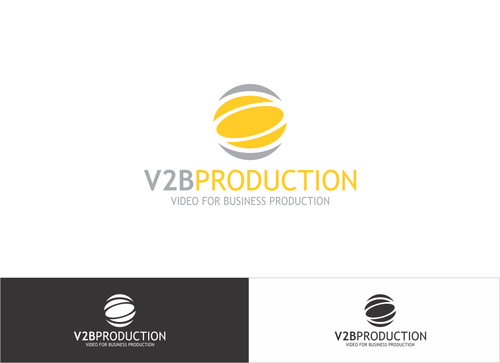
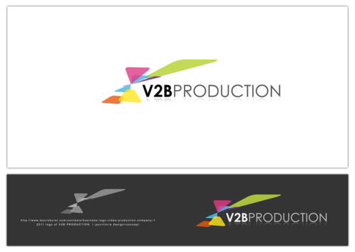
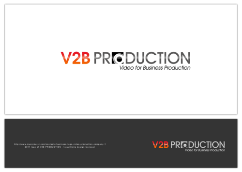
"V2B Production" or "Video for Business Production"
|
Contest Holder
httplab
?
Last Logged in : 4767days5hrs ago |
Concepts Submitted
88 |
Guaranteed Prize
225 |
Winner(s) | A Logo, Monogram, or Icon |
|
Live Project
Deciding
Project Finalized


Creative Brief
Business Logo Video Production Company
"V2B Production" or "Video for Business Production"
No
We are an innovative video production company looking for a cool, techy, modern, corporate logo.
Our process makes all the production cycle from shooting a film to publishing it on web or on TV.
We focus on brand emotion and teach people how to connect with their audience.
We know video and we know how to use writing, editing, to connect a feeling with your brand.
Video
Logo Type
![]()
Symbolic
![]()
Abstract Mark
![]()
Initials
![]()
Web 2.0
![]()
Cutting-Edge
Unique/Creative
Clean/Simple
Sophisticated
Corporate
Modern
Industry Oriented
High Tech
Serious
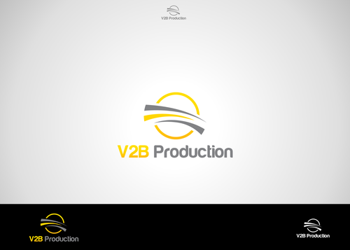
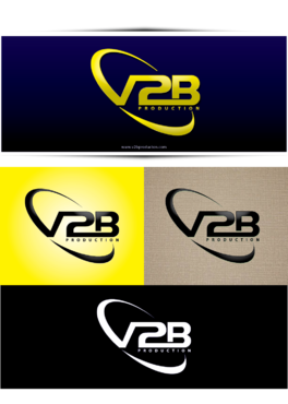
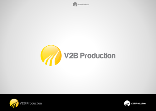
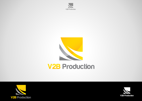
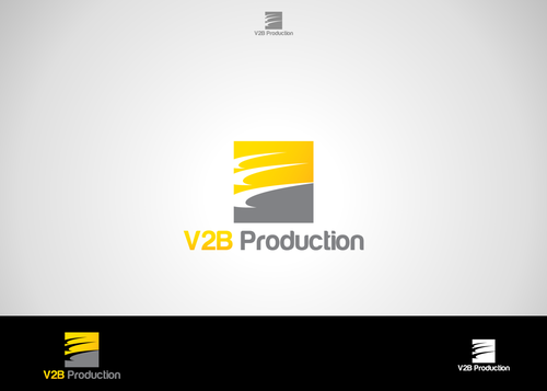
There are colors that we do like (eggyolk yellow and warm light gray combination). But again we are open to new ideas and going to leave it up to you the expert. We know there is a science behind choosing the color scheme. We'll know the perfect logo and color combination when we see it.
not sure
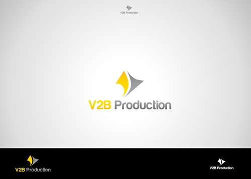
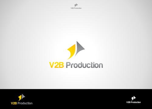
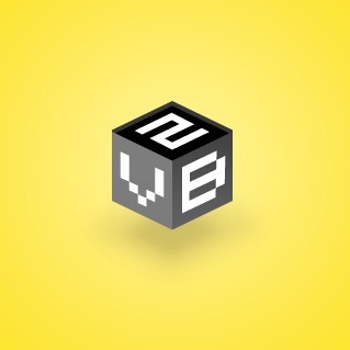
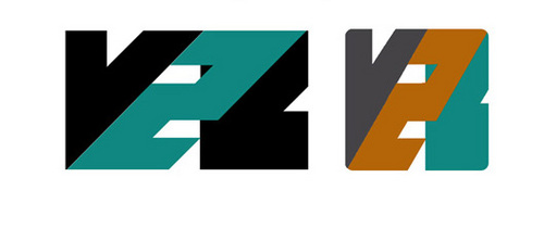
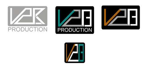
We prefer simple logo designs, that make use of the main company letters (v2b) and possibly a relevant image, or even an abstract symbol.
We don’t want to use elements that are heavily used in our industry.
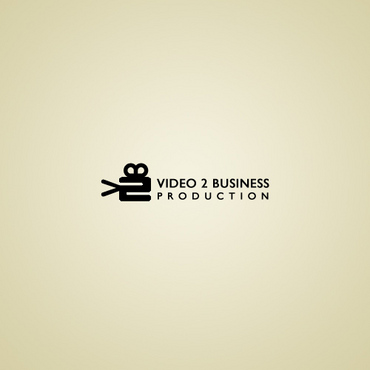
We don't want anything with a film reel.
Please do not include film strips with sprockets in the logo.
These seem to be done to death and we want something new and fresh and that expresses us.
But we are still open to any creative ideas. If your element would be great we’ll know it.
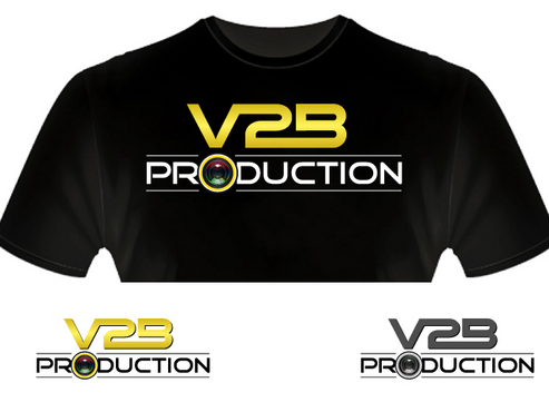
We also want it for letterhead and also for shirts for our crew. The paper would be light colored, and shirts can be light or dark.
A simple logo that works both in the print and web medium will win the race!
Lastly if it's a cool logo, I can see having it animated for our video projects at a later date.
Related Contests