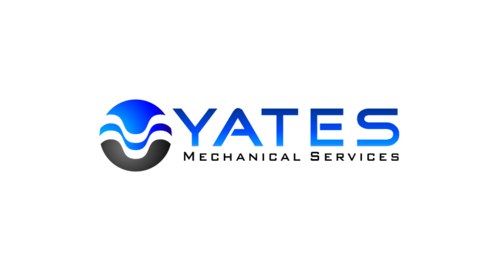
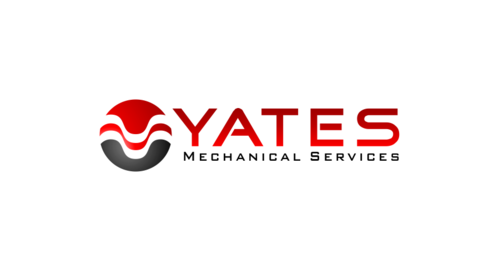
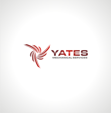
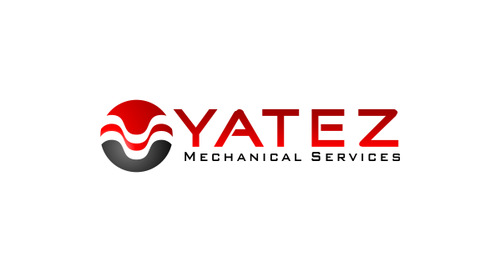
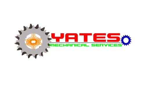
Business logo - Yates Mechanical Services
Yates Mechanical Services
|
Contest Holder
infinitygas
?
Last Logged in : 5173days20hrs ago |
Concepts Submitted
63 |
Guaranteed Prize
300 |
Winner(s) | A Logo, Monogram, or Icon |
|
Live Project
Deciding
Project Finalized

Creative Brief
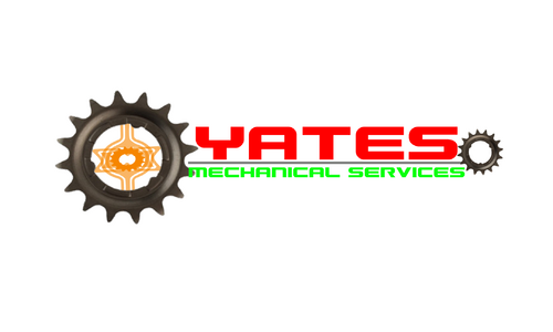
Business logo - Yates Mechanical Services
Yates Mechanical Services
Yes
Yates is an install and maintenance company, specialising in industrial pipe work and plant room equipment. Also providing plumbing, gas, air conditioning and electrical services.
Construction
Logo Type
![]()
Symbolic
![]()
Abstract Mark
![]()
Cutting-Edge
Clean/Simple
Corporate
Modern
Industry Oriented
Serious
Black, red, blue, grey, orange, green
not sure
We'd like an icon/symbol that includes (or one that is next to) "Yates" with "Mechanical Services" in smaller writing.
Although we are open to other ideas and will give direction towards anything else that we think looks good.
Related Contests


