Calculators.co.uk - front page and content page design
Site design for Calculators.co.uk - a UK site hosting different calculators
|
Contest Holder
sfinders
?
Last Logged in : 5154days17hrs ago |
Concepts Submitted
73 |
Guaranteed Prize
500 |
Winner(s) | Web Design |
|
Live Project
Deciding
Project Finalized
Creative Brief
Calculators.co.uk - front page and content page design
Site design for Calculators.co.uk - a UK site hosting different calculators
Internet Services
http://www.sitefinders.co.uk
Project: Calculators.co.uk
Idea: To host all of the different types of calculators on the site with supporting content
Our idea is generating targeted traffic through generic domains (we've got 4,500!). With Calculators.co.uk, the domain will host loads of different calculators with content supporting the calculators on offer.
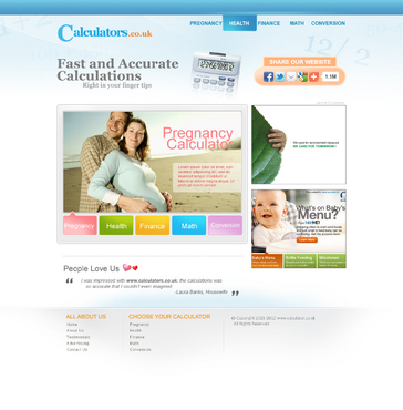
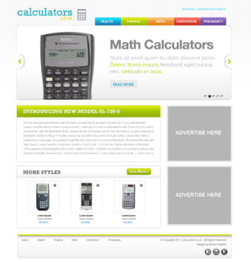
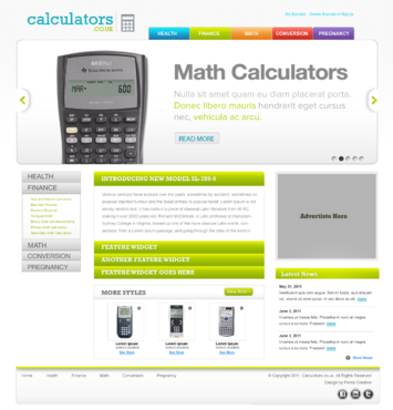
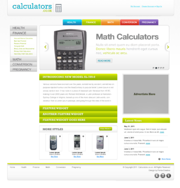
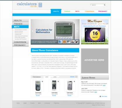
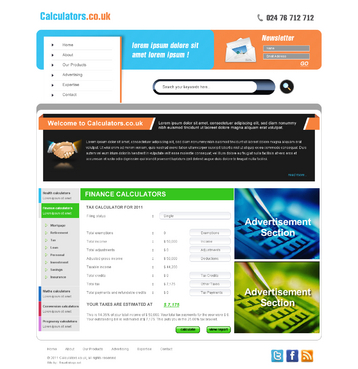
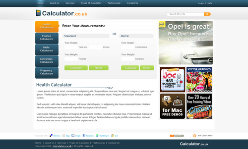
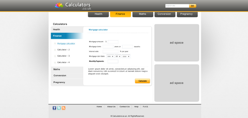
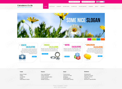
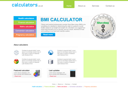
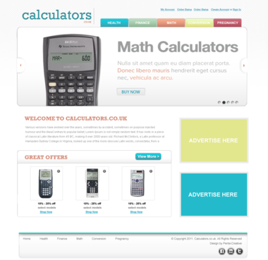
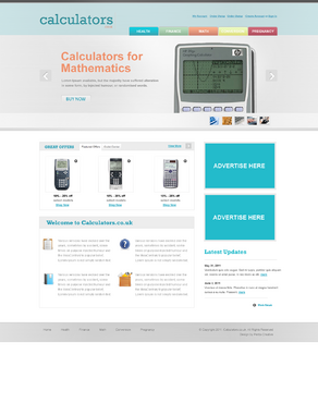
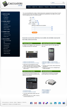
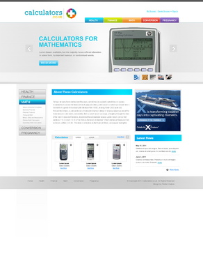
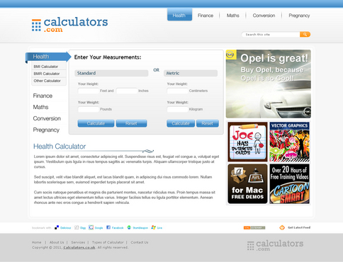
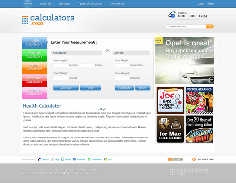
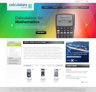
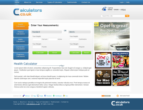
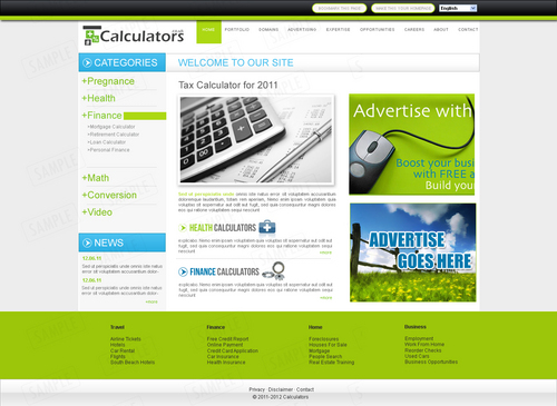
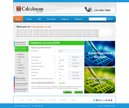
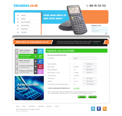
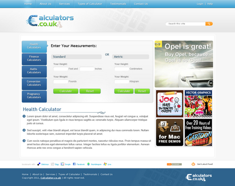
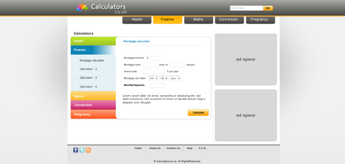
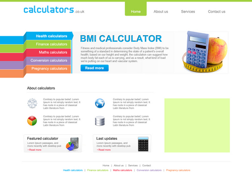
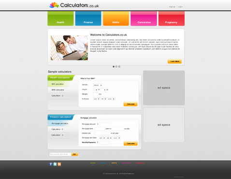
For Calculators.co.uk, we'd like a design that is clean but colourful and allows us to colour the different sections of the site that we'll have. The initial premise is that we'll have sections for the different 'types' of calculators:
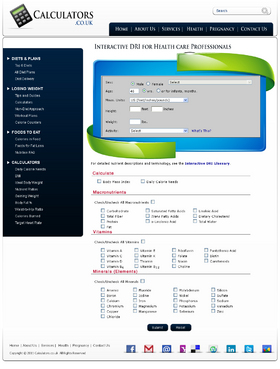
Health calculators
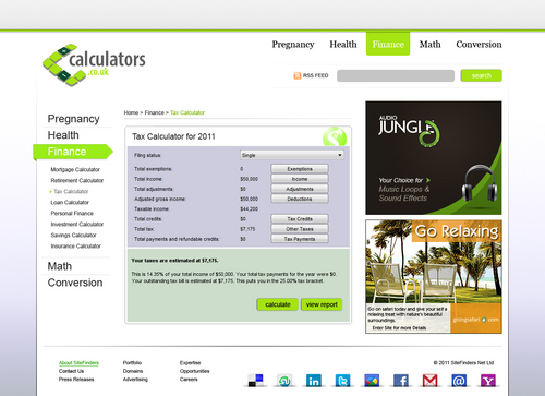
Finance calculators
Maths calculators
Conversion calculators
Pregnancy calculators
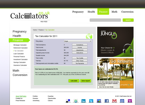
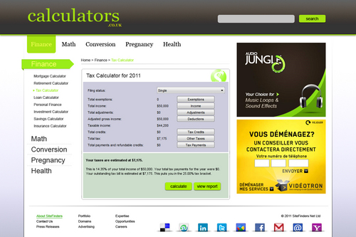
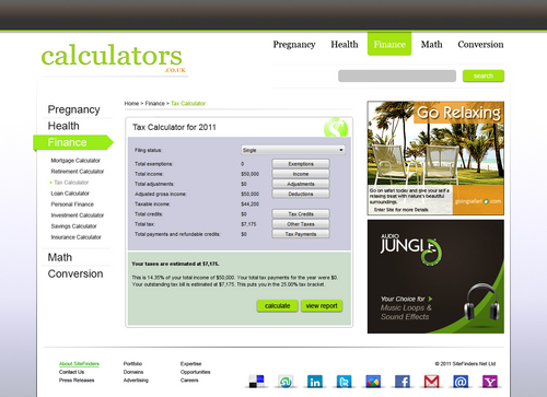
Within each section will be different calculators - so, for example, in Health, there will be a BMI calculator, BMR calculator and so on.
Ideally, we'd like each 'section' to have a different colour - i.e. blue for Health, green for Finance, blue for Maths, etc. The colours can be chosen by the designer as to what looks best.
We'd like a front page design and also a content page design. The home page shouldn't be too different in structure/layout to the content pages (i.e. structure follows through).
Ideally, there will be a column on the right hand side that allows advertising (300 x 250) and the main column for content should be at least 540px (this is where content and weidgets/calculators will be placed).
Once in a section, there should be a left menu that allows users to choose the type of calculator they want within that section.
This is our first try on Mycroburst and we're hoping that if this works out, we can find some designer(s) through this who we can offer many more design projects as we have many generic domain names waiting to be designed.
Likes: Clean, colourful, elegant, professional
Cutting-Edge
Unique/Creative
Clean/Simple
Professional
Trendy
Friendly
Exciting
Colorful
Elegant
Progressive
top
www.webmd.com
http://www.notableapp.com/tour/why-use-notable
http://www.zurb.com/
Related Contests
