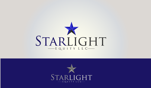
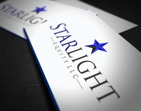
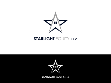
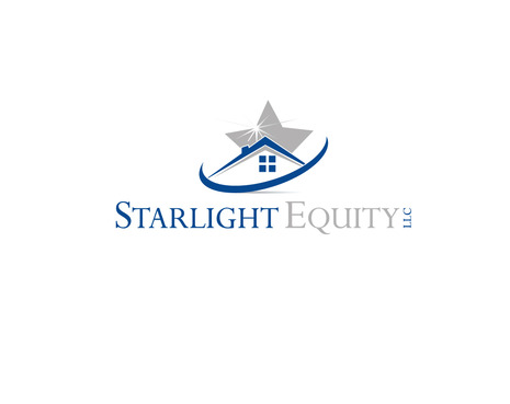
Clean, creative logo for real estate company
Starlight Equity LLC
|
Contest Holder
jonathancouch
?
Last Logged in : 3809days18hrs ago |
Concepts Submitted
129 |
Prize Money
350
|
Winner(s) | A Logo, Monogram, or Icon |
|
Live Project
Deciding
Project Finalized
Creative Brief
Clean, creative logo for real estate company
Starlight Equity LLC
No
Some keywords for inspiration: Investments, Solutions, Properties, Fairness, Integrity, Honesty, Professionalism, Starlight
I would like the design to be modern and elegant, yet creative enough to be impactful.
The logo will primarily used for business cards, direct mail, and stationary.
Real Estate
Symbolic
![]()
Abstract Mark
![]()
Modern
Professional
The images that I am uploading to the project contain logos with primarily shades of blue with black/gray, but I am open to seeing other colors.
not sure
I've looked through many of the designer's portfolios and chosen a few images that represent the general direction that I would like to go. The sample images will be uploaded to the project.
Related Contests


