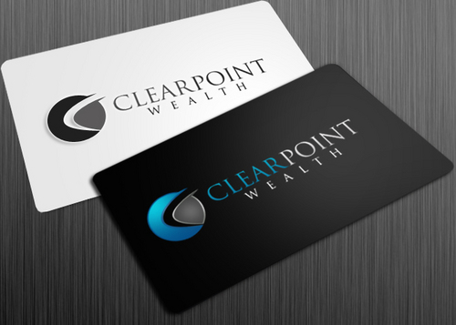
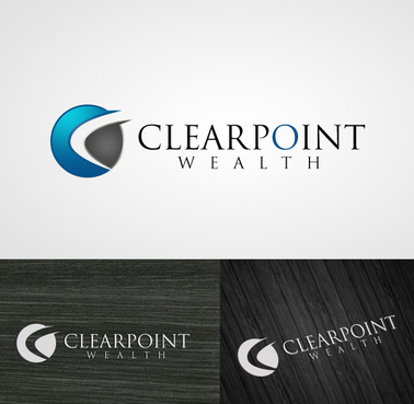
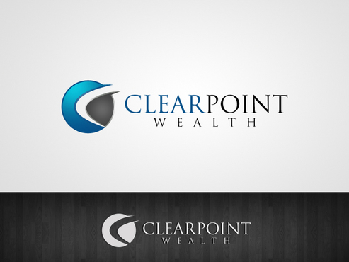
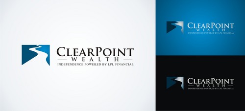
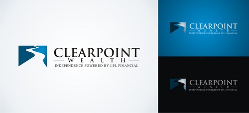
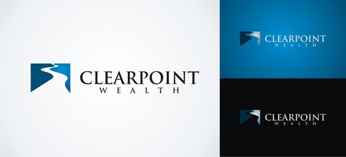
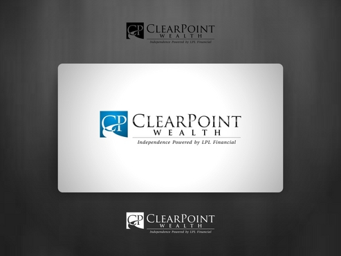
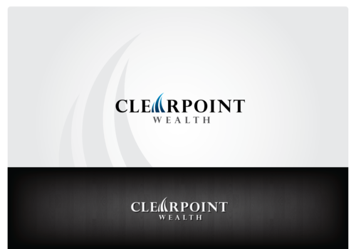
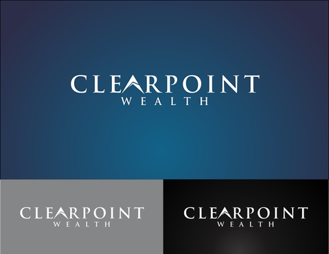
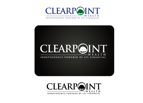
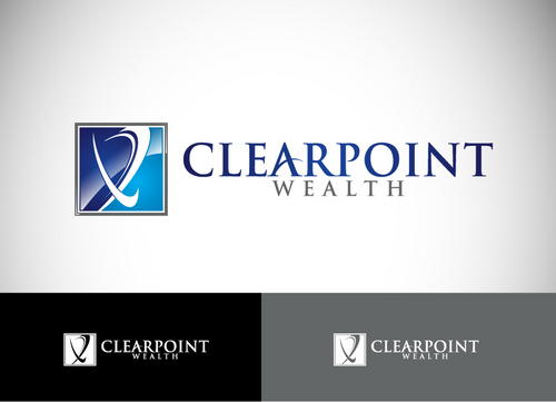
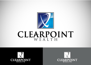
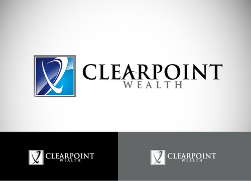
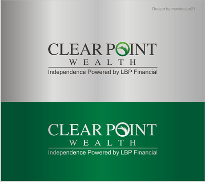
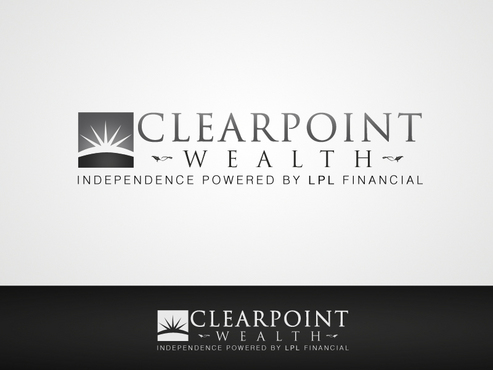
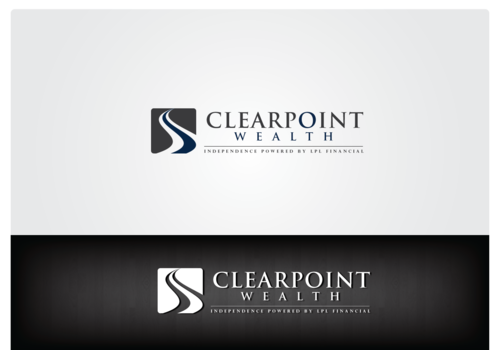
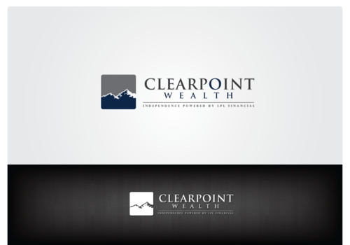
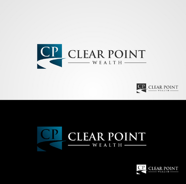
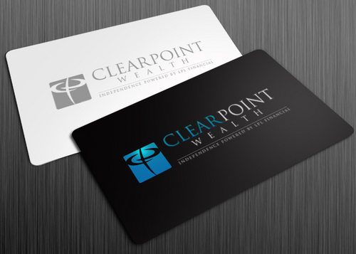
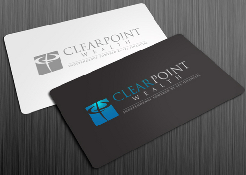
CLEARPOINT WEALTH - logo - wealth management firm
CLEARPOINT WEALTH
|
Contest Holder
Eastsidewealth
?
Last Logged in : 2811days10hrs ago |
Concepts Submitted
1063 |
Guaranteed Prize
450 |
Winner(s) | A Logo, Monogram, or Icon |
|
Live Project
Deciding
Project Finalized


Creative Brief
CLEARPOINT WEALTH - logo - wealth management firm
CLEARPOINT WEALTH
Yes
Logo - for financial planning & wealth managment company - working with affluent families investing and planning for successful retirement
Financial Services
Logo Type
![]()
Symbolic
![]()
Abstract Mark
![]()
Initials
![]()
Character
![]()
Modern
Sophisticated
>>blue / black / grey >> open to other colors though that are warmer . . My Website - will prob have mostly blues and greys in it with some accent orange or green for bullet pts/buttons - may also go with red accents in website instead of orange. (havn't designed website yet) Some websites (not the logos - just the website look and feel) similar to the website I may design are: www.ameriprise.com www.leggmason.com www.daveramsey.com www.genspring.com www.hightoweradvisors.com www.homrichberg.com - I may go this route color wise for a warmer feel than the blue and grey. Want a logo that will look good as etched glass sign or steel sign.
not sure
A logo that reflects strength, clarity, simplicity - either text based logo, possibly initials CP, or symbol that reflects the name well. I would like a logo that watermarks well and has the possibility to add some animation to it for video intros in the future. Also would like it to be suitable for a glass or steel sign in the future.
>> Please show all concepts on white/blue/black background!
>> open to a variety of ideas at this point
- anything related to guiding clients, clear path, independent,
Related Contests