

Creative Brief
Continuing Professional Development Seminars
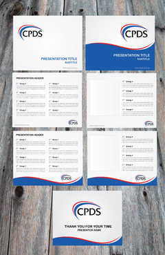
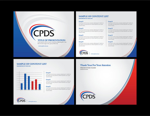
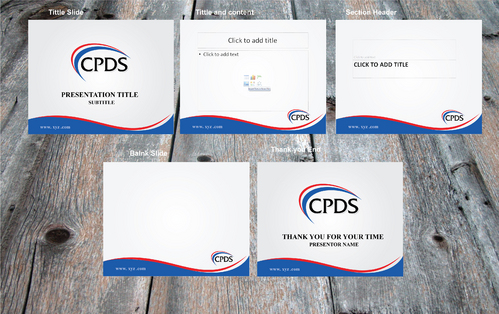
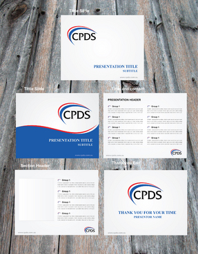
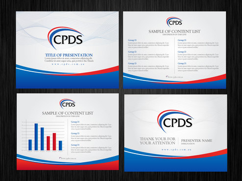
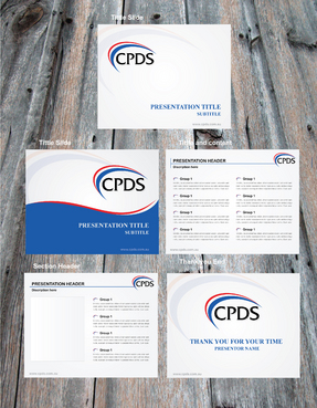
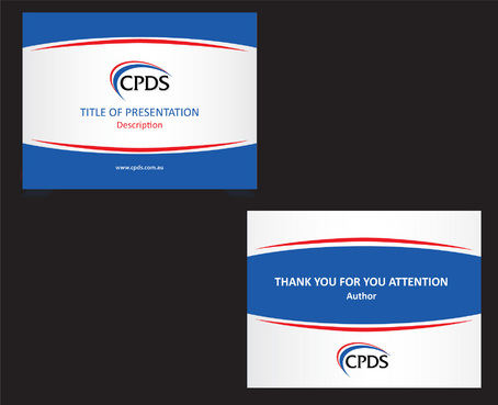
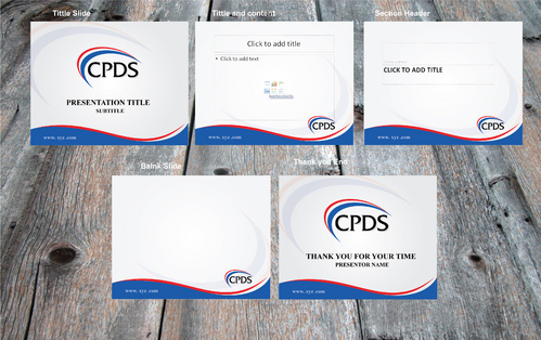
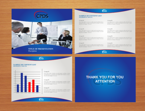
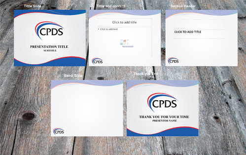
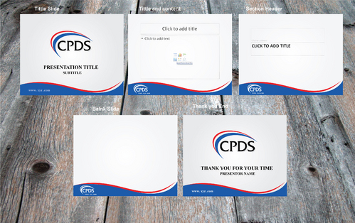
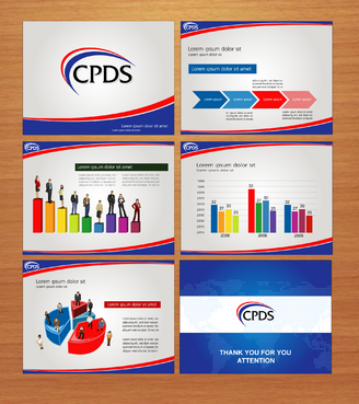
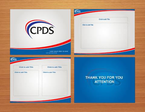
Power Point Template
We require a Power Point Template which we can use at our seminars.
Law
Professional - Lawyers. CPDS provides legal training and education seminar for lawyers.
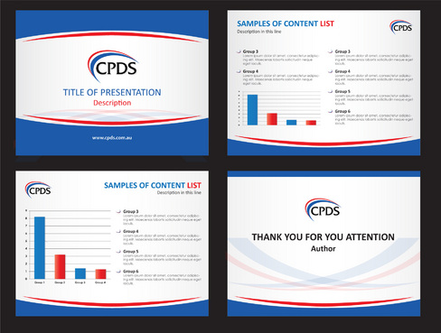
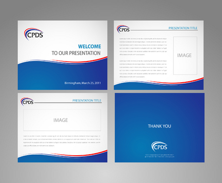
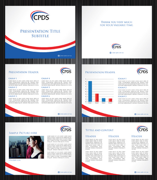
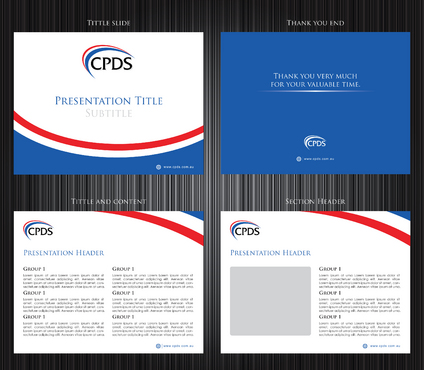
The template should include a title slide and other slides as required. The design should be subtle and allow sufficient space for content. The template would be used in a variety of different presentations, so should be flexible but consistent.
Related Contests


