Continuing Professional Development Seminars
Brochure Template
|
Contest Holder
mjdrenee
?
Last Logged in : 4365days4hrs ago |
Concepts Submitted
42 |
Guaranteed Prize
300 |
Winner(s) | Marketing collateral |
|


Creative Brief
Continuing Professional Development Seminars
Brochure Template
Law
Professional - Lawyers. CPDS provides legal training and education seminar for lawyers.
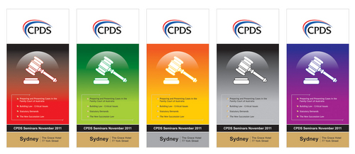
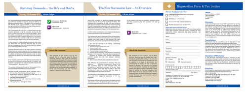
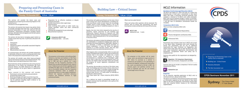
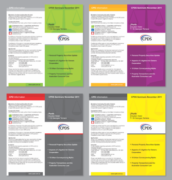
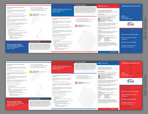
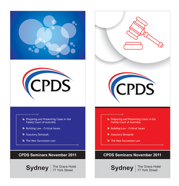
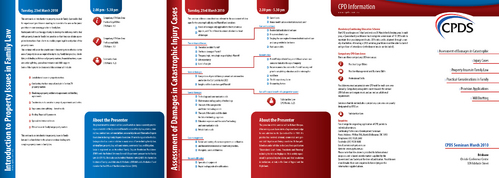
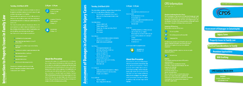
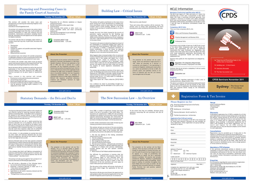
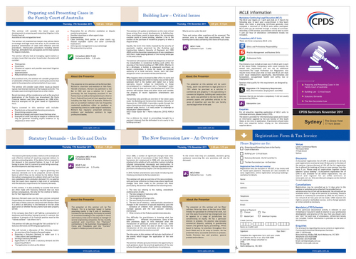
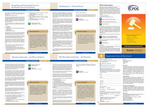
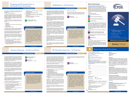
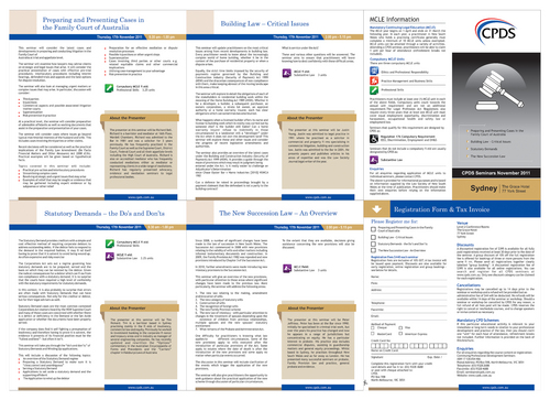
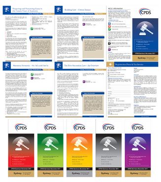
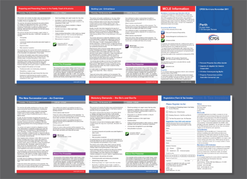
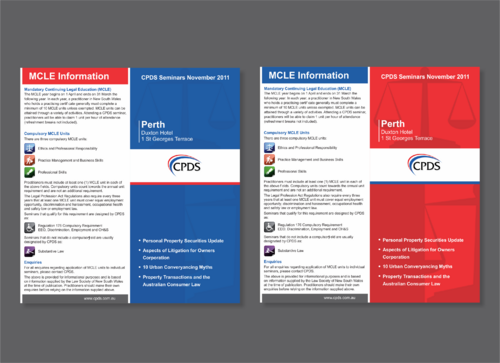
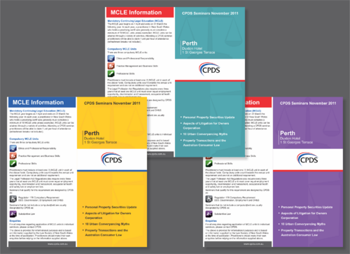
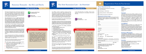
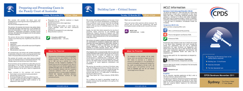
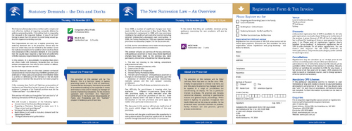
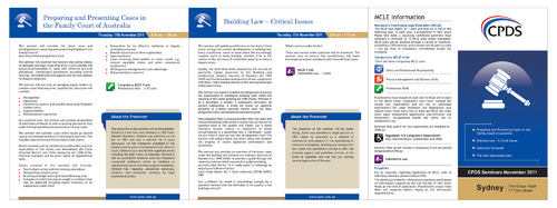
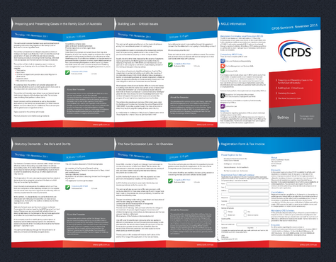
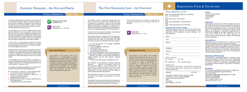
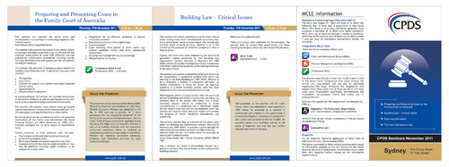
CPDS organises and presents regular legal professional seminars throughout Australia. Our marketing is heavily based on direct mail. When we schedule our seminars we design and print brochures and send them to all lawyers that are close to the location of the seminars. The brochures contain information that relates to the specific seminars that are scheduled. Therefore, the content is tailored specifically to the events that each brochure advertises. We currently use a brochure template that accommodates four individual seminars. We have used this template for the past couple of years and would like to update/improve the design. I will upload several PDF examples of the template we currently use, but do not feel constrained by this. We are looking for some imagination and new ideas. However, it will still need to have the following elements: 1. The brochure size needs to be as follows (note – this is the equivalent of a normal DL sized brochure but double size – instead of 3 panels, each side has 6) • Width – 599 mm • Height – 214 mm • Pages – two (front and back) • Panels – 12 (6 front and 6 back) 2. The front panel needs to have the following: • Our logo • The titles of each of the four events • The location and date of the seminars (Month/Year is sufficient) 3. The design of the balance of the brochure does not need to have any other specific requirements. However, it must contain the content to advertise each event as well as a registration form and the additional information that is contained in our existing brochures. I would not be too concerned with the actual content. The design for the front panel is the most important element. Also, we need a complementary graphical design/layout for the rest of the brochure. This includes a consistent layout, fonts and other graphical elements. One thing to keep in mind is that the layout should be simple. Complex or busy designs that have a lot of photos/graphics will not work. Also, I would probably prefer graphics or abstract designs to photos. The template will need to be supplied in a format that will allow the content to be edited using InDesign. Please note that we often schedule 8, 12 or 16 seminars at the same time. As each brochure advertises 4 seminars, we often will send out 2-4 different brochures in the same envelope. If all the brochures are exactly the same design, a casual receiver may assume that all the brochures are the same and only read one of the brochures and discard the others. Therefore, we need to be able to change the graphic or design on the front cover so that two or more brochures will instantly be recognised as different. We have always done this in the past by simply having a graphic on the front that we can change the colour. For example, we can have a blue version, a red version, a green version, etc. Last thing to note is that I also wish to redesign the icon set we use to designate the compulsory subject areas for our seminars. I will create a separate project for this, but you may wish to consider submitting a design for this as well. Please see this project for the specific details, but in short, we would like to redesign the icons that we use for the compulsory subjects. At the moment we use stock art, but we would like to use a custom designed icon set.
Related Contests