
Creative Brief
Continuing Professional Development Seminars
Icon Set
We wish to design an icon set to be used in printed brochures as well as our website and other marketing materials.
Law
Professional - Lawyers. CPDS provides legal training and education seminar for lawyers.
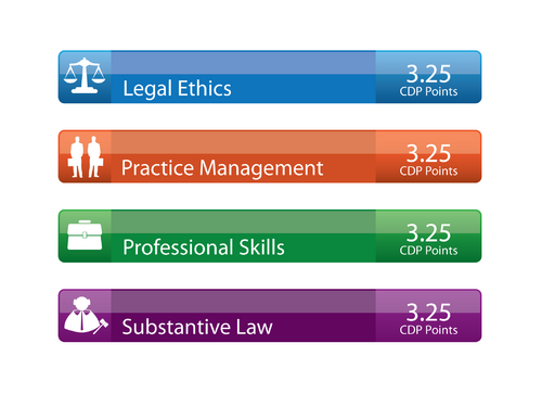
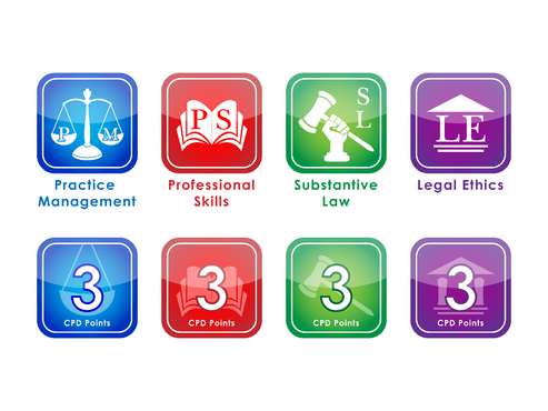
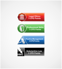
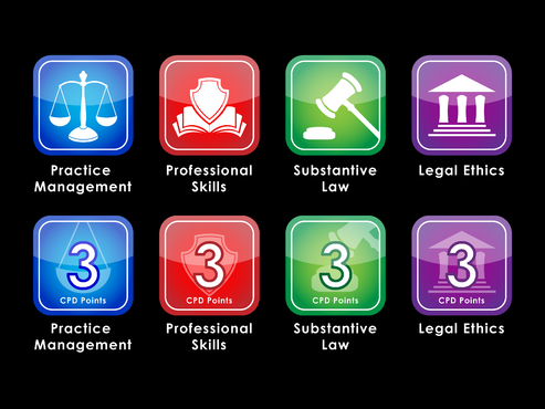
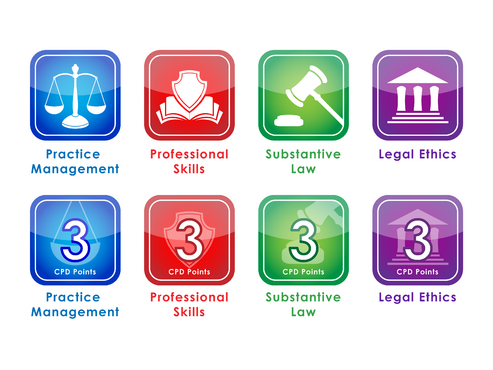
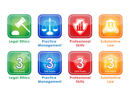
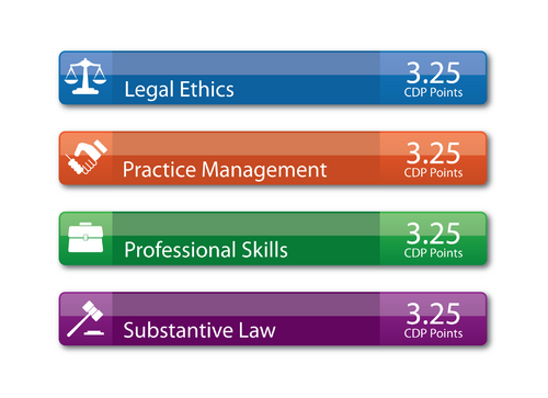
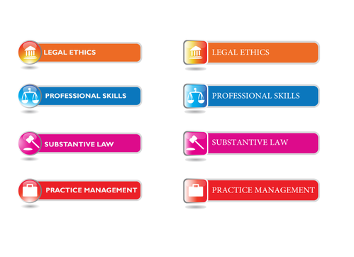
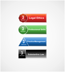
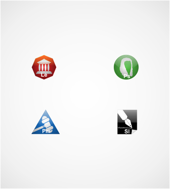
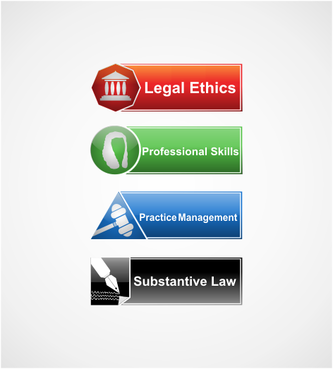
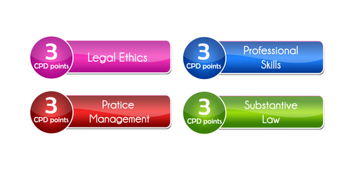
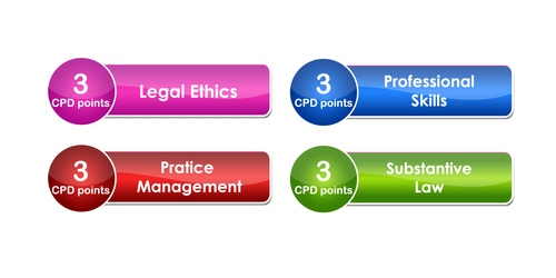
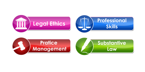
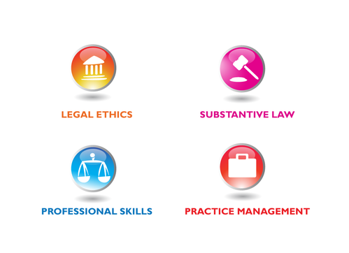
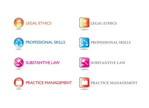
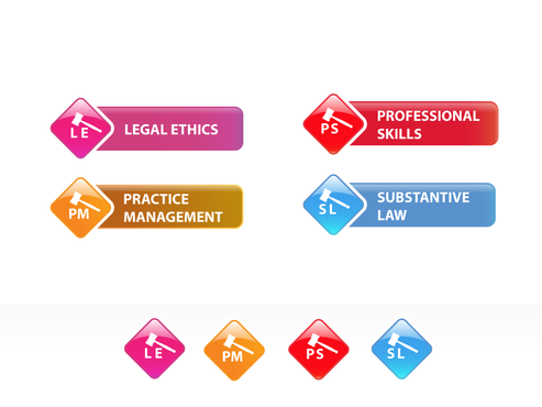
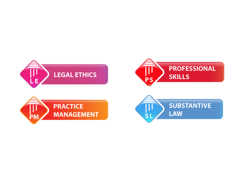
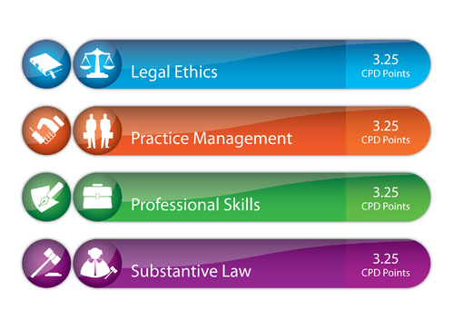
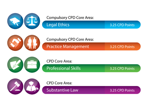
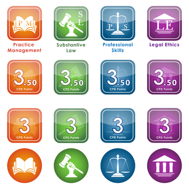
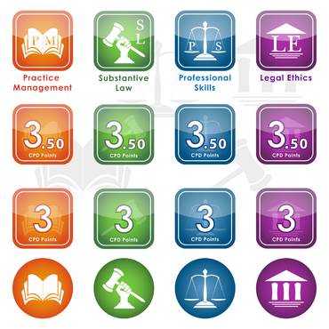
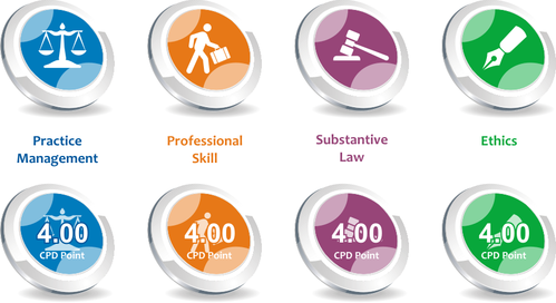
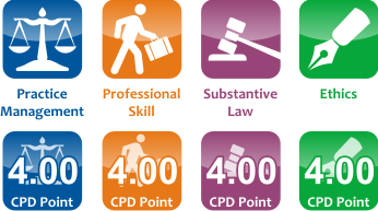
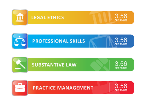
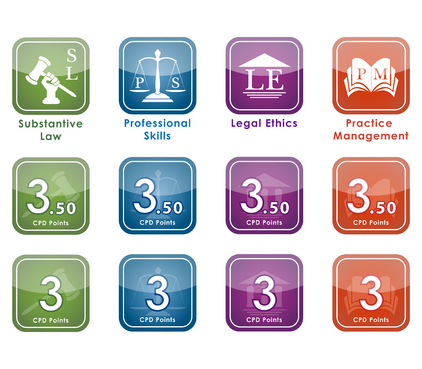
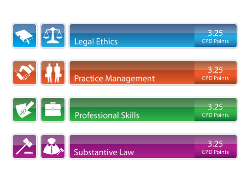
CPDS organises and presents regular legal professional seminars throughout Australia. Our marketing is heavily based on direct mail. When we schedule our seminars we design and print brochures and send them to all lawyers that are close to the location of the seminars. All lawyers in Australia are required to attend a specified number of hours of continuing education seminars each year. For every hour of attendance, they can gain 1 point and they usually need to accumulate 10-20 points per year. In most cases there are also compulsory areas that must be covered. Each State has different requirements, but there are four main compulsory areas: 1. Legal Ethics 2. Practice Management or Business Skills 3. Professional Skills 4. Substantive Law There is also an additional subject area which is used in one location (Sydney) – this is for OH & S, Employment Law, Equal Opportunity and Discrimination Law. We always designate how many points (or hours) a lawyer will get by attending one of our seminars and in which compulsory area they will get the points. What we need is an icon for each of the four main areas. Each icon should ideally be recognizable with the particular compulsory area and be a different colour. We would also like an icon for the additional subject area in Sydney, but this is not essential. Also, it would be ideal if the points and/or description of the compulsory area could be incorporated within the icon graphic. However, if this is not possible, then this can be done as text under the icon or to the side. The icon does not need to be any particular size – it could be square, round, rectangle or anything else. But, please remember the context we will be using it in. The main use will be in the marketing brochures. But we would also like to use it on our website and other media as required. I will also need to be able to edit each icon as the descriptions of the compulsory subjects differ slightly between the States. I will also need to be able to change the number of points. Ideally, I should be able to edit the icons using Adobe Illustrator. I will upload several examples of our marketing brochures which show how we currently designate points/compulsory areas for each seminar. The icons we use at the moment are a set of stock-icons I purchased on the web. However, these icons were never ideal and we would like something that is specifically designed for our purposes. Also, if you look at the back panel of each brochure (panel 5 on the first page), there is a description of what each icon represents and more information on the compulsory subjects. This information is different for each State. I will also upload some examples of icons used by some of our competitors. Please note that none of these examples actually specify the number of points within the graphic. This is not ideal. I think a clear number should be included in the graphic. For example, if the seminar has 3 points – then a clear “3” should stand out in the icon. Finally, please also note that I wish to redesign the template we use for our marketing brochures. I will create a separate project for this, but you may wish to consider submitting a design for this as well. Please see this project for the specific details.
Related Contests


