Creative Consulting Company
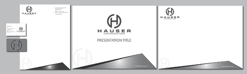
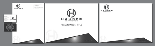
business card, stationary, ppt template
|
Contest Holder
Hauser
?
Last Logged in : 4125days11hrs ago |
Concepts Submitted
156 |
Guaranteed Prize
250 |
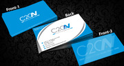
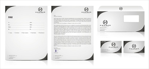
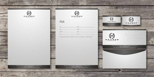
Winner(s) | Business Cards and Stationery |
|
Live Project
Deciding
Project Finalized


Creative Brief
Creative Consulting Company
business card, stationary, ppt template
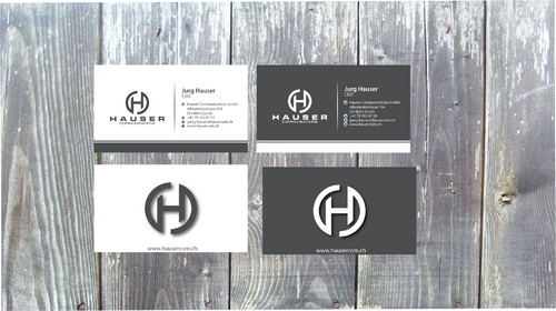
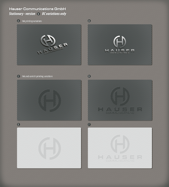
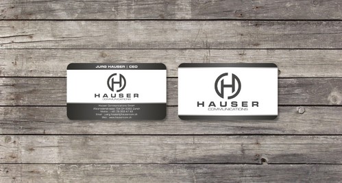
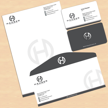
I need double sided standard sized Business Card [3.5" x 2"]
Use specific fonts
Use what works the best in your design
Cutting-Edge
Corporate
Modern
Professional
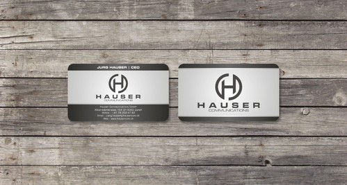
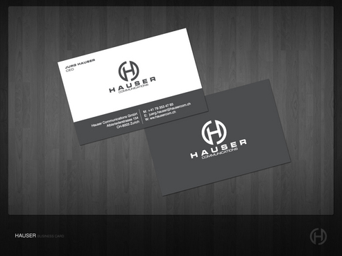
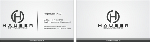
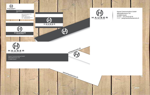
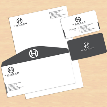
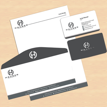
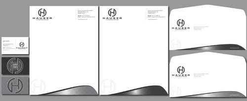
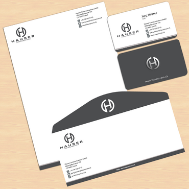
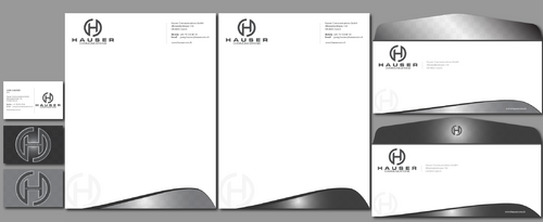
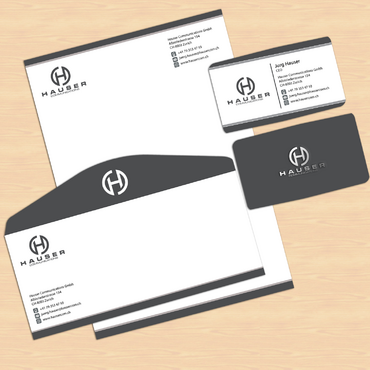
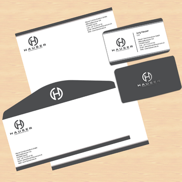
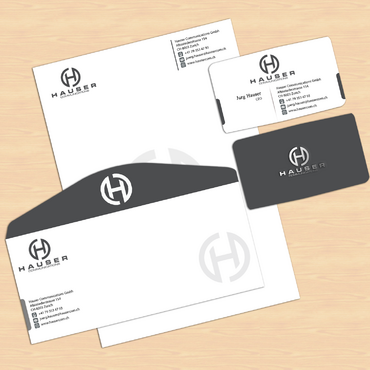
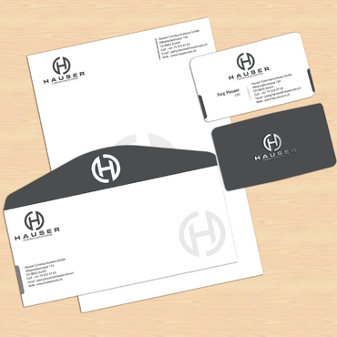
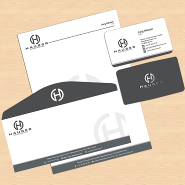
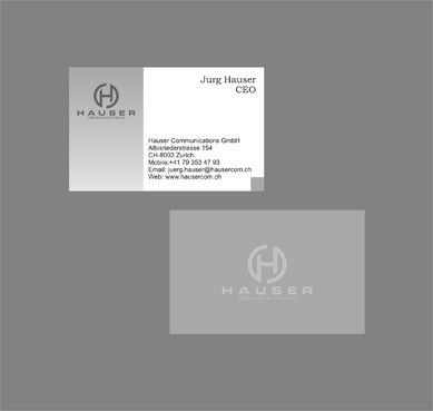
Jurg Hauser
CEO
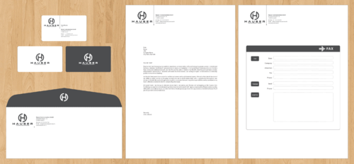
Hauser Communications GmbH Albisriederstrasse 154 CH-8003 Zurich
+41 79 353 47 93
juerg.hauser@hausercom.ch
www.hausercom.ch
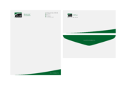
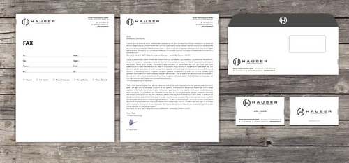
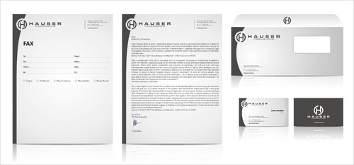
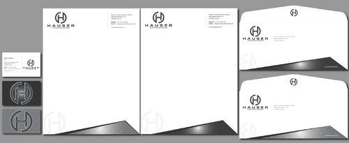
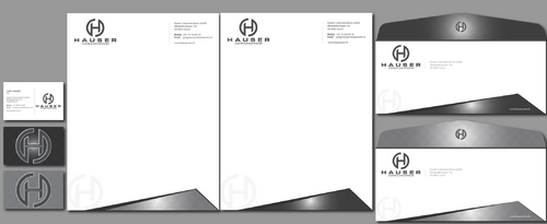
Hauser Communications is a consultancy that specializes in all aspects of high end event organization and sponsorship activation. We are located in Switzerland. I'm looking for a clean and stylish look. The sizes are european: Letterhead: DIN A4 210mm x 297mm (8.27" x 11.69") Business Cards: 85mm x 54mm (3.346" x 2.126") Plz use "Mobile" instead of "Cell" Stationery: --------------- Do not use Ilustration which runs off the edge. We do print the letters with our own printers. Therefore, there will be a margin. And please no watermarks. Business Cards: ----------------------- I consider to grade up the back of the card with some varnish or film, but not sure yet. You can use either the black or the white logo. ppt Template: ------------------ Template should match the grafical concept.
Just the Logo. I you mind pimp up the logo a little bit (gradient, shadow, 3D etc.), feel free to do so. But you don't have to.
Communications and Media
Related Contests