CSI: New Business Logo
Cabinetry Solutions & Improvements LLC
|
Contest Holder
CabinetrybyCSI
?
Last Logged in : 5090days9hrs ago |
Concepts Submitted
206 |
Guaranteed Prize
300 |
Winner(s) | A Logo, Monogram, or Icon |
|
Live Project
Deciding
Project Finalized


Creative Brief
CSI: New Business Logo
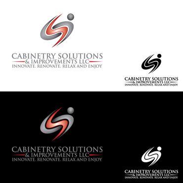
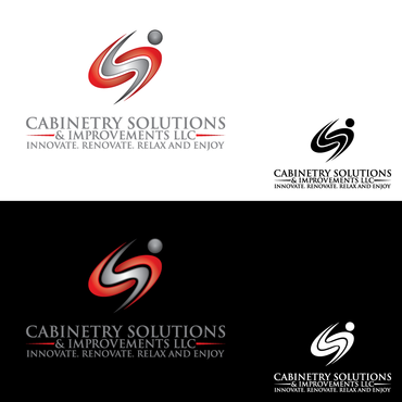
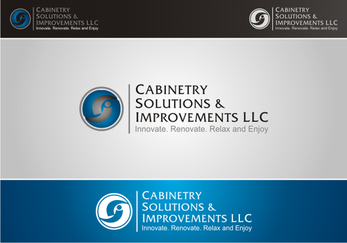
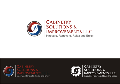
Cabinetry Solutions & Improvements LLC
Innovate. Renovate. Relax and Enjoy
Yes
We are a new kitchen and bath design center located outside of Chicago, IL. The three owners of Cabinetry Solutions & Improvements have been in the construction industry for a combined 60 years and . CSI offers all types of cabinetry along with the services necessary to complete any remodeling or new home project. We offer vast insight and guidance for our clients no matter how big or how small their project. We will continually discover and innovate within our industry to create a one-of-a-kind experience for our clients. From family life to the decision process, we understand the stress involved with any remodeling or new home project; therefore, we are committed to making an enjoyable and relaxing experience for every client. From our custom line to many other name brand cabinets, we have a product that will meet any need or want for all budgets. Whether its new flooring, new counter tops, a faucet, or an addition to your house, CSI has an extensive line of home products and services. CSI has not only designed and built many stunningly beautiful kitchens, bathrooms, theater rooms, home offices, and even furniture, we even build our own cabinetry! Most of all, it has been a real blessing to have worked with so many great clients in the past and we will continue to grow our lasting relationships with these patrons as well as our new customers.
Architecture
Logo Type
![]()
Symbolic
![]()
Abstract Mark
![]()
Initials
![]()
Cutting-Edge
Unique/Creative
Clean/Simple
Sophisticated
Modern
Illustrative
Feminine
Geometric
Various blues (we are open to color suggestions)
not sure
We are considering having an emphasis on the "S" of CSI (make the "S" stand out). We will have black polo shirts and sweaters with embroidered logo. The logo should have it's own look while still incorporating the name and tagline.
Related Contests


