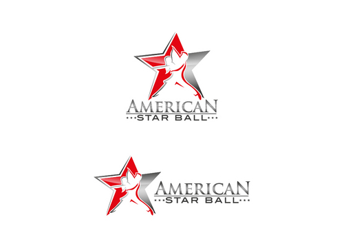
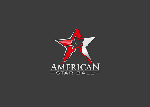
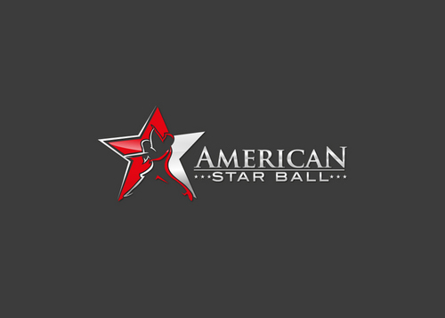
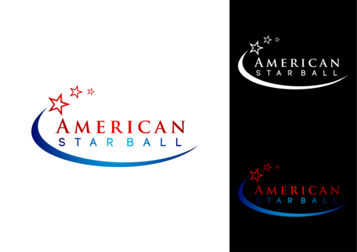
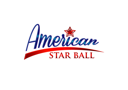
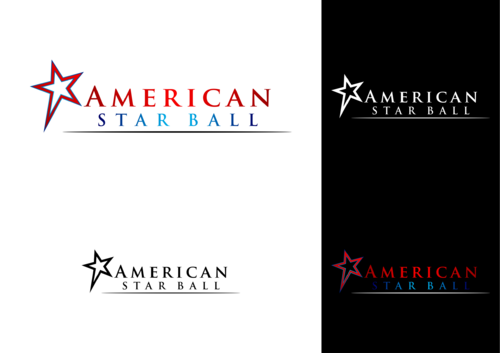
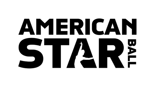
Dancesport Competition Logo
American Star Ball
|
Contest Holder
rejenkaya
?
Last Logged in : 4226days23hrs ago |
Concepts Submitted
79 |
Guaranteed Prize
300 |
Winner(s) | A Logo, Monogram, or Icon |
|
Live Project
Deciding
Project Finalized
Creative Brief
Dancesport Competition Logo
American Star Ball
Yes
We want our logo to covey that this is a prestigious dance competition. We want competitors to remember the name of our competition when they are deciding what competitions to participate in. We don't want anything cutesy or childish. The majority of our audience will be dance teachers and their adult students. We want our logo to look hip, trendy, and modern.
Entertainment
Logo Type
![]()
Symbolic
![]()
Abstract Mark
![]()
Illustrative
![]()
Character
![]()
Modern
Cutting-edge
Sophisticated
Professional
not sure
Related Contests