SALES / SUPPORT : +1-877-525-5646   |  


Disozo company logo

Diasozo

Contest Holder Diasozo ?

Last Logged in : 3579days6hrs ago

Concepts Submitted

208

Guaranteed Prize
300
Winner(s)

1

A Logo, Monogram, or Icon veildAll design entries can be viewed by other designers. Featured Featured Contest
tick_gray

Live Project

tick_gray

Deciding

tick_blue

Project Finalized


Project: Disozo company logo
Industry: Health Logo
Contest Launched: Mar 23, 2011
Selected: 1 winning design from 208 concepts
Winning Design by: donarkz
Close Date: Apr 08, 2011


Disozo company logo - Health


Awarded as a winner
Project Report    

Sort by:


#175

#174

#168

#162

#179

#178

#158

#153

#75

#74

#63

#27

#159

#114

#109

#108

#98

#94

#91

#82

#69

#38

#32

#31

#15

#10


Creative Brief


Disozo company logo

Diasozo

Be made whole

Yes

Diasozo is a company that promotes wholeness, or wholesomeness. The word is of Greek origin, and means to be made whole or well, to cure, to preserve, to rescue, to heal, to save.

We are selling natural products--healthy organic foods and nutrient rich soil amendments. We are making the things humans consume healthier by making our dirt healthier. Think dirt nutrition and aminal nutrition, healthy meat and vegetables, personal care products, as well as artisan wares.

We dont want the logo to be specific to foods or fertilizers as the logo will likely brand other products in the future. So we're thinking that the logo should be more about the word and concept "Diasozo" and less about the products we sell. Its ok to include the tagline with the logo for letterhead or business cards, but we will want the logo to stand alone as well.

We are looking for a simple logo, that is easily transferable to clothing, stickers, etc. We are open to all concepts and ideas.

Health

Symbolic
Symbolic

Abstract Mark
Abstract Mark


Unique/Creative
Clean/Simple
Outdoors/Natural
Fun
Abstract

earth tones-- brown (soil), green (plants), orange (sun)

2

We will try to leave lots of feedback to help your ideas along. We are really open to any original concepts.

Related Contests


 logo for re-branding new nursing facility
$400
Prize Money
184
Concepts
Logo for a chiropractic health clinic
$199
Prize Money
63
Concepts
Logo for Wellness Center
$200
Prize Money
239
Concepts
Inspiring Logo for fun and innovative fitness and wellness center
$199
Prize Money
159
Concepts

Discussion


Comments

  • April 07, 2011 5:43 PM
    Diasozo Diasozo
      Project Holder
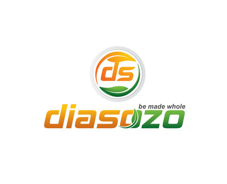
    donarks- On #175,can you make the leaf over the "i" smaller by quite a bit? It looks too big to us. Otherwise we like it a lot.

    Like Icon 0   DislikeIcon 0
  • April 06, 2011 10:46 PM
    Diasozo Diasozo
      Project Holder
    Donarks- #168 is great, lovin it! Can you try to turn the green under the S into a leaf by putting some stem veins on it or something? That would be great. And make the leaf over the "i" about half as big? Maybe try making "be made whole" in all capital letters if it still fits alright?

    Like Icon 0   DislikeIcon 0
  • April 06, 2011 3:09 PM
    Diasozo Diasozo
      Project Holder
    Looks great everyone! Heres a few ideas. fawwaz- Make the D the same thickness as the S. Put the "be made whole" above the ozo instead of below. sembranidsgn- Remove the leaf (or the dot)over the i. Replace the leaf O with the symbol for the first O in the word diasozo. Keep going on your symbol design-- maybe try adding some dirt somehow or a dirt hill or another pasture hill. We probably like your #161 the best at this point. Donarkz- Remove the leaf outside the circle. Shrink the leaf over the i. Keep working with your symbol. We aren't sure the S works without a D with it. You could remove the D and S altogether and just focus on a "sun,dirt,meadow,leaf,etc." idea or see if theres a way to incorporate them better. Thinktwice- We like #153. Try making the sky and sun smaller or the pastures bigger. Maybe try a soil or dirt pasture, or not if it looks dumb. Move the "be made whole" over the ozo. Thank you all for working with us. The designs are looking good. We like how you all have 3 or less colors, and the symbols are looking good.

    Like Icon 0   DislikeIcon 0
  • April 05, 2011 2:08 PM
    Diasozo Diasozo
      Project Holder
    ThinkTwice- nice. You are on to something. We like where your going. Fonts are a little to "fast and racey" kind of too sporty or masculine looking.

    Like Icon 0   DislikeIcon 0
  • April 05, 2011 12:42 PM
    Diasozo Diasozo
      Project Holder
    Unfortunatly, the design we selected from "hrose" was a copy of someone else's logo. You can see the logo design idea that we chose was more of a drawing than letters. We like the sun, leaf, and pasture in the logo that we felt was a good description of what we doing with our company. If anyone can design a symbol with those ideas, that would be great. Donarks lettering is still our favorite. We like the capital S as in DiaSozo (Dia Sozo can actually be two words). Sembranidsgn has pretty good lettering as well- we like the "soz".

    Like Icon 0   DislikeIcon 0
  • April 05, 2011 7:27 AM
    SiteAdmin SiteAdmin
     
    Contest has been reopened for 3 days. --- Vincent

    Like Icon 0   DislikeIcon 0
  • April 02, 2011 2:20 AM
    SiteAdmin SiteAdmin
     
    Winning entry #113 by designer "hrose" has been disqualified - as it was identical to the given source. Source: http://a1.twimg.com/profile_images/510865903/cleanjourney_logo_only_-_no_text_normal.jpg CH will reopen the contest on April 5, 2011 and select a new design.

    Like Icon 0   DislikeIcon 0
  • March 29, 2011 11:58 PM
    Diasozo Diasozo
      Project Holder
    We wanted to thank you all for your excellent designs. We are so impressed with the artistic talent that you have all submitted on our project. We should have our selection chosen within a day or two.

    Like Icon 0   DislikeIcon 0
  • March 27, 2011 10:24 PM
    Diasozo Diasozo
      Project Holder
    We like the leaf over the i.

    Like Icon 0   DislikeIcon 0
  • March 27, 2011 10:20 PM
    Diasozo Diasozo
      Project Holder
    We really like the fonts and lettering in both #78(sembranidsgn) and #75(donarkz). They are distinct yet simple. We are not sure we want to be known by a "leaf" alone. We have seen other "organic" companies that have a single leaf. On the other hand the leaf is working in several of the designs. We love the new simplified logo on #74(hrose)with grass, leaf, sun etc. in it, but the font is too plain and doesn't stand out with any personal identity. All of your artistic talent has really helped us to see our preferences.

    Like Icon 0   DislikeIcon 0
  • March 26, 2011 1:02 AM
    Diasozo Diasozo
      Project Holder
    Again, We would like to commend you on your talents. We are so impressed with all your original ideas. donarkz--probably #27 is our favorite so far; Simple, reproducible, and it all works good together. thanks for exploring other font types, if you want to try some more we would appreciate it. or try something different with the leaf? hrose--thanks for trying to tweak the symbol. We still really like your original in #12. can u simplify it with less small details? Niklasiliffedesign-- we like your symbol in #49 but is has an oriental feel to it. Could you try fattening up the letters or try altering the circle or trying different fonts or moving or changing the "S".

    Like Icon 0   DislikeIcon 0
  • March 24, 2011 4:55 PM
    Diasozo Diasozo
      Project Holder
    Wow, you guys have come up with more brilliant ideas in one day--you are all very goood at what you do. Heres a few of our thoughts like the symbol alot on #12 and also #15 like the cross in #10 like the colors in #15 or #1 like the idea of making a symbol out of the D or D&S as in #18,#15, #9,#8 favorite fonts so far are #15 or maybe #9 Donarkz-- try making the symbol in a circle instead of a square and with different fonts or capializations to make the 2 letters work together. We like #15 the best so far. hrose-- we like alot about your symbol in #12. can it be simplified a little? explore other fonts and how a D or D&S could go in the symbol. Everyone-- think simple, no small details like small tick-marks or color fades We like donarks DS symbol because it could be stamped on our soaps, or branded on our cattle, as well as stickered on various products or embroiderd on clothes

    Like Icon 0   DislikeIcon 0
  • March 23, 2011 10:46 PM
    Diasozo Diasozo
      Project Holder
    Thank you for your early design ideas. We are especially interested in a "symbol" that represents the concept, more than the actual word Diasozo in various fonts as a logo. Its good if the word accompanies the symbol. Also, I realize that I put that I wanted the tagline in the logo, but its not necessary unless it really works well.

    Like Icon 0   DislikeIcon 0