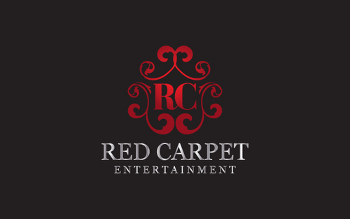
DJ Entertainment Logo
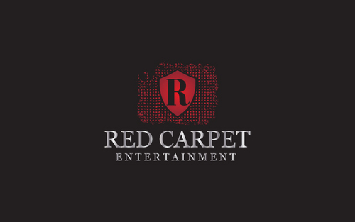
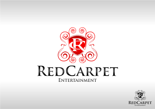
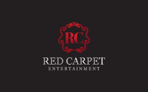
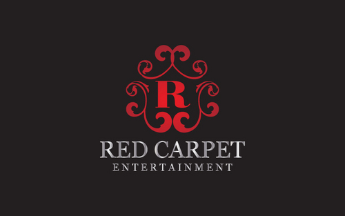
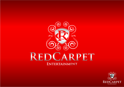
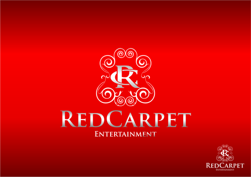
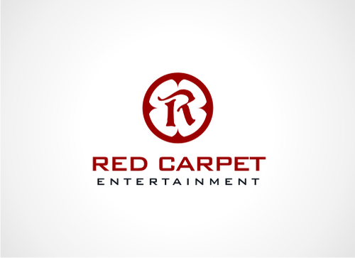
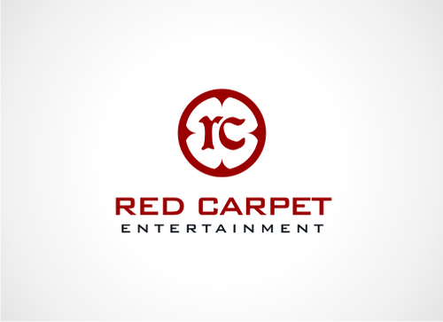
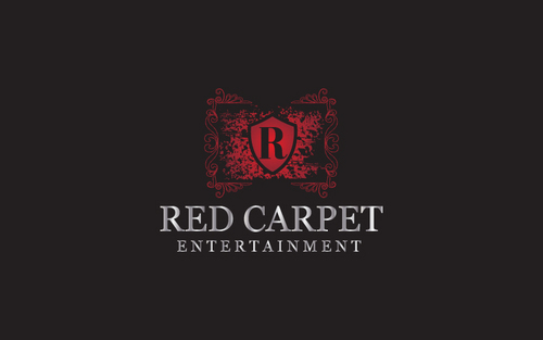
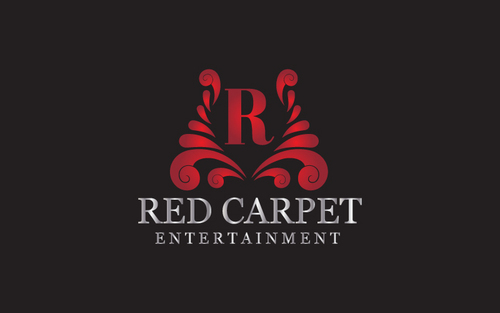
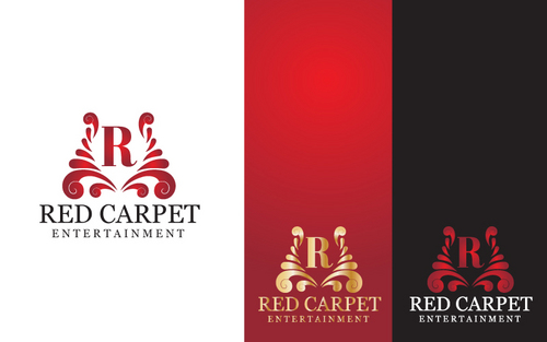
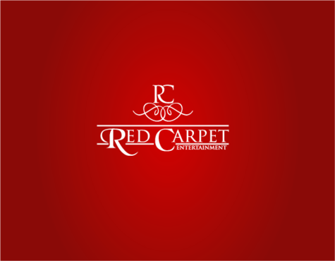
Red Carpet Entertainment
|
Contest Holder
tyguy85
?
Last Logged in : 5503days7hrs ago |
Concepts Submitted
155 |
Guaranteed Prize
300 |
Winner(s) | A Logo, Monogram, or Icon |
|
Live Project
Deciding
Project Finalized

Creative Brief
DJ Entertainment Logo
Red Carpet Entertainment
No
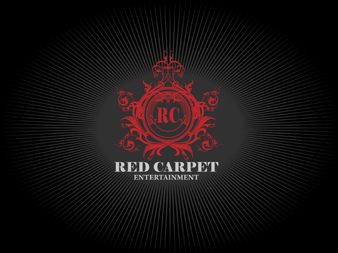
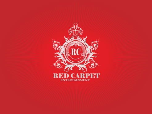
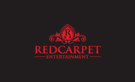
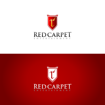
This company is a disk jockey service. I'd like the logo to have a "royal" or "upscale bar" sophisticated look. It will be used on future web site and promotional materials for clients looking for a DJ. One logo that I really like is from Nomad Lounge: http://nomadlounge.com/ Also, I like some of the Kingsbury logos that were created on this web site: http://orders.logodesignguru.com/contests/the-kingsbury/users/Braviantho
Entertainment
Abstract Mark
![]()
Cutting-Edge
Unique/Creative
Sophisticated
Abstract
A darker red that reflects a rich red carpet look. The text could be gold or silver.
2
1) I like the Nomad logo (http://nomadlounge.com/). One suggestion might be to put the letters "RC" (for Red Carpet) in a royal-like symbol - like the "N" in Nomad's logo. But I'm open to trying other creative ideas too. 2) I would like the "Red Carpet" text to be bigger than "Entertainment." 3) Please don't use red carpet or red carpet rope/pole pictures in the logo. I'd like to just stick with elegant/royal font and a royal looking art in the logo (like the URLs above).
Related Contests