Dr. Glenn Paleczny
Dr. Glenn J. Paleczny
|
Contest Holder
Gpaleczny
?
Last Logged in : 3182days7hrs ago |
Concepts Submitted
115 |
Guaranteed Prize
250 |
Winner(s) | A Logo, Monogram, or Icon |
|
Live Project
Deciding
Project Finalized


Creative Brief
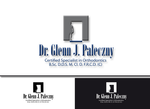
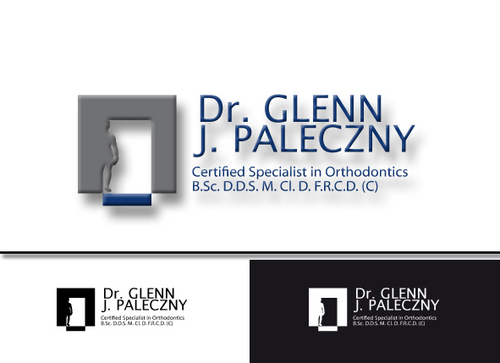
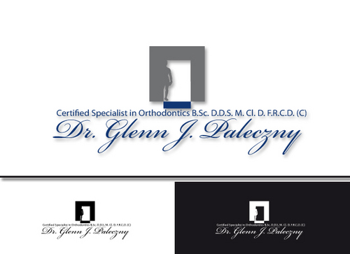
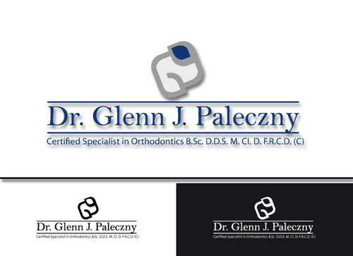
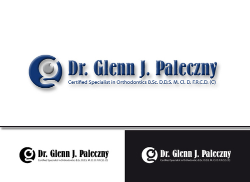
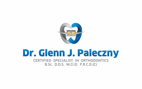
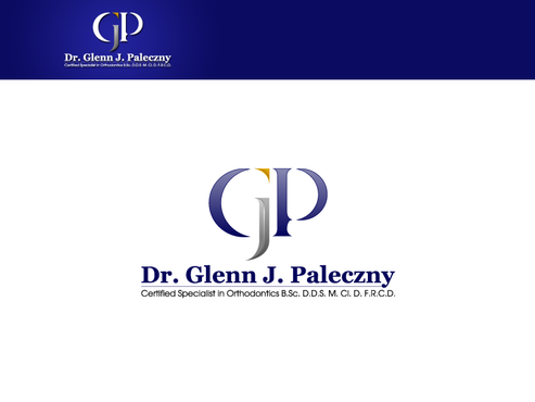
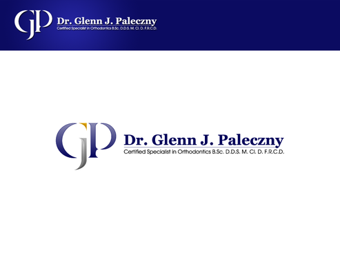
Dr. Glenn Paleczny
Dr. Glenn J. Paleczny
Certified Specialist in Orthodontics B.Sc. D.D.S. M. Cl. D. F.R.C.D. (C)
Yes
I am a certified specialist in orthodontics. My office
employs 10 persons who work with braces on the teeth to create beautiful healthy smiles on people of all ages. These patients usually are feeling bad about the status of their smile or bite and are seeking improvement. We treat patients predominatly in the early teen ages right through to young adults (age 20-50). Occasionally we treat younger (age 5-10) or older patients(age 50-70). Our office predominantly recieves referrals from other dental offices (general dentists) who are not specialists. We are highly respected in our community. I have taken post graduate training for an extra 3 years at university to attain my specialist status.
Medical
Logo Type
![]()
Symbolic
![]()
Abstract Mark
![]()
Initials
![]()
Web 2.0
![]()
Cutting-Edge
Unique/Creative
Sophisticated
Modern
Industry Oriented
Local/Neighborhood
Fun
Playful/Cartoonish
Predominantly Navy blue (or Royal Blue) with Silver-grey. (If it helps to add just a small touch of gold for very minor accents to give it a distinctive quality that would be fine)
3
I am looking for something that really sets me apart from other orthodontic offices. The fact that I am a specialist is probably key. People should know that they are seeing a dentist who has special training with braces to solve their problems that most other dentists in the area do not have. Please use your imagination to design the logo but consider the "G" and "P" in my first to letters as a focal point or using a tooth or teeth with braces . I am open to anything that you think will knock my socks off ie family tree, animal, aligned teeth, a wave of water ....whatever. I reside in North Bay , Ontario Canada and we have several large lakes in the area (but we are not on the ocean and no palm trees grow here) Good Luck
Related Contests