DRAGON CORPORATE LOGO
DRAGON PETROLEUM
|
Contest Holder
Fuhso
?
Last Logged in : 5490days21hrs ago |
Concepts Submitted
122 |
Guaranteed Prize
350 |
Winner(s) | A Logo, Monogram, or Icon |
|
Live Project
Deciding
Project Finalized


Creative Brief
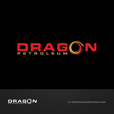
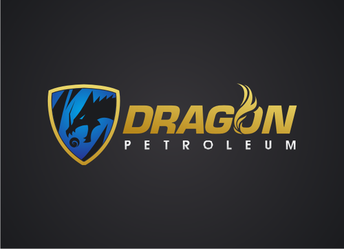
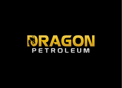
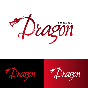
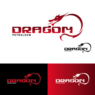
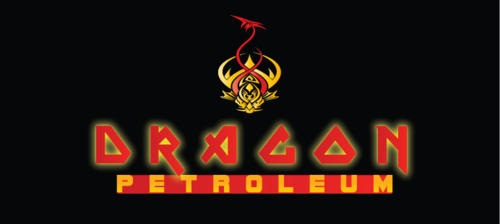
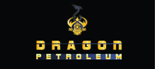
DRAGON CORPORATE LOGO
DRAGON PETROLEUM
No
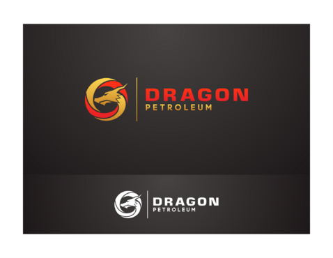
A petroleum based company.
Energy
Symbolic
![]()
Abstract Mark
![]()
Unique/Creative
Sophisticated
Corporate
Industry Oriented
High Tech
Red & Gold, or Blue & Gold or Red, Blue & Gold.
3
The logo will be representational of a Dragon. It may consist of part(s) of a dragon. Be geometrical in shape. May use a combination of shapes in the overall Logo Design. The logo though must be able to sit on a Flat Black Background. May also incorporate the use of a tear drop in some combination with a dragon or any other creative take (outside of suggestions).
Should not look close to B.P. (British Petroleum) or Mortal Combat Logo.
Related Contests