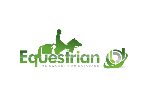
SALES / SUPPORT : +1-877-525-5646   |  


EquestrianDB Part 2

Equestrian

Contest Holder sunnyonline ?

Last Logged in : 4314days4hrs ago

Concepts Submitted

52

Guaranteed Prize
250
Winner(s)

1

A Logo, Monogram, or Icon veildAll design entries can be viewed by other designers. Featured Featured Contest Expedite Expedite Contest
tick_gray

Live Project

tick_gray

Deciding

tick_blue

Project Finalized


Project: EquestrianDB Part 2
Industry: Advertising Logo
Contest Launched: Sep 08, 2010
Selected: 1 winning design from 52 concepts
Winning Design by: fotedefrappe
Close Date: Sep 18, 2010


EquestrianDB Part 2 - Advertising


Awarded as a winner
Project Report    

Sort by:


#44

#43

#40

#39

#26

#20

#46

#45

#41

#30


Creative Brief


EquestrianDB Part 2

Equestrian

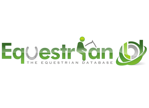
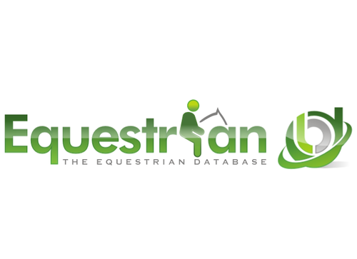
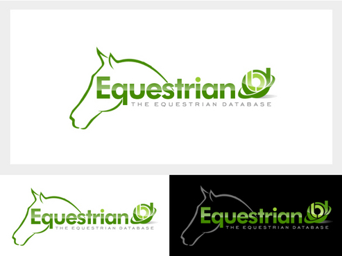
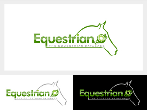
The Equestrian database

Yes

We are a small business that is developing a series of websites aimed at users and businesses within a specific industry to post free classified ads and business listings.

EquestrianDB.com is aimed at the Equestrian community.

Advertising

Symbolic
Symbolic

Web 2.0
Web 2.0


Cutting-Edge
Clean/Simple
Corporate
Modern

not sure

IMPORTANT:

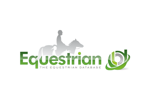
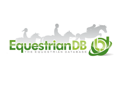
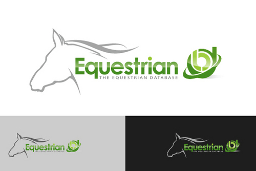
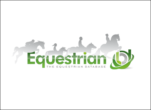
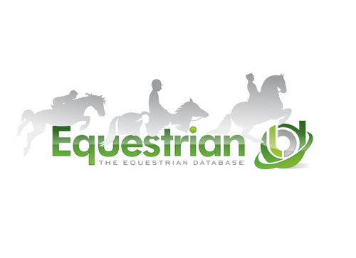
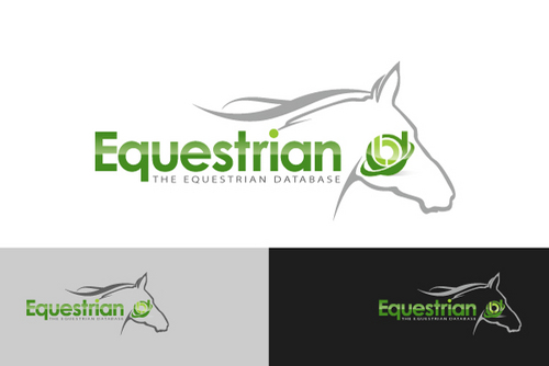
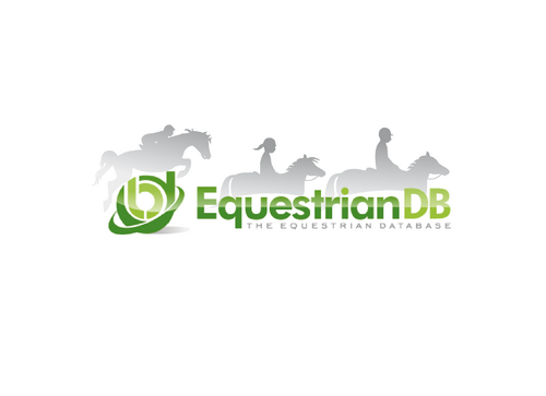
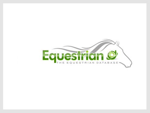
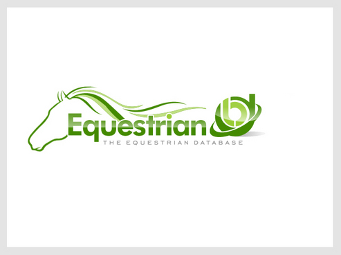
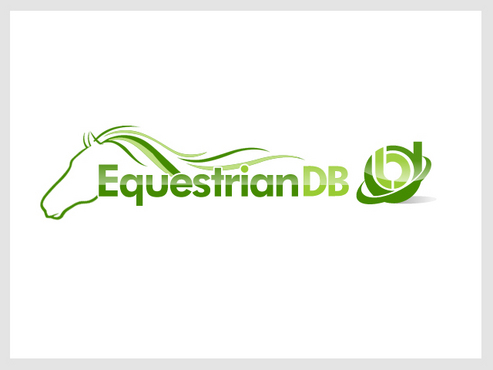
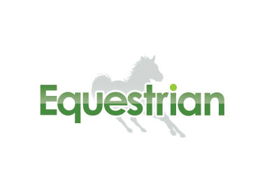
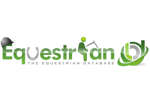
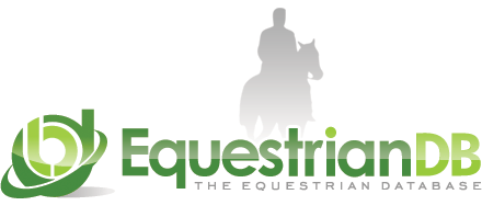
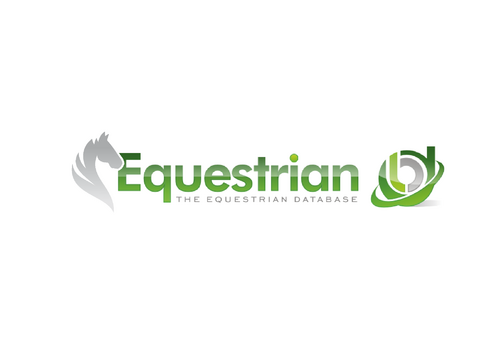
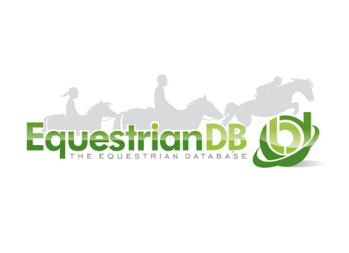
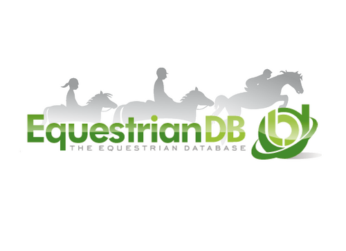
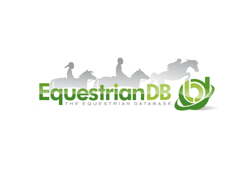
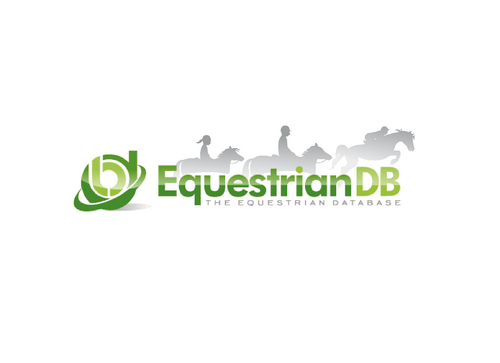
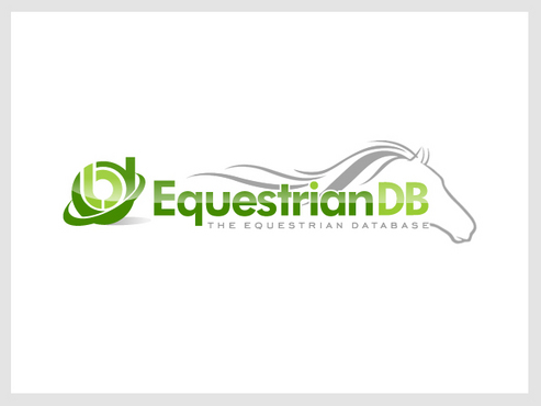
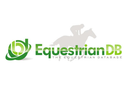
We require the word Equestrian in an appropriate type face enhanced with an equestrian symbol, such as a horse's head / tail / mane, horse hat, etc. etc. The design could appear behind the text or form part of the lettering but must complement our DB logo which can be found at:

http://www.equestriandb.com/content/images/equestriandblogo.png

Please be creative and ensure that the design does not detract too much from the overall impact of the current logo but complements it. This means the image must not stand out. It must be subtle - we want our audience to see the Equestrian name and logo first and then your design.

This probably, but not definitely, means that your design will stay in the background, have a low luminosity, possibly light grey or a very pale colour taken from the logo. We would prefer the height of your design to not exceed the height of the DB logo.

If you think you can make a valuable contribution to our current logo then please submit your design.

Good luck!

Related Contests


A logo redesign for my horse farm
$250
Prize Money
62
Concepts
Strong Coffee Marketing Logo
$300
Prize Money
125
Concepts
Logo for tradebank
$300
Prize Money
62
Concepts
Logo for summer "Win A Tank" promotion
$250
Prize Money
98
Concepts

Discussion


Comments

  • September 17, 2010 3:55 AM
    sunnyonline sunnyonline
      Project Holder
    #52 Thanks for your hard work and patience! Please would enlarge the horse image on the right. It is out of proportion with the other two. Also would you allow the gray to show through behind the lettering. The head of the horse in the middle is still too small and the neck needs to be extended a little. Thanks.

    Like Icon 0   DislikeIcon 0
  • September 16, 2010 5:13 PM
    fotedefrappe fotedefrappe
     
    It's subtle. Into #52 I have added : - + the horse neck - + balance between the white borders - different gradient

    Like Icon 0   DislikeIcon 0
  • September 16, 2010 5:09 PM
    sunnyonline sunnyonline
      Project Holder
    #51, #52 Is there a difference?

    Like Icon 0   DislikeIcon 0
  • September 16, 2010 4:33 PM
    sunnyonline sunnyonline
      Project Holder
    #50 Getting there. Middle horse still needs to have a longer neck and larger head and preferably the head pointing down more. Can we try with having the same opacity of the gray from top to bottom. White margin to lettering looks good. Thanks.

    Like Icon 0   DislikeIcon 0
  • September 16, 2010 3:00 PM
    sunnyonline sunnyonline
      Project Holder
    #49 Please could we have a gradual transparent gradient of the horses behind the lettering and have a white shadow around the lettering so that there is a narrow margin around the letters. Thanks.

    Like Icon 0   DislikeIcon 0
  • September 16, 2010 2:35 PM
    sunnyonline sunnyonline
      Project Holder
    #24 We still like this design, however the proportions of the head and neck are not right. Please see comment for #47 below. Thanks.

    Like Icon 0   DislikeIcon 0
  • September 16, 2010 2:34 PM
    sunnyonline sunnyonline
      Project Holder
    #47 Middle horse: The proportions are not right. Please make the neck longer and the head larger and make the head face down more. Thanks.

    Like Icon 0   DislikeIcon 0
  • September 16, 2010 9:55 AM
    sunnyonline sunnyonline
      Project Holder
    #45 having the logo appear over the eye just doesn't work.

    Like Icon 0   DislikeIcon 0
  • September 16, 2010 8:30 AM
    sunnyonline sunnyonline
      Project Holder
    #44 We like this except for the placement of the horse's head - it doesn't look quite right. Please could you try and position it behind EquestrianDB (not the logo) and somehow blend it into the wording. The design and wording must 'come together' somehow. I hope you know what I mean. Thanks.

    Like Icon 0   DislikeIcon 0
  • September 15, 2010 2:26 PM
    sunnyonline sunnyonline
      Project Holder
    #42 Almost. Put the jumping horse to the far right. Make all horses smaller so that they all fit behind the EquestrianDB and not the logo. Thanks.

    Like Icon 0   DislikeIcon 0
  • September 15, 2010 7:25 AM
    sunnyonline sunnyonline
      Project Holder
    qcssoft #39,#40 We like these expect for the design of the horses head. Please could you make this more like a horse's head. I'm told from horsey people that the shape is nothing what a real horse's head actually looks like. Thanks.

    Like Icon 0   DislikeIcon 0
  • September 15, 2010 2:34 AM
    sunnyonline sunnyonline
      Project Holder
    #31 Please could we see the following changes made to this design: Replace rider on right with rider on left. Remove rider on left. Move all 3 riders left so first rider starts behind the E. Have the lettering layer on top of the silhouette layer. Have a white stroke around the letters so that the edge of the silhouette does not come in direct contact with the letters. Thank you.

    Like Icon 0   DislikeIcon 0
  • September 15, 2010 1:17 AM
    sunnyonline sunnyonline
      Project Holder
    #25 Please could we see a version with 100% of the silhouette behind the text and give it a white edge where it comes up against the text as in #20 and bring down the vertical height of the rider on the right a little. Thanks.

    Like Icon 0   DislikeIcon 0
  • September 14, 2010 3:57 PM
    sunnyonline sunnyonline
      Project Holder
    #25 Could we see them about 50% smaller with the girl on the pony coming inline (not below) the other riders. Thanks.

    Like Icon 0   DislikeIcon 0
  • September 14, 2010 2:52 PM
    sunnyonline sunnyonline
      Project Holder
    #5 I like this one alot except for the head which is not attractive.

    Like Icon 0   DislikeIcon 0
  • September 14, 2010 2:49 PM
    sunnyonline sunnyonline
      Project Holder
    Please note that the EquestrianDB logo has been slightly updated and can be found at: http://www.equestriandb.com/Content/css/equestriandb/Images/dblogo_440x82.png

    Like Icon 0   DislikeIcon 0
  • September 14, 2010 2:43 PM
    sunnyonline sunnyonline
      Project Holder
    #23 Well done! This is much better. Any chance we can have more like this? Perhaps showing 3 or 4 different riding styles (racing, dressage, jumping, etc.) appearing as a silhouette in the background from left to right)?

    Like Icon 0   DislikeIcon 0
  • September 14, 2010 8:31 AM
    sunnyonline sunnyonline
      Project Holder
    Hi #5 is the closest so far to what we are looking for - hope that helps.

    Like Icon 0   DislikeIcon 0
  • September 14, 2010 3:58 AM
    fotedefrappe fotedefrappe
     
    Several logos seem to be compliant with the brief. However the max rate is 2 stars. Can you tell us more exactly what you are looking for please ?

    Like Icon 0   DislikeIcon 0
  • September 13, 2010 3:12 PM
    sunnyonline sunnyonline
      Project Holder
    #12, #13 I think you've missed the point. Please read the brief again.

    Like Icon 0   DislikeIcon 0
  • September 09, 2010 12:48 AM
    sunnyonline sunnyonline
      Project Holder
    Suggestion: Imagine the type of design Google would use on their logo.

    Like Icon 0   DislikeIcon 0
  • September 08, 2010 6:32 AM
    sunnyonline sunnyonline
      Project Holder
    #1 Good attempt. Too large. Not very original. Direction of movement should be forward, ie. left to right.

    Like Icon 0   DislikeIcon 0