Frozen Dessert Logo
Gianella's
|
Contest Holder
GianellasIce
?
Last Logged in : 4953days2hrs ago |
Concepts Submitted
75 |
Guaranteed Prize
199 |
Winner(s) | A Logo, Monogram, or Icon |
|

Creative Brief
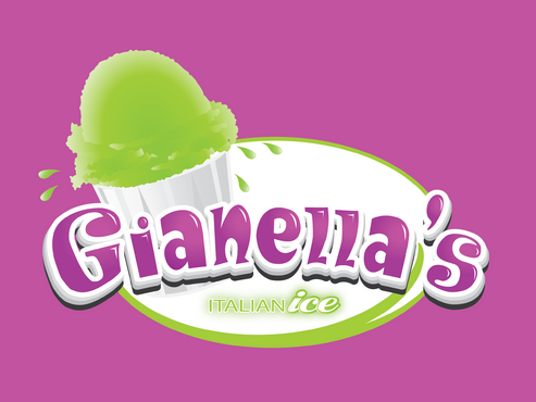
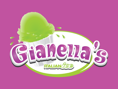
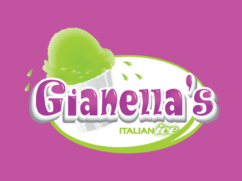
Frozen Dessert Logo
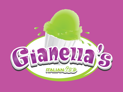
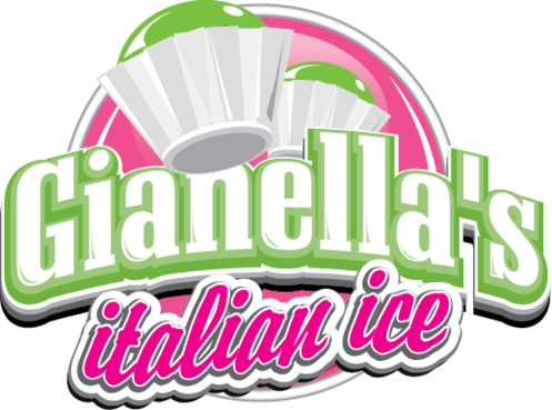
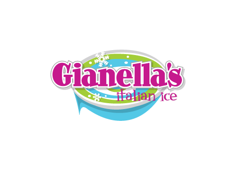
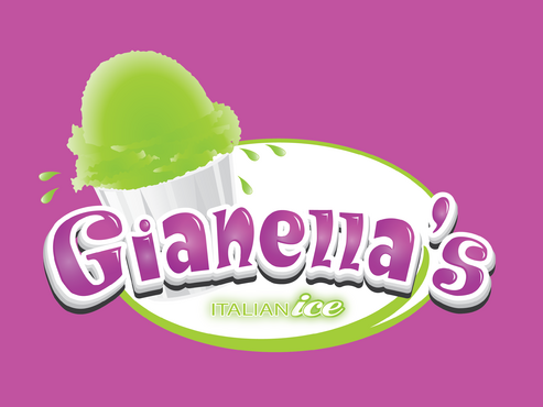
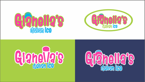
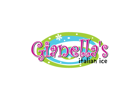
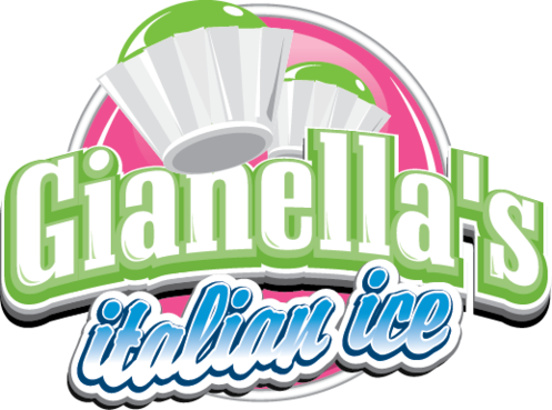
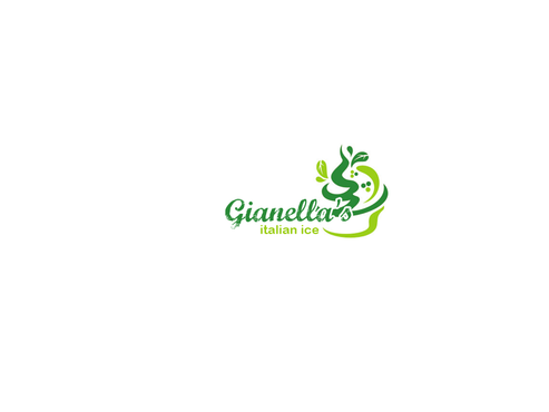
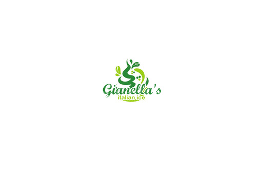
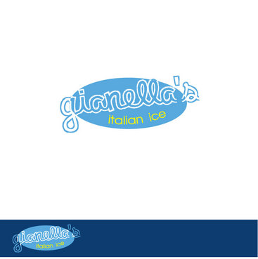
Gianella's
italian ice
Yes
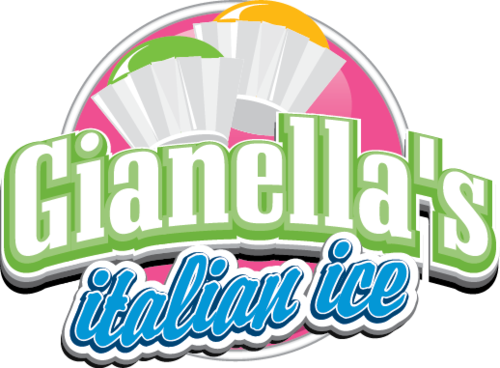
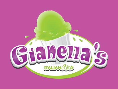
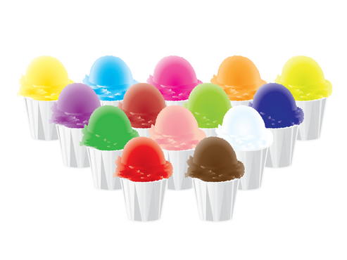
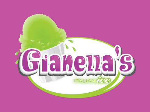
This will be a mobile pushcart business selling Italian ice, which is very popular here in the Northeast US. It is different than ice cream, gelato or frozen yogurt because it's mostly water, no cream. It's also different because it's served in some size of drinking cup, usually, not in a cone or small cup. It has its own unique appearance, which I'm trying to have captured in the design so that it is instantly recognizable to people at the places I will sell. The graphic will be on a pushcart and has to be visible from a distance, being able to see/understand what the product is from far away, before reading the words.
italian ice appeals to kids, teenagers and parents/adults, so the logo has to appeal to a wide age group. Nothing cartoonish, though, please. I'm looking to convey that it's a traditional, loved product but way better than anything around the area. My company will be unique in that I'll use biodegradable cups and spoons, when no one selling Italian ice does. Everything about the company is green and forward-thinking. I want something inviting, interesting, somewhat elegant without being too feminine or expensive looking and still fun and approachable.
Everything about this business is a contradiction in terms. Traditional product, new approach. Typically sold in cities, but I'm selling in suburbs. Business feel is similar to frozen yogurt shops, but more exciting and also mobile. Also, the business is seasonal, usually only sold during the summer months.
Food
Logo Type
![]()
Symbolic
![]()
Unique/Creative
Modern
Local/Neighborhood
Fun
Illustrative
Youthful
Lime Green and White are essential. My cart umbrella is Lime Green, and needs to be picked up in the graphic logo, but not overdone. Royal Blue in moderation may also be used. The logo will be placed against a Fuschia background when wrapped around the cart, so it needs to really pop out visually. But it will also go on white T-shirts, so it would be great if it could work both ways.
3
Because my product is not frozen yogurt, I'd like to stay away from that trendy look. If it's possible to create something that borders on the frozen yogurt look (I do share the progressive approach of being green), while still being totally unique, hipper and slightly more fun, without falling over into cutesy or childish, that's what I'm after. The name Gianella's also has to be readable, since it's unusual. I'm interested in sophisticated but quirky.
Related Contests


