Live Project
Deciding
Project Finalized


Creative Brief
Grapeseed and Peanut Oil label designs
Southern Oil
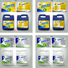
We are a company which manufactures and bottles canola oil under our brand name, “ B-well”. We will soon bottle two more oils, peanut and grapeseed, under this brand and we are looking for front of pack label designs for these two products.
Packaging
These products will eventually be available in retail stores. We are targeting all food lover consumers that like to cook, whether at home for their own enjoyment or as culinary master chefs for friends and family.
The size of the front panel is 60mm(w) x 101mm(h). There are two logos that have to be on the label, our B-well logo, as well as the Heart and Stroke Foundation logo. The minimum acceptable size of the Heart Mark is 1,5cm and it must have a minimum of 20% of its diameter as clear space surrounding it. The designated colour of the Heart Mark is Pantone 186 C or CMYK processed colours of 100% magenta, 100% yellow and 10% black and must always be reproduced in this format. Besides these two logos, the name of the product is the only other mandatory info on the front panel. The material on which will be printed is bi-axially oriented polypropylene (BOPP). It is important that the designers have a good understanding of design which also prints well. The label wraps around the bottle and contains information on each of the four panels, but for now, we would just like to finalize the main design on the front panel. I have attached a photo of our current B-well canola product which is on a white background with a yellow vignette. Very important: we would like the 3 products to have a family feel without being just a copy of one another. Furthermore, we do not want a white background again and would rather have different shades of the chosen colour/s. We would like the B-well logo to be bigger than it currently is and like the positioning to be in the middle (but will consider other positions as well). Fonts should be different for each product, but clearly legible. The colour of the cap has to work well with the label design. Look and feel: we would like a premium look and feel for both products with some depth (3D feel) to the design and not just a flat, one dimensional look. Our canola product focuses very much on the health benefits of canola oil, but peanut and grapeseed oil will be more about adventurous cooking, trying new cuisines and the enjoyment of eating (in a nutshell). Please let me know should you need more information.
Related Contests