Live Project
Deciding
Project Finalized


Creative Brief
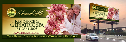
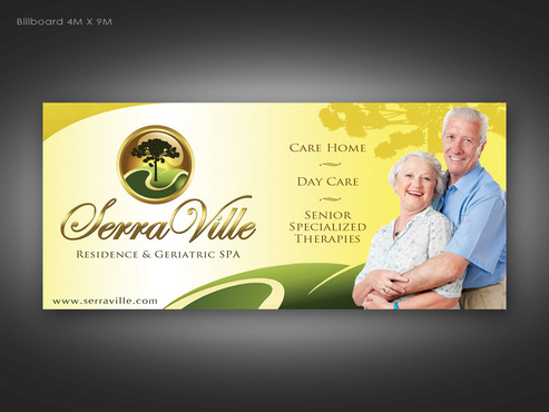
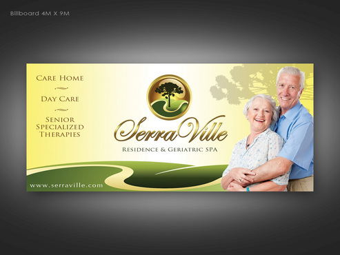
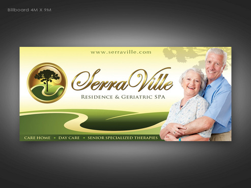
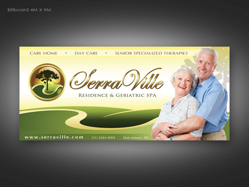
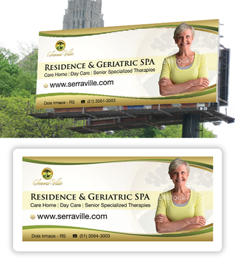
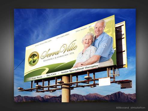
Highway Billboard Advertising for Care Home
Size is 4 x 9 mts (height x width)
Need the following texts on it: "Residence & Geriatric SPA" "Care Home | Day Care | Senior Specialized Therapies" "www.serraville.com" "(51) 3564-3003" "Dois Irmaos - RS" Think about: - Clean and Clever design to capture drivers' attention. - Quality of Life improvement for the elderly and their families. - Size is 4 x 9 mts (height x width) or 13 x 29.5 feet As a suggestion, maybe a good looking senior woman staring at the viewer would help to get more attention.
Health
Elderly and their families.
Must be easy to read as billboards get 3 to 5 seconds of the drivers attention.
Related Contests