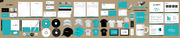
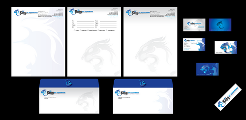
King of Hardware GmbH Business Cards and Stationery
for King of Hardware GmbH
|
Contest Holder
giller
?
Last Logged in : 1395days5hrs ago |
Concepts Submitted
26 |
Guaranteed Prize
200 |
Winner(s) | Business Cards and Stationery |
|
Live Project
Deciding
Project Finalized

Creative Brief
King of Hardware GmbH Business Cards and Stationery
for King of Hardware GmbH
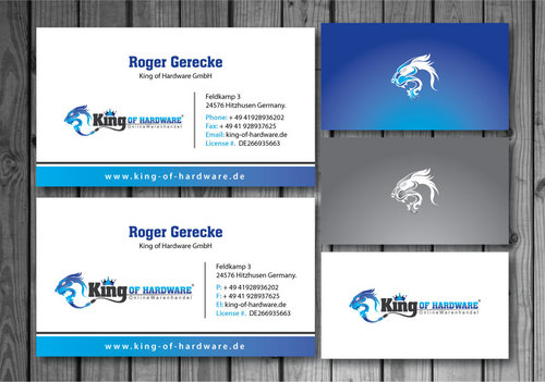
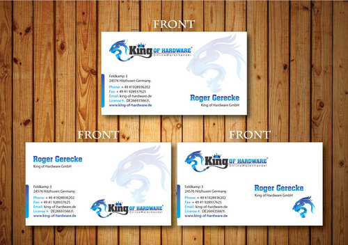
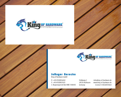
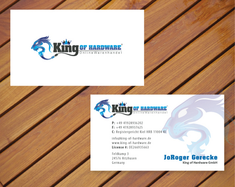
I need single sided standard sized Business Card [3.5" x 2"]
Use same font as used in my logo
Corporate
Professional
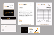
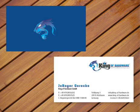
Roger Gerecke
King of Hardware GmbH
Feldkamp 3 24576 Hitzhusen Germany
+49 41928936202
Registergericht Kiel HRB 11004 KI
+49 41928937625
info@king-of-hardware.de
www.king-of-hardware.de
DE266935663
'''## atantion this info for stationari only###''' Bankverbindung King of Hardware GmbH Sparkasse Westholstein Kto.-Nr. 84688681 (BLZ 22250020) IBAN DE09 2225 0020 0084 6886 81
King of Hardware GmbH Roger Gerecke Feldkamp 3 24576 Hitzhusen Germany Tel +49 41928936202 Fax +49 41928937625 info@king-of-hardware.de www.kingofhardware.de www.dildopunk.de
Consumer Electronics
Related Contests