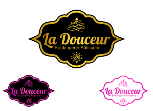
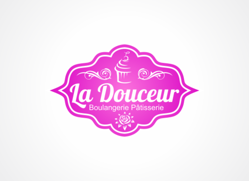
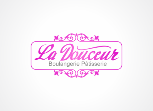
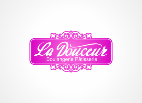
La Douceur boulangerie's logo
La Douceur
|
Contest Holder
vanmay
?
Last Logged in : 5127days12hrs ago |
Concepts Submitted
310 |
Guaranteed Prize
350 |
Winner(s) | A Logo, Monogram, or Icon |
|


Creative Brief
La Douceur boulangerie's logo
La Douceur
Boulangerie Pâtisserie
Yes
- This is a premium bakery and chocolate house
- Products: pastries, cakes, chocolate, occasional cakes.
- The meaning of the brand name:
http://www.larousse.fr/dictionnaires/francais-anglais/douceur. However it has another meaning (slang word) as "cake".
- Style: premium, simple but elegant, French style. \
- Target customers: individuals, high income, have good taste and high demand in food, ages of 25 - 45, mostly women.
- Besides, the bakery also provides pastries and cakes for 5* hotels/resorts.
- Also provides cakes as customized designs for special events.
Food
Logo Type
![]()
Symbolic
![]()
Abstract Mark
![]()
Unique/Creative
Clean/Simple
Traditional
Feminine
Colors that are eye-catching but shows the elegance
not sure
Below are some examples that I like. However the concepts and ideas are not suggestions or a must-follow for the logo I expect.
1. http://www.logobee.com/logo-design-samples/samples/192.png
Classic, industry oriented but no impression.
2. http://www.logobee.com/logo-design-samples/samples/4.png
Classic and simple
3. http://www.logobee.com/logo-design-samples/samples/299.png
Art but colors are not good.
4. http://www.logobee.com/logo-design-samples/samples/174.png
Really like it as it creates the spirit of big brand, the logo and colors are appropriate with the brand.
5. http://www.logobee.com/logo-design-samples/samples/40.png
Simple and impressive, very industry oriented. Really like it.
6. http://www.logobee.com/logo-design-samples/samples/142.png
Shows the speed, industry. shows the compatibility between words and sketch. Really like it.
7. Avoid the heavy, cloudy and too eye-catching colors. Avoid the designs that are too much such as http://www.phrizbie-design.com/logo_design0.html
Related Contests


