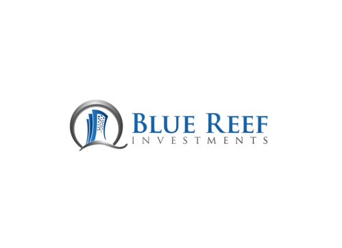
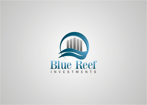
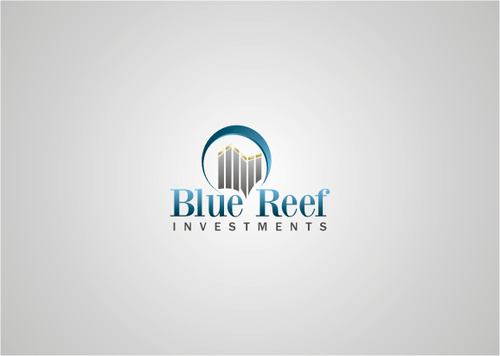
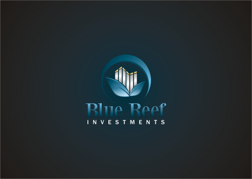
Logo and branding campaign for Blue Reef Investments Inc
Blue Reef Investments
|
Contest Holder
bluereef
?
Last Logged in : 4941days23hrs ago |
Concepts Submitted
111 |
Guaranteed Prize
250 |
Winner(s) | A Logo, Monogram, or Icon |
|
Live Project
Deciding
Project Finalized


Creative Brief
Logo and branding campaign for Blue Reef Investments Inc
Blue Reef Investments
No
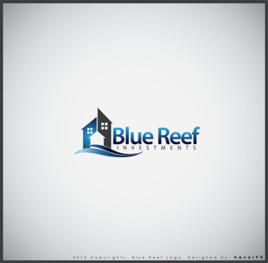
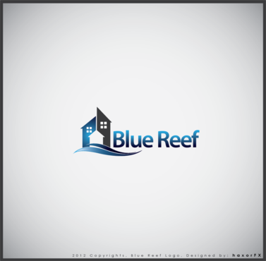
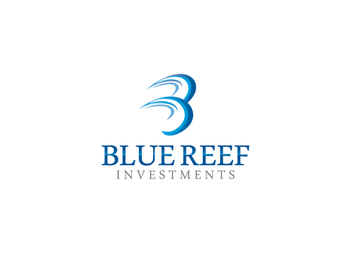
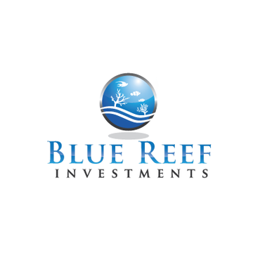
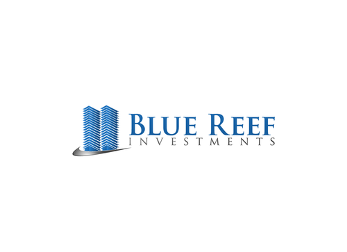
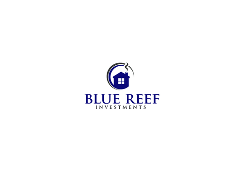
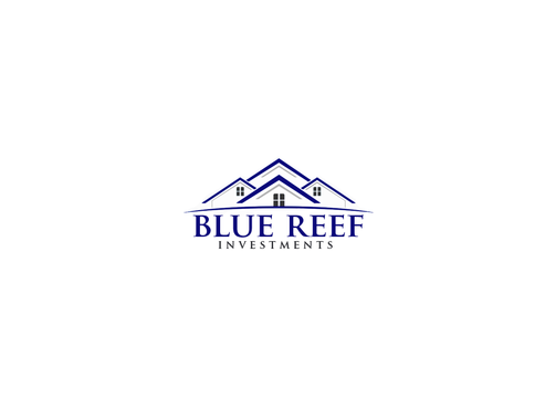
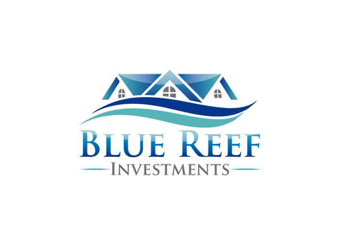
Blue Reef is a real estate investment company that rehabs older properties to give home buyers a completely finished property to move into with no work needed. We also offer real estate solutions to current or future property owners and focus on serving them. We are also going to have a rental property division/company that will provide safe, comfortable and affordable housing. The company is based out of Edmonton, Alberta. I want to design a website to match the branding created by the logo.
A reef is the home for a community providing all of its needs and that's what the company is about, serving the community by providing great homes.
Real Estate
Logo Type
![]()
Abstract Mark
![]()
Illustrative
![]()
Unique/Creative
Clean/Simple
Modern
Industry Oriented
Outdoors/Natural
Serious
Abstract
Definitely blue, perhaps lighter and darker shades. I like the idea of white letters but I'm open to creative color schemes; but nothing too complex. Perhaps something that would work good on a blue background for business cards and letterhead (a future project).
not sure
In the logo, the word 'Investments' can be made to be secondary and smaller, but this is not necessary. I'm looking for something creative but not overly complex. A recent mycroburst project I like is this Earth Wide Homes logo http://www.mycroburst.com/contests/business-logo-and-branding-campaign/users/bazinga
Related Contests


