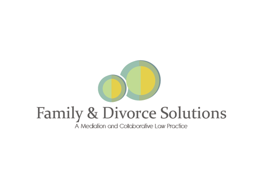
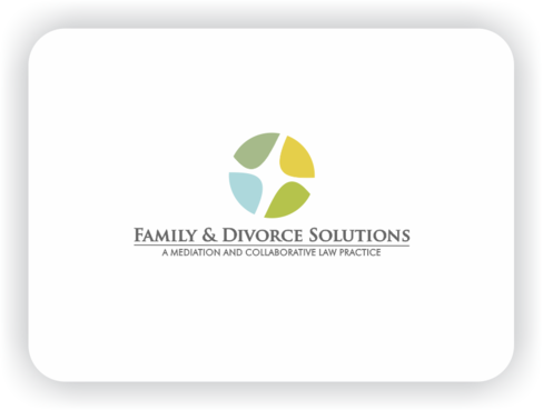
Logo Design for Divorce Mediation and Law Practice
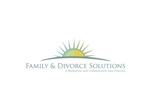
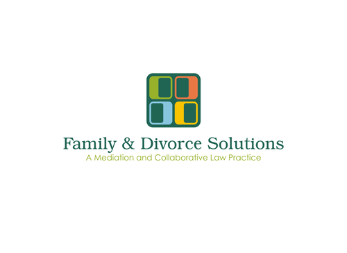
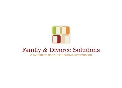
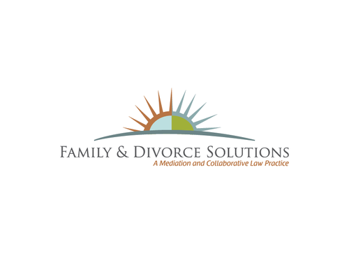
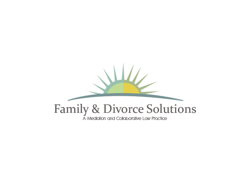
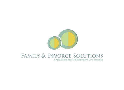
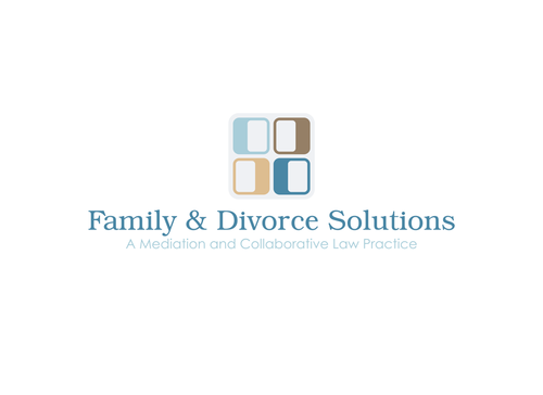
Family & Divorce Solutions
|
Contest Holder
rlippman01
?
Last Logged in : 5322days11hrs ago |
Concepts Submitted
831 |
Guaranteed Prize
400 |
Winner(s) | A Logo, Monogram, or Icon |
|
Live Project
Deciding
Project Finalized


Creative Brief
Logo Design for Divorce Mediation and Law Practice
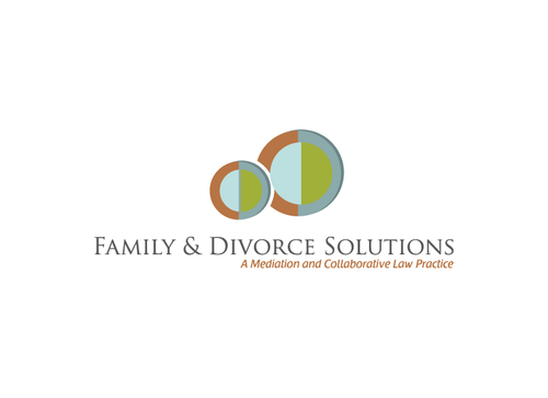
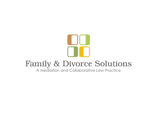
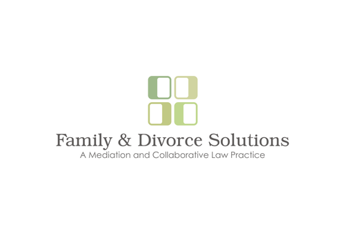
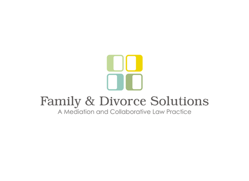
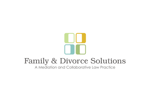
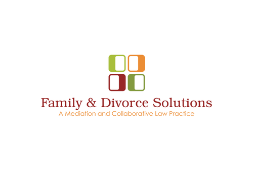
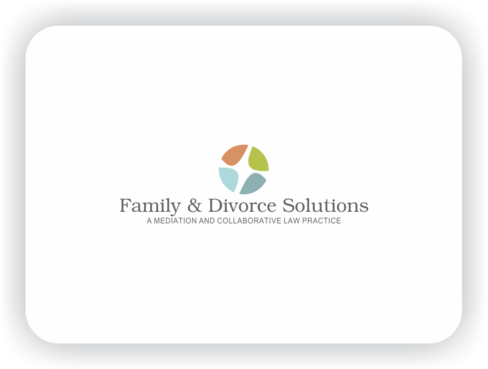
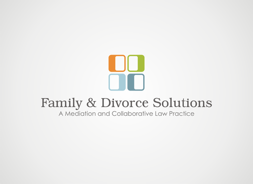
Family & Divorce Solutions
A Mediation and Collaborative Law Practice
Yes
Family & Divorce Solutions is a small divorce mediation and law practice serving individuals and couples in Maryland and the District of Columbia. Small means small: I am a one-person shop operating from a home office (with several four-legged office mates). I am a graduate of Stanford Law School and have been practicing law for over 20 years. I am deeply committed to minimizing the conflict, drama and expense of divorce by making the process as civilized, as cooperative, as reasonable and as fair as possible. My goal is to help clients make informed, thoughtful, practical decisions on the legal issues so that they can move forward into a better, happier future. I offer several distinct services: mediation for couples; and legal representation for individuals. Please visit my existing, homemade (and soon-to-be-redesigned) website for a better overview of my practice: www.familyanddivorcesolutions.com.
Ideally, this design can serve as the backbone of my new website. The mediation website www.themediationline.com is an excellent example of this.
Law
Abstract Mark
![]()
Unique/Creative
Clean/Simple
Sophisticated
Modern
Serious
Abstract
Geometric
I definitely want some color in the font and/or image, but the color(s) must be sophisticated and calming. No really bright colors, or easter-egg pastels. I'm thinking more like blues, greys, taupes, tans, creamy yellow or perhaps muted orange and/or greens (such as in the George Nelson ball clock). Please take a look at my Photostream on Flickr at http://www.flickr.com/photos/59573465@N04/ to get a better idea of the colors and shapes I like.
not sure
I'm open to the idea of including my tagline in this design, but am also willing to consider designs without it.
Related Contests