Logo for a high-end, luxury, Technology company
Enhanced Home
|
Contest Holder
apatelEH
?
Last Logged in : 3874days19hrs ago |
Concepts Submitted
162 |
Guaranteed Prize
300 |
Winner(s) | A Logo, Monogram, or Icon |
|
Live Project
Deciding
Project Finalized

Creative Brief
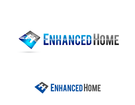
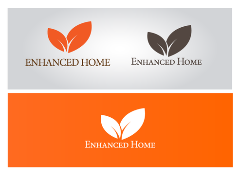
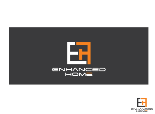
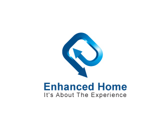
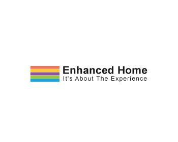
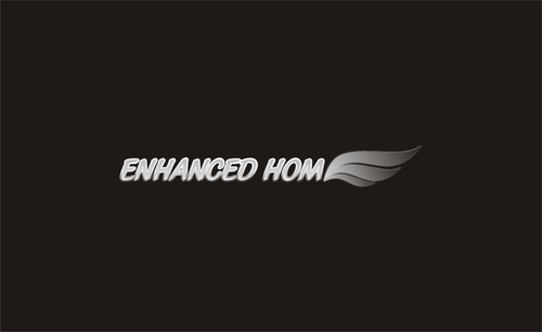
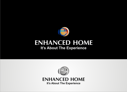
Logo for a high-end, luxury, Technology company
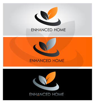
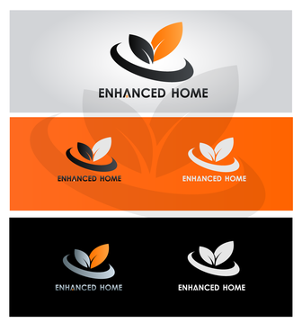
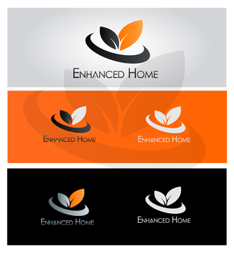
Enhanced Home
It's About The Experience
No
We are a very high-end, high-technology home automation company that delivers Audio/Video/Lighting/Control solutions for our customers. Our typical whole home projects range from $250k to $750k. We want a very modern, clean logo that is easily reproducible. Also we want to present a very sophisticated, young image for those that love technology and luxury.
Electronics
Symbolic
![]()
Abstract Mark
![]()
Illustrative
![]()
Cutting-Edge
Clean/Simple
Sophisticated
Modern
High Tech
White, Silver, Black and something with a little punch like blue or orange. We like white/silver lettering on a black background but we are open to other options. The use of blue or orange as an access color would add a little something to the look But again we are open to ideas.
2
see our current website for where we stand today. www.enhanced-home.com
We really like clean, modern and high-tech but something that really speaks luxury. We would like a simple "bug" but do not want to use a typical house or a speaker, etc. Something more abstract and not so literal.
Related Contests