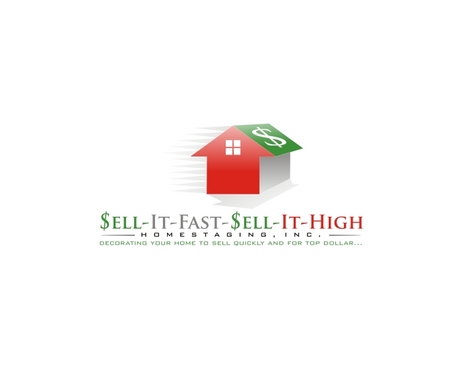
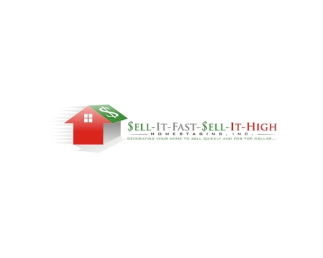
Logo for a homestaging business (preparing clients' homes to be real estate market-ready.)
Sell-It-Fast-Sell-It-High Homestaging, Inc.
|
Contest Holder
jsmccn
?
Last Logged in : 4027days13hrs ago |
Concepts Submitted
49 |
Prize Money
200
|
Winner(s) | A Logo, Monogram, or Icon |
|
Live Project
Deciding
Project Finalized


Creative Brief
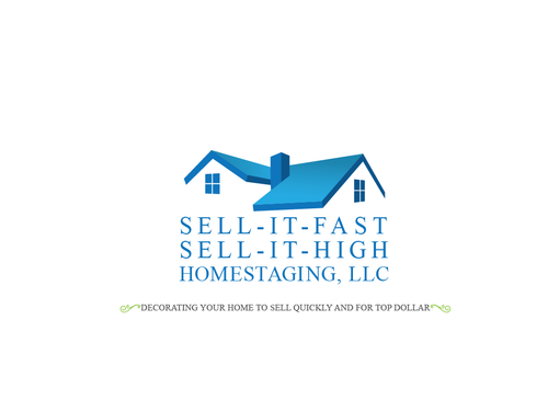
Logo for a homestaging business (preparing clients' homes to be real estate market-ready.)
Sell-It-Fast-Sell-It-High Homestaging, Inc.
Decorating your home to sell quickly and for top dollar...
Yes
Transforming a client's home from ordinary to extraordinary to avoid reducing asking price. Other thoughts: Moving home quickly off market with goal of reduced stress and increased profit.
Real Estate
Symbolic
![]()
Masculine
Feminine
Traditional
Sophisticated
Simple
Professional
Green, blue, gray(this one optional.) I would like the colors to convey calmness. Nothing too pale that it doesn't make a statement, yet not too bold to cause palette anxiety!
not sure
I think it is best to give everyone a blank canvas. What I can suggest is a unisex design that appeals to the masses, an appealing design that encourages the viewer to linger, and tells what I do for clients. Creative, but not cutesy. Best of luck to all! Thank you in advance for all of your efforts.
Related Contests


