Logo for a new ice fishing product
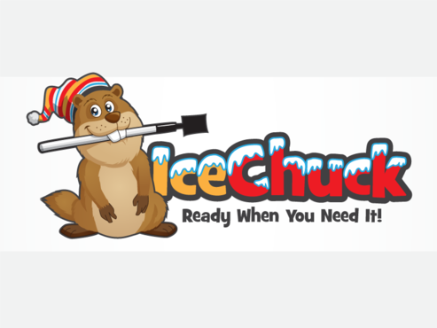
Ice Chuck
|
Contest Holder
chuckyx1
?
Last Logged in : 4766days17hrs ago |
Concepts Submitted
20 |
Prize Money
250
|
Winner(s) | A Logo, Monogram, or Icon |
|
Live Project
Deciding
Project Finalized


Creative Brief
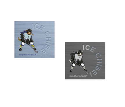
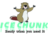
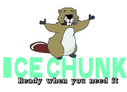
Logo for a new ice fishing product
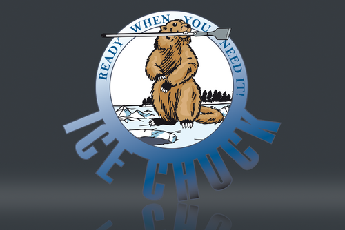
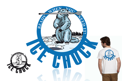
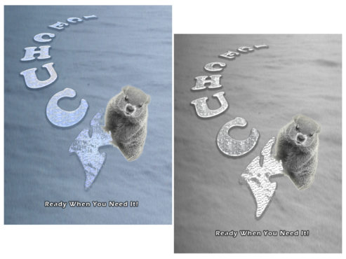
Ice Chuck
Ready When You Need It!
No
It will represent an innovative ice fishing product that is lighter, smaller and more mobile than existing similar items. The message should imply that it is always there at the users disposal should the need arise.
Outdoors
Character
![]()
Traditional
Youthful
Simple
not sure
This is pretty specific unless a creative mind can come up with something better.
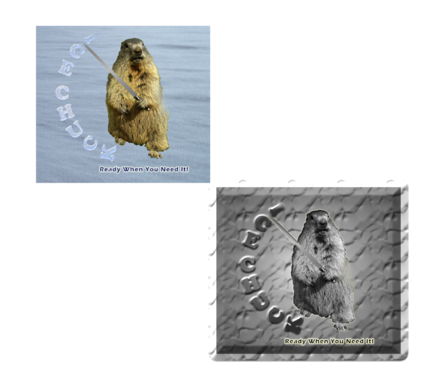
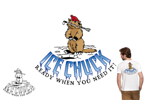
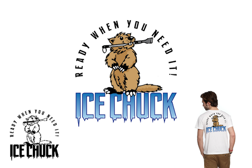
I want an image of a woodchuck holding an ice chisel in his mouth like he is fetching for his master. It should have the whole body with a face that could be used separately. He should be happy. He can have a stocking cap (preferably) or not. He should look like a woodchuck and not a beaver. I want the words "Ice Chuck" in semi-circular letters underneath him and they could look like they are carved out of ice if possible. I want the words "Ready When You Need It." under that in smaller text (not carved). He could be stylized or cartoonish. I want something that could easily be screened and would still look good in black and white or color.
Related Contests