SALES / SUPPORT : +1-877-525-5646   |  


Logo for a School District in Oklahoma

Silo Rebels

Contest Holder ShayHayes ?

Last Logged in : 3549days18hrs ago

Concepts Submitted

93

Guaranteed Prize
200
Winner(s)

1

A Logo, Monogram, or Icon veildAll design entries can be viewed by other designers. Featured Featured Contest
tick_gray

Live Project

tick_gray

Deciding

tick_blue

Project Finalized


Project: Logo for a School District in Okl ...
Industry: Education Logo
Contest Launched: May 20, 2011
Selected: 1 winning design from 93 concepts
Winning Design by: honeybadger
Close Date: Jun 05, 2011


Logo for a School District in Oklahoma - Education


Awarded as a winner
Project Report    

Sort by:


Creative Brief


Logo for a School District in Oklahoma

Silo Rebels

Yes

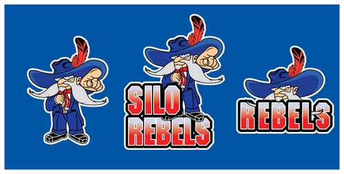
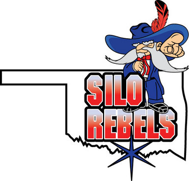
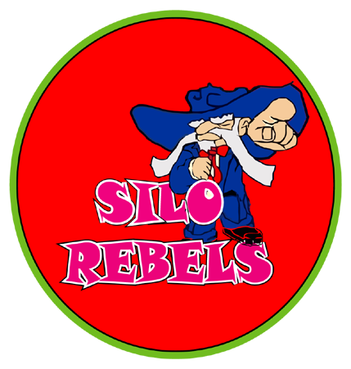
This logo is going to represent an entire school district Oklahoma. Their mascot is a rebel. I have attached several images of what their rebel looks like and they are not wanting to deviate from this image at all. It just needs to be cleaned up a bit. The problem with their logo is that it is EXTREMELY close to the UNLV Rebel. Silo's new rebel needs to be changed only enough to keep them from being sued from UNLV. THIS NEW LOGO WILL BE TRADEMARKED.

Education

Symbolic
Symbolic

Abstract Mark
Abstract Mark

Initials
Initials

Illustrative
Illustrative

Character
Character


Cutting-Edge
Unique/Creative
Clean/Simple
Sophisticated
Local/Neighborhood
Fun
Illustrative
Playful/Cartoonish

Blue and White. View the images attached to see the exact color of blue they are wanting to use.

not sure

I have attached several images or the Rebel they are using for their mascot along with the images of what UNLV is using for you to review. Again, only make enough change to the rebel to make it noticeably different from the college's rebel. We are needing the head of the rebel along with the full bodied rebel.

Related Contests


Logo for a school from Kindergarten to high school
$200
Prize Money
49
Concepts
St. Thomas Catholic School Logo Design
$300
Prize Money
135
Concepts
Logo for Foundation
$350
Prize Money
48
Concepts
STEAMd - Logo for non-profit
$200
Prize Money
86
Concepts

Discussion


Comments

  • May 31, 2011 12:19 PM
    ShayHayes ShayHayes
      Project Holder
    Just got the word to add one additional thing. They want a feather in his hat. It would be feather like an eagle or a turkey would have, a nice wide feather. The feather should be a red base with black outline, and black details and shading. They are not real sure about the placement of it but lets try behind the hat or something like this. thank you.

    Like Icon 0   DislikeIcon 0
  • May 31, 2011 12:12 PM
    ShayHayes ShayHayes
      Project Holder
    I just received some good feedback from the school. So this is good. They have eliminated the logos they thought were totally off the mark. We are facing a dilemma at this point. There is not one single logo they like for what they want. They see features of each persons log and want to join them together. The logos with 4 stars contain at least one feature they really like and want in a final product. Below I have outlined comments about each logo and what they like specifically and what they don’t like. What they want: They want to have a full body Rebel by itself with no text. A fully body Rebel Standing on the text like you see in #64. They want this incorporated with the Oklahoma State Outline with the star showing the location like you see in #63. The Head of the Rebel over the word REBELS like you see in #33 (but without the word SILO). The text should be a Fade from grey/white to red like you see in #64. The text should have a black on white outline like you see in #33. The Rebel should not have a black bold outline! They love the added details of the Mustache in #64 but would like to see it a little fatter like #56. They love the added details in the hands, face, tie, shirt and belt buckle of #56. They like the color shading under the hat of #64 but don’t like the top of the hat of #64. They like the top of #56 but again add a bit of shading. They like the longer nicer tie and open shirt of #56. They like the smoother lines of #56 & #64. I know this is a lot but this is the feedback I received from the school. Please let me know if you have any comments.

    Like Icon 0   DislikeIcon 0
  • May 31, 2011 8:53 AM
    kazi1010feni kazi1010feni
     
    I have not get any comments from you plz comment me about my logo as i can go right way

    Like Icon 0   DislikeIcon 0
  • May 25, 2011 8:48 PM
    ShayHayes ShayHayes
      Project Holder
    Sorry for the delay in response. We have received some bad weather here that has prevented us from focusing on this. I will have some comments tomorrow. thank you

    Like Icon 0   DislikeIcon 0
  • May 24, 2011 10:46 AM
    ShayHayes ShayHayes
      Project Holder
    #33 & #32 I really like your style and want to keep what you have but also need full body #20 #30 #31 #13 I really like you style and how he is standing ontop of the letters. The body and head needs some extra work to cleanup the lines and art. Make him look like he really belongs ontop of the words and not just laied in there.

    Like Icon 0   DislikeIcon 0
  • May 23, 2011 7:41 PM
    ShayHayes ShayHayes
      Project Holder
    To all, I think we are starting to get somewhere. It is time for each of you to stand out with your own talent. What At this point I am looking for good designs for BIG BOLD BLOCK letters. Lets stay with more solid colors. I would also like to see you clean up the REBEL a bit. What can you do to make him a bit more smooth. Cleaner lines. I would like to see the top of his hat worked on a bit. I also have a hard time with the transition between the uppper and lower parts of his body. Remember I have also asked you to take the Head off the body for a stand alone logo with the HEAD. I am counting on you guys to come up with some really great stuff. The next project is to take this logo and add sports varriations. SHOW US WHAT YOU HAVE! Thank you

    Like Icon 0   DislikeIcon 0
  • May 23, 2011 11:11 AM
    ShayHayes ShayHayes
      Project Holder
    #8, #9, #10 are too rigid. The image needs to be clean and smooth...

    Like Icon 0   DislikeIcon 0
  • May 23, 2011 11:09 AM
    ShayHayes ShayHayes
      Project Holder
    #3 is too different from their current rebel. They just need their logo cleaned up not completely redone.

    Like Icon 0   DislikeIcon 0
  • May 23, 2011 11:07 AM
    ShayHayes ShayHayes
      Project Holder
    Eliminated #13 and #14 because the rebel needs to keep his cowboy hat.

    Like Icon 0   DislikeIcon 0
  • May 23, 2011 11:05 AM
    ShayHayes ShayHayes
      Project Holder
    I am eliminating #18 because it's UNLV's rebel...

    Like Icon 0   DislikeIcon 0
  • May 21, 2011 9:28 PM
    ShayHayes ShayHayes
      Project Holder
    #7 #6 , you are on the right track. Now I would like to see some options on the text. Ur us currently plane and not appealing. Show me some options.

    Like Icon 0   DislikeIcon 0
  • May 21, 2011 11:38 AM
    AriuS AriuS
     
    What colors would you like? : Blue and White. View the images attached to see the exact color of blue they are wanting to use.

    Like Icon 0   DislikeIcon 0
  • May 21, 2011 10:14 AM
    jayzapiper jayzapiper
      Project Holder
    DESIGNERS: Some clarification: Silo Rebel colors are red, white, and blue (see attached example 'Silo_6067'). The current logo is already significantly different from the UNLV Runnin' Rebel and the Ole Miss Rebel, so differentiation from an already trademarked collegiate logo will not be a problem. Therefore it does not need to be reinvented, just beefed up from the current version. Silo has the most successful high school baseball program in the state over the last ten years, winning 8 state championships in that time. They do have a baseball Rebel, but would entertain new ideas as the current version is slightly similar to the Ole Miss Rebel. But the main focus here is to enhance the provided example.

    Like Icon 0   DislikeIcon 0
  • May 21, 2011 6:21 AM
    ShayHayes ShayHayes
      Project Holder
    I am eliminating #1 #2 From this contest. Please read the brief and look at the images attached. #1 copied UNLV, just like I asked you not to do. #2 I don't need a new style, I need what I uploaded cleaned up.

    Like Icon 0   DislikeIcon 0