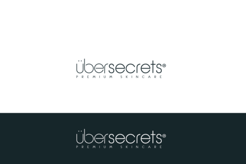
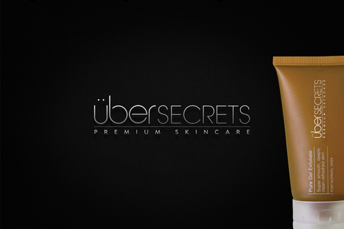
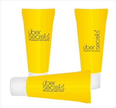
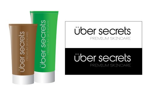
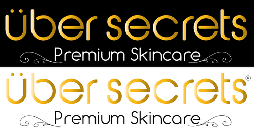
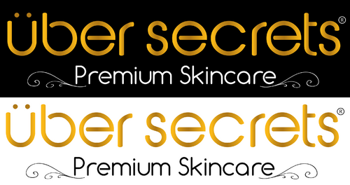
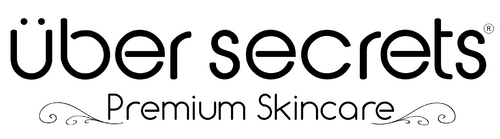
Logo for a Skincare Brand
Uber Secrets
|
Contest Holder
UberSecrets
?
Last Logged in : 4909days10hrs ago |
Concepts Submitted
160 |
Guaranteed Prize
150 |
Winner(s) | Other |
|
Live Project
Deciding
Project Finalized

Creative Brief
Logo for a Skincare Brand
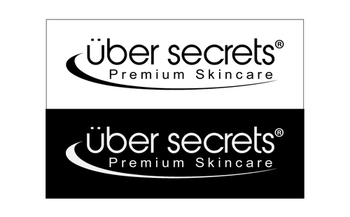
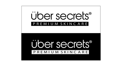
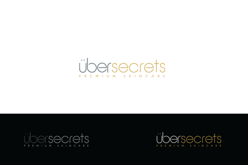
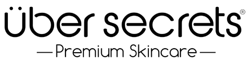
Uber Secrets
We already have a logo simply known as uber (with the 2 dots above the u). We now want to expand this to become Uber Secrets (still using the 2 dots above the U) and add in the tagline Premium Skincare
Personal Care
The target audience is mainly females between 25-65 years old use use skincare products.
We are looking to bring out some new lines and would like to get the logo updated first. you can see our current logo at http://www.romanindesign.com/UBER.html and me discussing the current products at http://www.youtube.com/watch?v=tkxEzAmil1w
Related Contests