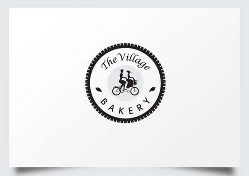
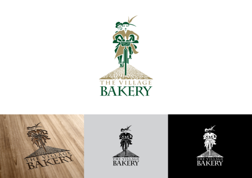
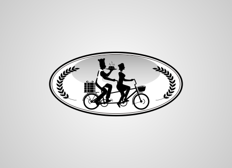
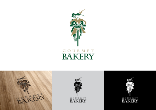
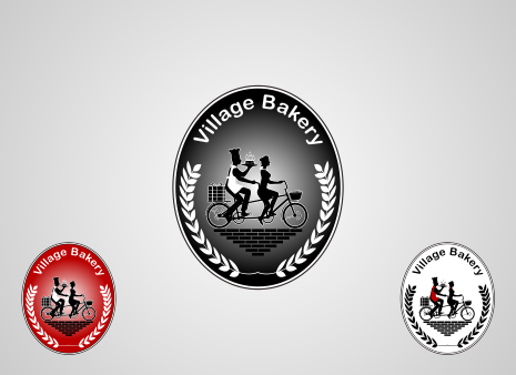
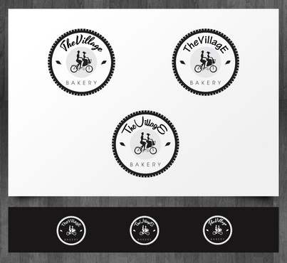
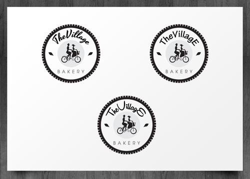
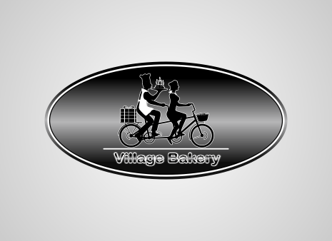
Logo for a village bakery
No text
|
Contest Holder
VillageBakeShop
?
Last Logged in : 4348days23hrs ago |
Concepts Submitted
47 |
Guaranteed Prize
199 |
Winner(s) | A Logo, Monogram, or Icon |
|


Creative Brief
Logo for a village bakery
No text
No tag line
Yes
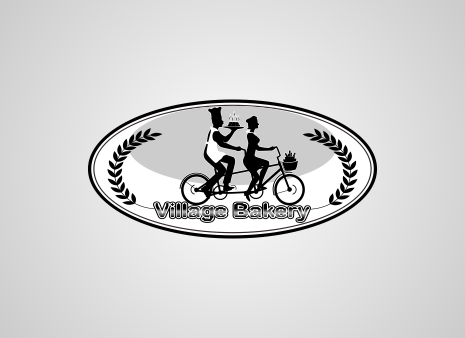
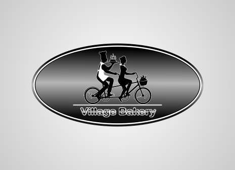
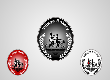
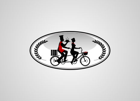
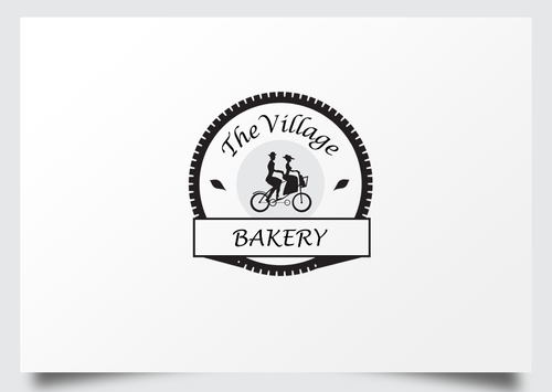
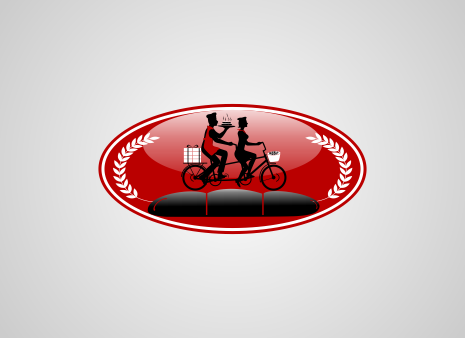
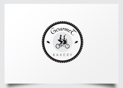
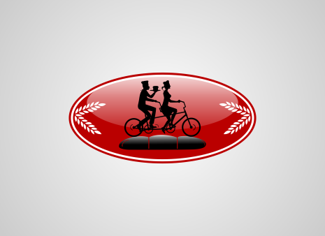
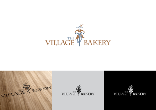
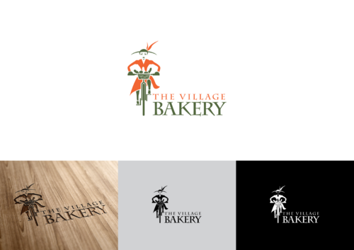
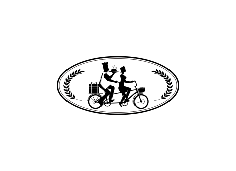
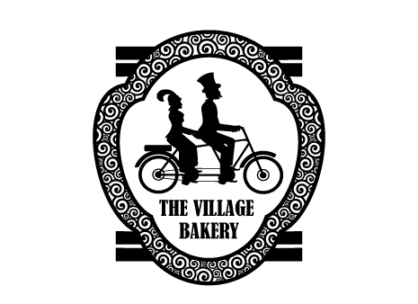
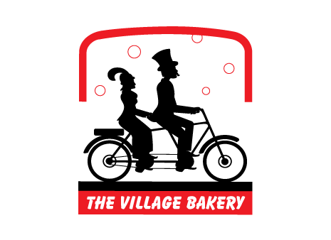
Gourmet Bakery - a comfortable neighborhood bakery/coffee shop that is an integral part of the day-to-day life in a fun, active and close-knit luxury village. The bakery has not been built yet, so this logo will be used in the business plan and concept proposals.
Food
Symbolic
![]()
Black and white with or without red accent
3
The neighborhood/village is connected with bike paths and the bakery owners ride a tandem bike. We'd like the logo to create an identity for the bakery but also make a connection with the owners - making the business more personal and part of the community.
We will provide an inspiration photo of a sculpture that conveys a sense of what we are looking for.
Related Contests


