Logo for an Orthodontic supply company
Aero Orthodontics
|
Contest Holder
tsmack32
?
Last Logged in : 4749days4hrs ago |
Concepts Submitted
65 |
Guaranteed Prize
200 |
Winner(s) | A Logo, Monogram, or Icon |
|
Live Project
Deciding
Project Finalized


Creative Brief
Logo for an Orthodontic supply company
Aero Orthodontics
Yes
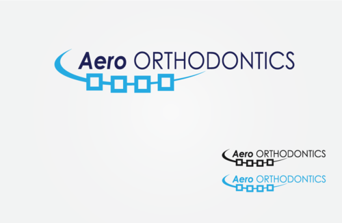
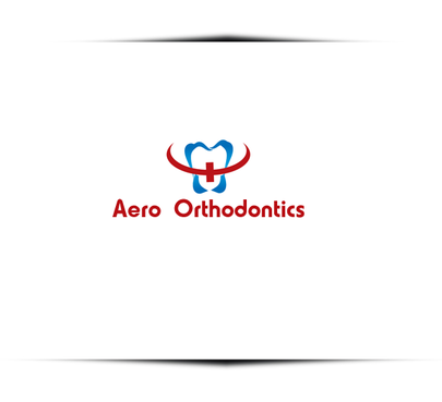
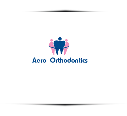
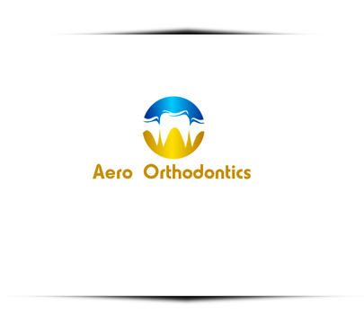
Aero Orthodontics will provide products, supplies and solutions to orthodontists, who straighten teeth. Their goal is to give their patients a perfect smile. I would like to convey an image of smoothness (aerodynamic), forward thinking (innovation and technology) and straightforwardness (straight teeth). Common products sold are brackets, wires, elastic products, etc, but the company will do more than sell products; it will offer solutions to a variety of other needs orthodontic practices have, such as marketing, trends, and advice (consulting) on what will make the orthodontic experience more pleasant for patients, doctors and staff.
Medical
Abstract Mark
![]()
Retro
Traditional
Professional
High Tech
Rustic
navy blue and a lighter blue, but not so light that it washes out on a white background
2
The logo I tried to design was wavy and used specific geographic shapes, mainly curves, or circles. The problem was people were finding it difficult to read Aero. The word orthodontics can be totally separate from the Aero part of the logo, and can be very basic. I actually like the word orthodontics is all caps in the Century Gothic font, but I am certainly open to any suggestions and alternatives, which is why I am asking for expert help!
Related Contests