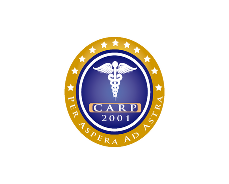
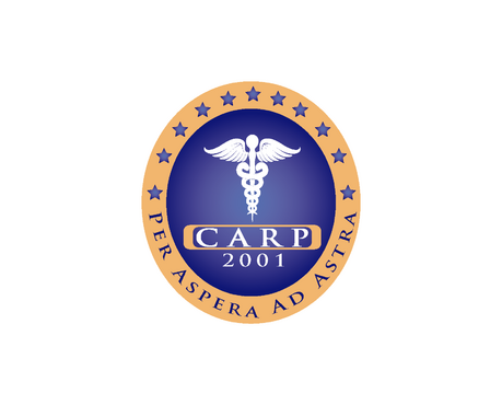
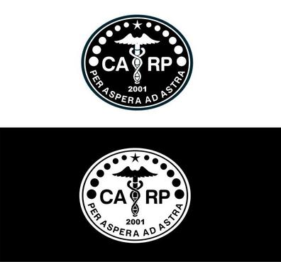
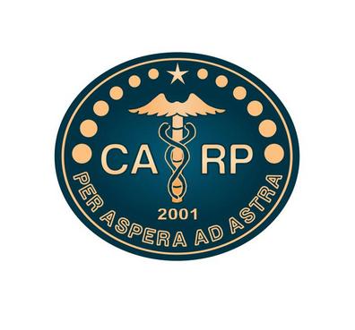
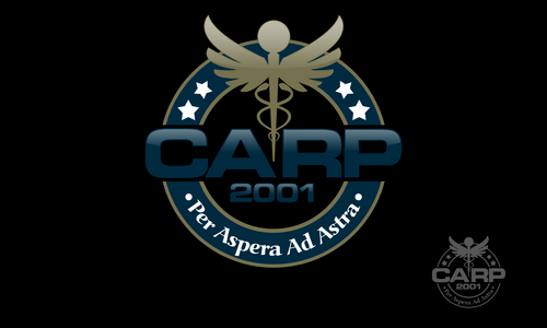
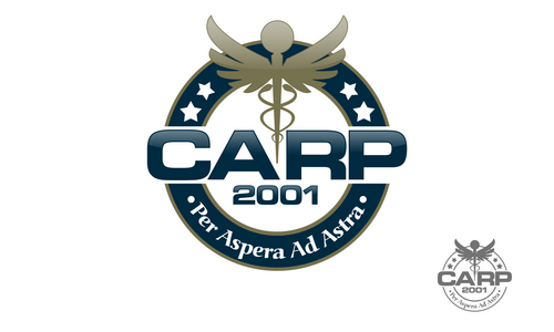
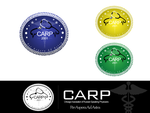
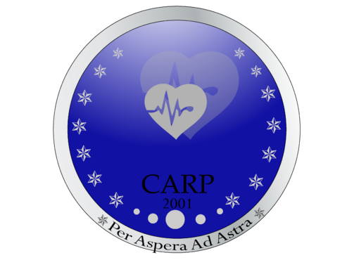
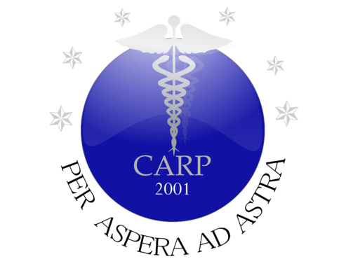
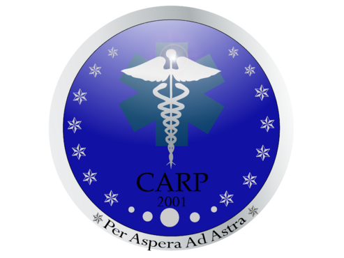
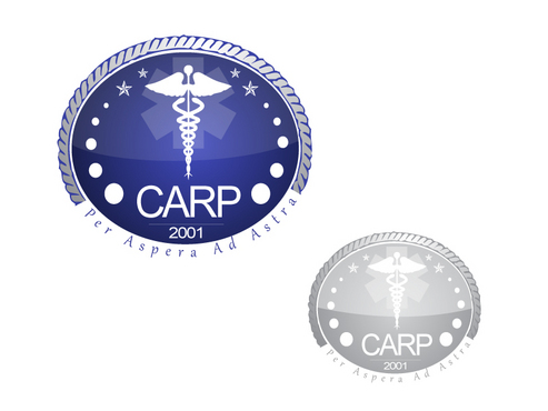
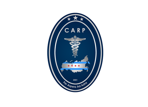
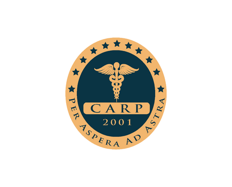
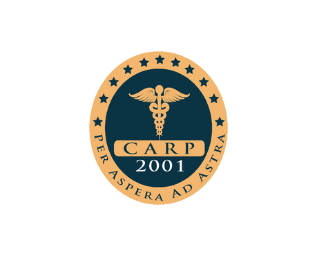
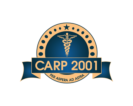
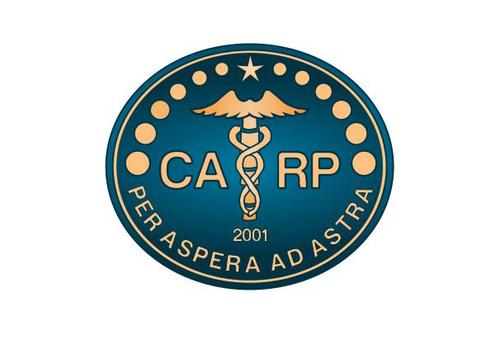
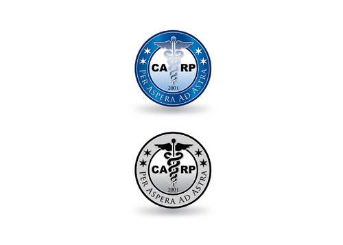
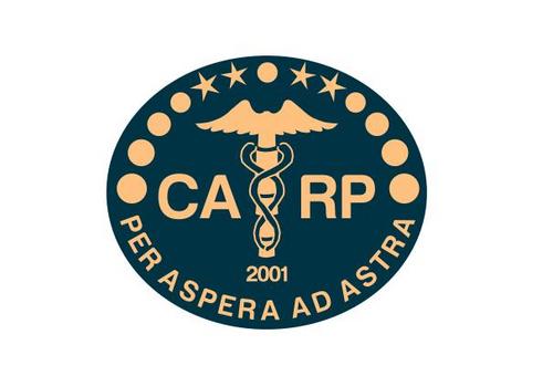
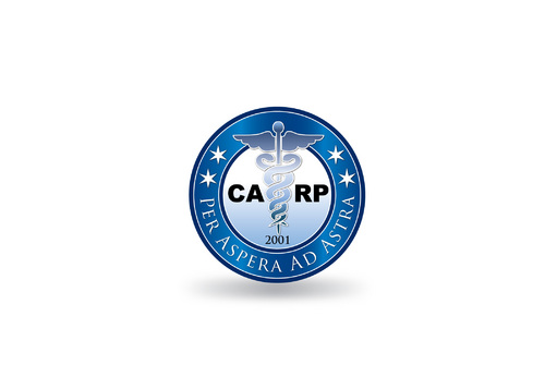
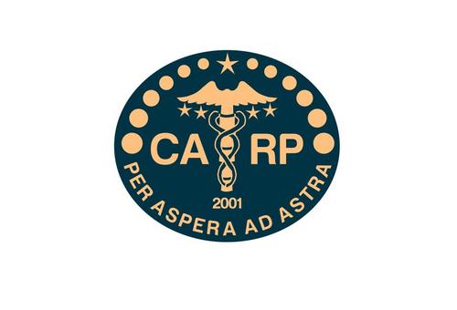
Logo for Chicago Assosiation of Russian Speaking Physicians
CARP 2001
|
Contest Holder
astraglam
?
Last Logged in : 4964days16hrs ago |
Concepts Submitted
45 |
Guaranteed Prize
200 |
Winner(s) | A Logo, Monogram, or Icon |
|
Live Project
Deciding
Project Finalized

Creative Brief
Logo for Chicago Assosiation of Russian Speaking Physicians
CARP 2001
Per Aspera Ad Astra
Yes
This is a non for profit educational medical society, full name is Chicago Assocation of Russian Speaking Physicians, CARP for short. It was founded in 2001.
Design should be a seal like oval or circle with CARP 2001 in the center and a medical type sympbol. The tagline line should be running in a semi circle around the edge of the seal
Health
Illustrative
![]()
Sophisticated
Corporate
Industry Oriented
Traditional
Serious
any but red or orange. Navy is preferred
2
Related Contests


