Logo for creative consulting company
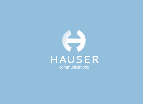
Hauser
|
Contest Holder
Hauser
?
Last Logged in : 4126days19hrs ago |
Concepts Submitted
241 |
Guaranteed Prize
450 |
Winner(s) | A Logo, Monogram, or Icon |
|
Live Project
Deciding
Project Finalized


Creative Brief
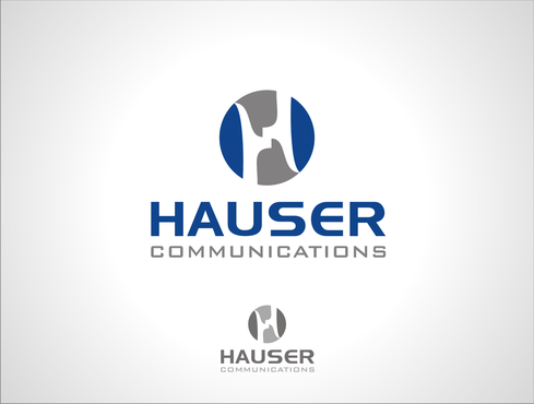
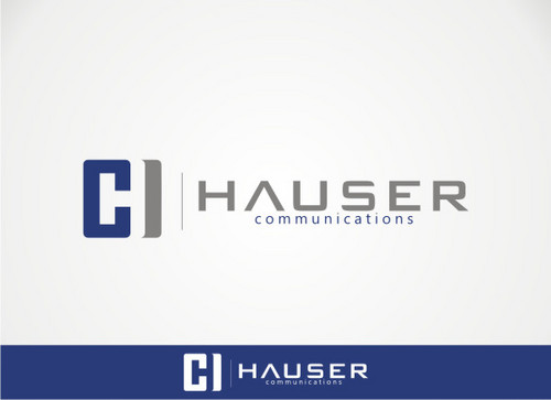
Logo for creative consulting company
Hauser
Communications
Yes
Hauser Communications is a consultancy that specializes in all aspects of high end event organization and sponsorship activation.
We are located in Switzerland.
Communications and Media
Logo Type
![]()
Abstract Mark
![]()
Initials
![]()
Unique/Creative
Clean/Simple
I am open to suggestions.
2
The logo is used on different marketing material in different sizes. Also will the logo be used on the back of working clothes, like black vests.
Therefore please no 3d or pixel graphics.
Related Contests