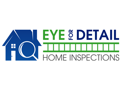
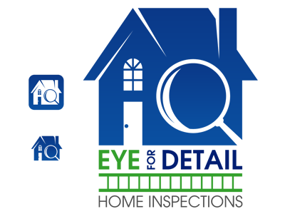
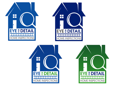
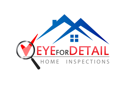
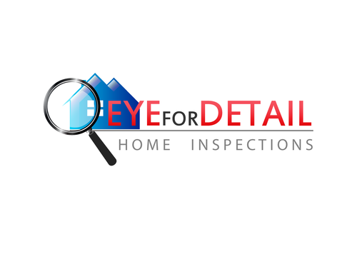
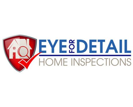
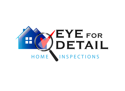
Logo for Eye for Detail Home Inspections
Eye for Detail Home Inspections
|
Contest Holder
saainco
?
Last Logged in : 5431days16hrs ago |
Concepts Submitted
50 |
Prize Money
149
|
Winner(s) | A Logo, Monogram, or Icon |
|
Live Project
Deciding
Project Finalized


Creative Brief
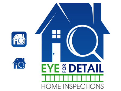
Logo for Eye for Detail Home Inspections
Eye for Detail Home Inspections
Yes
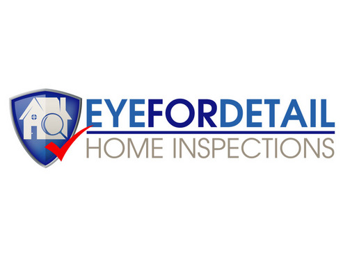
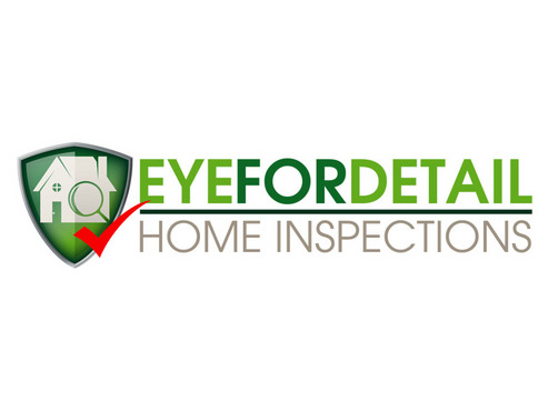
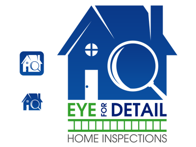
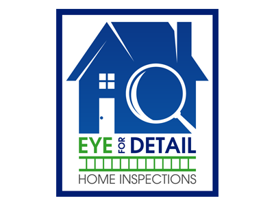
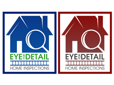
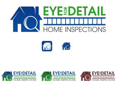
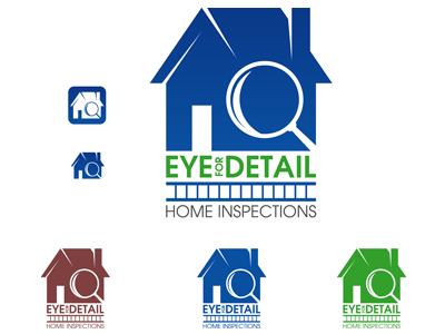
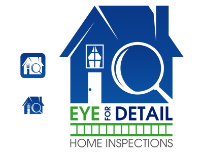
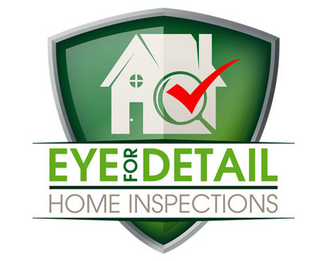
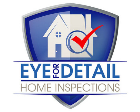
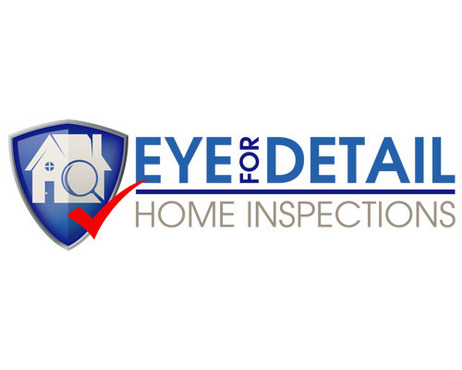
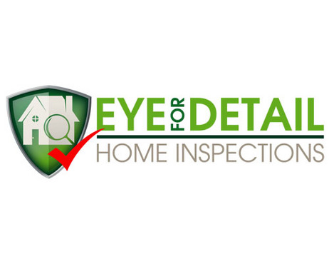
This logo is for a home inspection co. in Denver, CO. I created the current logo when I started the business 8 years ago (using MS Excel), and it is time for an update. You can see the current logo at www.eyefordetail.net I love the original logo, but it is very simple, and time for an update.
Real Estate
Symbolic
![]()
Unique/Creative
Sophisticated
Corporate
Modern
Industry Oriented
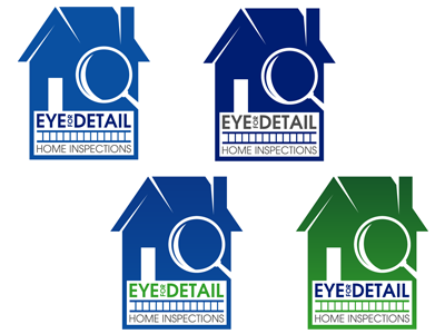
My current logo uses a color that I have always called 'Indian Red' (Hue: 0, Sat: 80, Lum: 90; Red:128, Green: 64, Blue: 64) which I like, but might not suit a different logo. I tend to gravitate towards logos using green or blue (or both), and like the use of grey or silver. Any professional looking color combo would be welcomed.
not sure
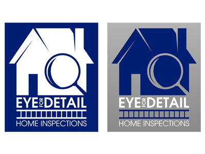
I would like a logo which utilizes an image of one or more home inspection symbols or tools, such as a house, roof (or roof shingles), a magnifying glass, a flashlight, a ladder, windows, doors, etc. Despite the name of the company, though, I am not big on the idea of using an eye in the logo, although if the right design came along, I may be open to it. Please do not hesitate to submit a design which doesn't conform to my ideas, because I probably won't know what I want until I see it. I'm looking forward to seeing what the imaginations of some folks who are gifted in this area could do with my logo that I could not.
Related Contests


