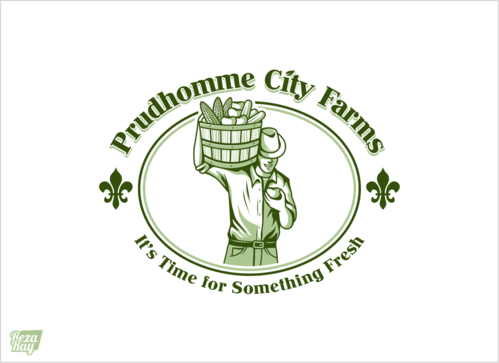
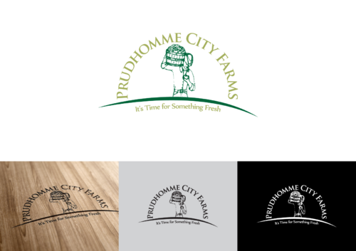
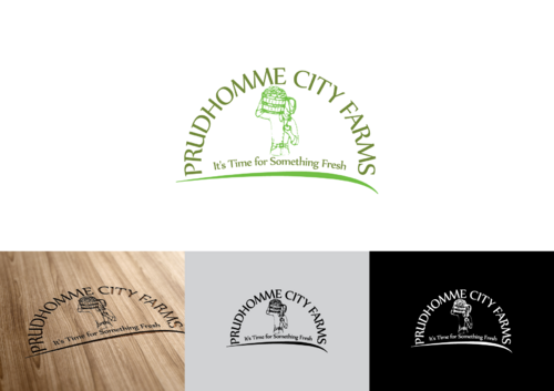
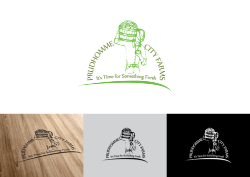
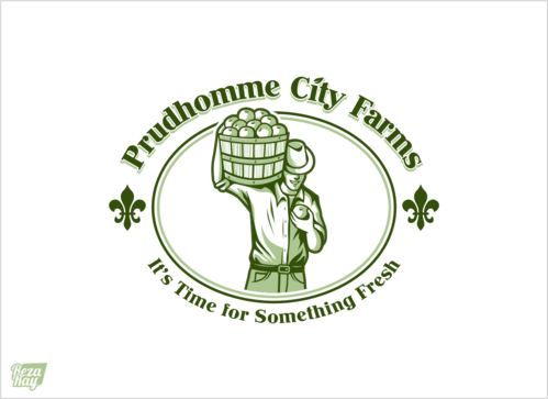
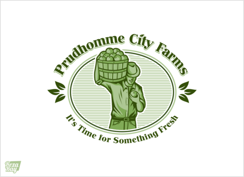
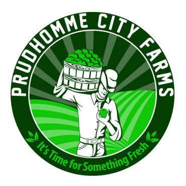
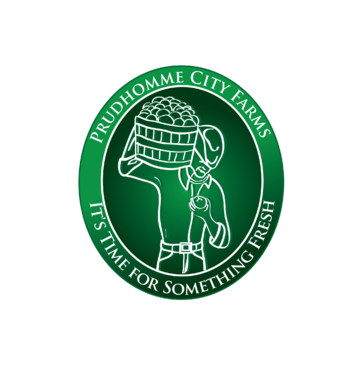
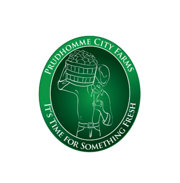
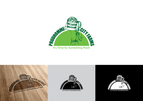
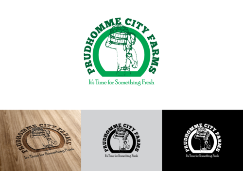
Logo for farm
Prudhomme City Farms
|
Contest Holder
tedandmollydaigle
?
Last Logged in : 4424days15hrs ago |
Concepts Submitted
54 |
Guaranteed Prize
200 |
Winner(s) | A Logo, Monogram, or Icon |
|
Live Project
Deciding
Project Finalized

Creative Brief
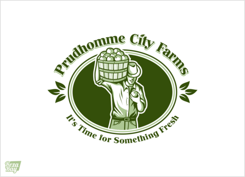
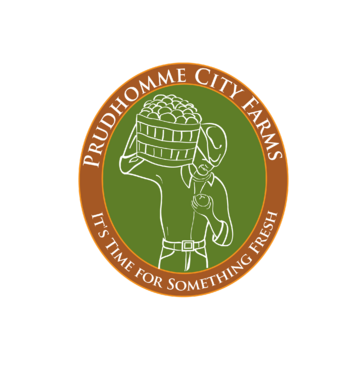
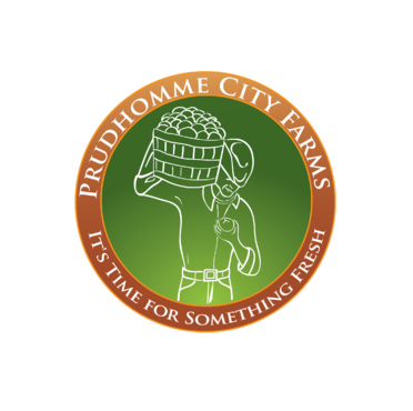
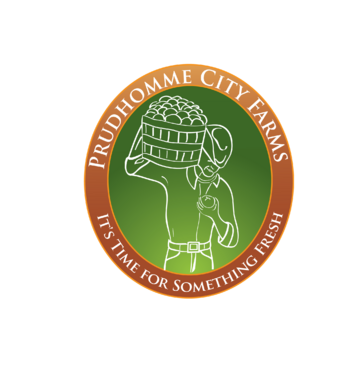
Logo for farm
Prudhomme City Farms
It's Time for Something Fresh
Yes
We want this logo to present the freshness of our product (we are diversified fruit and vegetable farm), the pride we have in our product and the joy that farming brings to us.
Agriculture
Character
![]()
Traditional
Simple
Professional
Rustic
Green and white
2
We have a rough sketch that we'd like to work from. It is in the attached files.
Related Contests