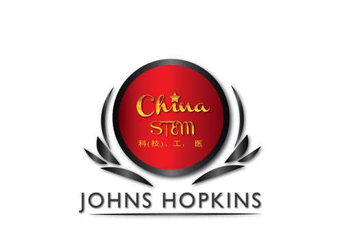
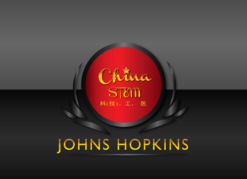
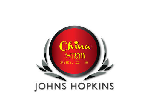
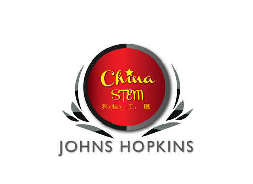
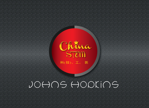
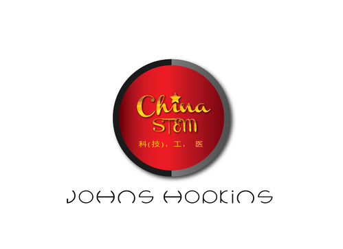
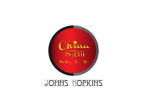
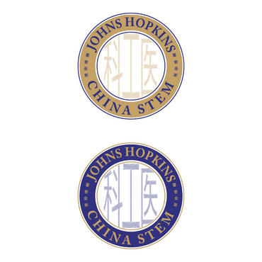
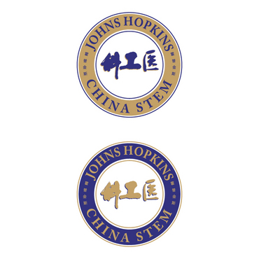
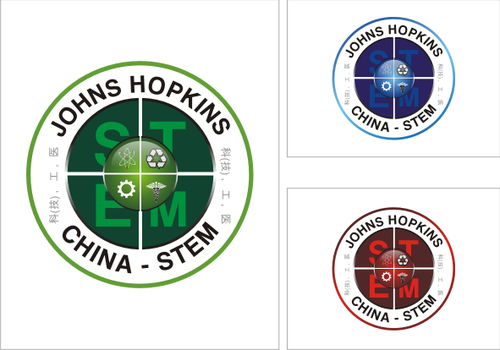
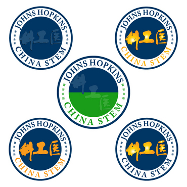
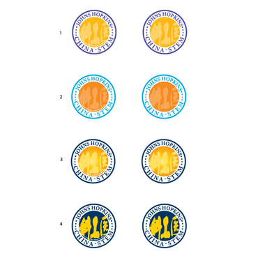
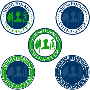
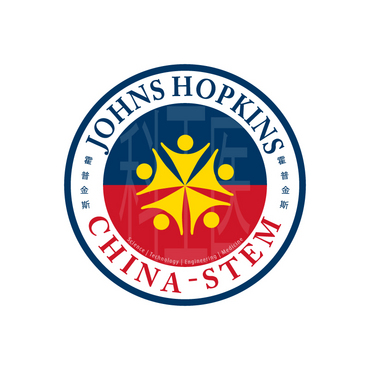
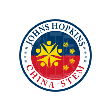
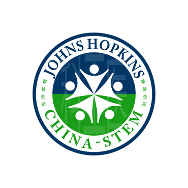
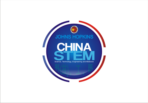
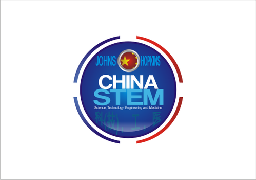
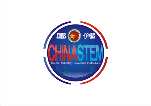
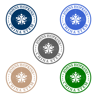
logo for Hopkins China-STEM
words to be included: Johns Hopkins, China, STEM, and 3-4 Chinese characters
|
Contest Holder
ningpingyu
?
Last Logged in : 5101days18hrs ago |
Concepts Submitted
89 |
Guaranteed Prize
215 |
Winner(s) | A Logo, Monogram, or Icon |
|
Live Project
Deciding
Project Finalized

Creative Brief
logo for Hopkins China-STEM
words to be included: Johns Hopkins, China, STEM, and 3-4 Chinese characters
Yes
This logo is for an intensive advanced Chinese language and research program that Johns Hopkins University will launch in summer 2012. The location is in China. STEM stands for Science, Technology, Engineering and Medicine. We want to convey that the program is about knowledge for the future--modern and scientific.
Education
Illustrative
![]()
Clean/Simple
Modern
We want 2-3 colors. One of them should be Johns Hopkins University blue.
3
Our program is Education/Study Abroad. We want the effect to be (besides clean/simple and modernj that are checked in your listed options): professional, elegant, scientific and technological for the future.
We want these Chinese characters: 科(技), 工, 医 in Chinese calligraphy in the background or less prominent than our program name.
Related Contests


