SALES / SUPPORT : +1-877-525-5646   |  


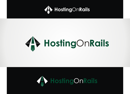
Logo for Hosting Company

Hosting On Rails

Contest Holder hostingonrails ?

Last Logged in : 4235days10hrs ago

Concepts Submitted

55

Guaranteed Prize
199
Winner(s)

1

A Logo, Monogram, or Icon veildAll design entries are veiled from other designers till the end of the contest. Featured Featured Contest
tick_gray

Live Project

tick_gray

Deciding

tick_blue

Project Finalized


Project: Logo for Hosting Company
Industry: Internet Services Logo
Contest Launched: Sep 07, 2012
Selected: 1 winning design from 55 concepts
Winning Design by: Logoziner
Close Date: Sep 14, 2012


Logo for Hosting Company - Internet Services


Awarded as a winner
Project Report    

Sort by:


#12

#46


Creative Brief


Logo for Hosting Company

Hosting On Rails

No

Hosting on Rails is specialized in "Ruby on Rails" hosting, http://rubyonrails.org.

We help the customers with personal contact and advice, to create a tailor made package for their specific needs. No cheap hosting with us, but real value for money in customer support and a high quality of service.

Internet Services

Logo Type
Logo Type

Web 2.0
Web 2.0


Modern
Professional
High Tech

not sure

A hint or inspiration on the (trademarked) Ruby on Rails logo, or railway tracks would be nice.

Related Contests


Logo for Application
$300
Prize Money
168
Concepts
Logo for an email security solution
$600
Prize Money
766
Concepts
Logo for Internet service Provider.
$250
Prize Money
138
Concepts
Logo for Solid Klik Indonesia
$500
Prize Money
179
Concepts

Discussion


Comments

  • September 12, 2012 1:06 AM
    hostingonrails hostingonrails
      Project Holder
    @neonlite Thanks for your dratfs, but its not the style i'm looking for, please try to make something more "2012". But liked the fonts you chose. @mURITO Thanks for your time, but this is too "generic". Can you use the same style you are designing in now, but try to find some connection with the railway tracks and other points out of the brief. @majdjanineh Like the "H", but can you try to make the "H" better readable / recognizable as a letter "H". Also try some other variations on it. Like the style. Thanks for your effort so far. @Everyone Liked the color settings (red/black/white) because of the connection to Ruby on Rails and (green/black) because we are a company thinking about the environment. @Logonizer #12 Like the style you've used, can you try to get me something else? Liked the green :)

    Like Icon 0   DislikeIcon 0
  • September 12, 2012 12:46 AM
    hostingonrails hostingonrails
      Project Holder
    @hambaAllah #25 #24 #23 #11 #10 Sorry, but you need to find an other style of the logo. I got now 5 designs, but all of them pretty the same, and none of them are what i'm looking for.

    Like Icon 0   DislikeIcon 0
  • September 10, 2012 4:04 PM
    hostingonrails hostingonrails
      Project Holder
    Drafts #1,#2,#6 : Thanks for your effort so far, but needs to be more "Web 2.0"/modern. Drafs #5 and #8 Both designs are already more like what i'm looking for :)

    Like Icon 0   DislikeIcon 0
  • September 07, 2012 11:50 AM
    SiteAdmin SiteAdmin
     
    Attention Designers!! MycroBurst permits you to submit unlimited designs with unlimited variations. However, if you are providing 2 or 3 different color versions of the same logo in one draft, please make sure that if the particular draft gets finalized, each color version should be separated before you will send the final files. Thanks, MB/LDG/LS Team

    Like Icon 0   DislikeIcon 0