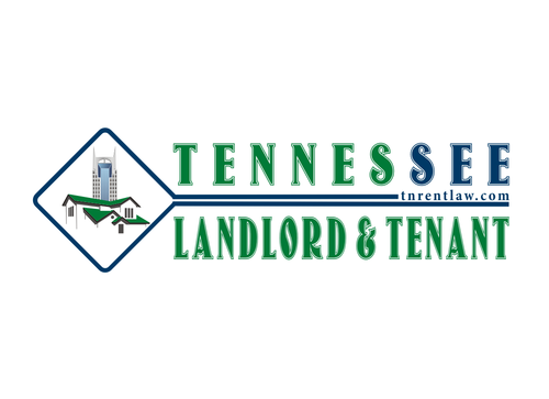
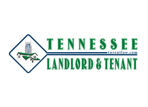
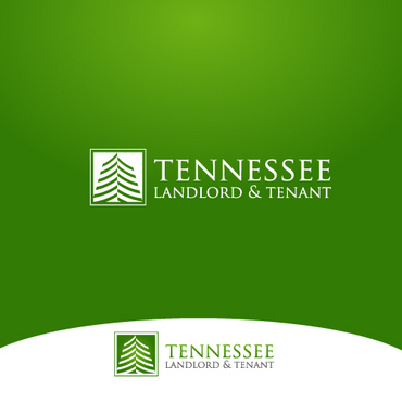
Logo for Landlord/Tenant Law Services
Tennessee Landlord & Tenant
|
Contest Holder
capleshawandrew
?
Last Logged in : 2752days14hrs ago |
Concepts Submitted
76 |
Guaranteed Prize
199 |
Winner(s) | A Logo, Monogram, or Icon |
|


Creative Brief
Logo for Landlord/Tenant Law Services
Tennessee Landlord & Tenant
TNRentLaw.com
No
Tennessee Landlord & Tenant is a "one stop shop" for legal help with residential property rentals (HOMES AND APARTMENTS) in Tennessee. We sell forms like leases, repair notices, and eviction notices. We advise landlords on how to comply with renters law. We advise tenants facing eviction. We represent landlords, tenants, and roommates/sub-tenants in court eviction proceedings and repair complaints. Our main clients are people who buy houses and rent them out, or people who own a few apartment buildings but can't justify hiring a staff attorney.
Law
Symbolic
![]()
Abstract Mark
![]()
Illustrative
![]()
Character
![]()
Cutting-Edge
Corporate
Modern
Industry Oriented
Serious
Green is the base, with blacks/greys/whites to support Possibly some tan in there if need be... flexible on supporting colors. The template for our website is here (go to "skins" and select "green" or "lime" to see the color): http://ambitious.olegnax.com/ We are leaning towards green, but open to lime if it is better for the logo. Or, we could veer off altogether and choose another color from the template like a blue if you have a good logo that inspires you.
not sure
STAY AWAY from scales and courthouses. Yes, this is Law, but it is more Rental Real Estate than anything. Good Shape Ideas: House and Apartment Buildings, The State of Tennessee Outline, The 3-Star Circle from the middle of the Tennessee Flag, Nashville Skyline, a Posted Notice, etc. Also, the web address TNRentLaw.com could be a part of the logo, but not sure. Because the logo is going in the upper lefthand corner of the website (see theme), it may be overkill. Use your judgement. The main things we need are the logo for the upper left of the site and a business card design, but stationary would be nice too.
Related Contests