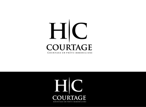
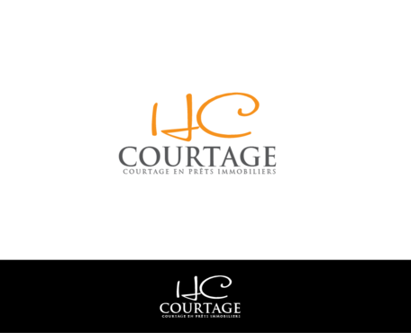
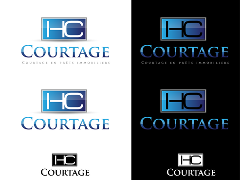
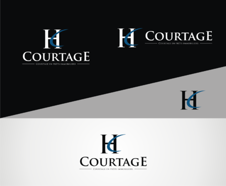
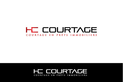
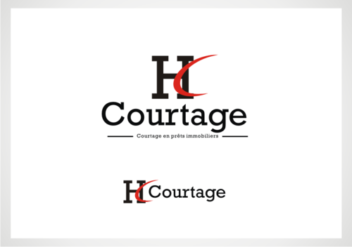
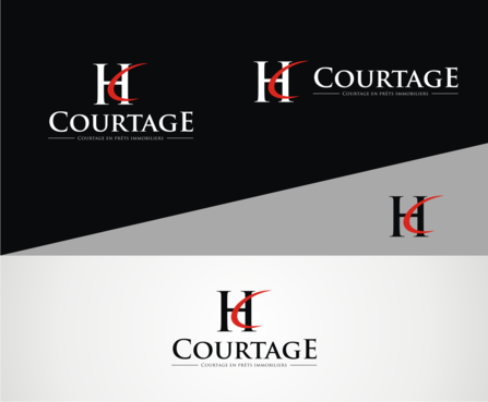
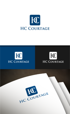
Logo for loans brokerage company
HC Courtage
|
Contest Holder
siteprojet
?
Last Logged in : 2237days7hrs ago |
Concepts Submitted
302 |
Guaranteed Prize
200 |
Winner(s) | A Logo, Monogram, or Icon |
|
Live Project
Deciding
Project Finalized


Creative Brief
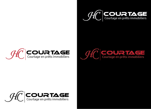
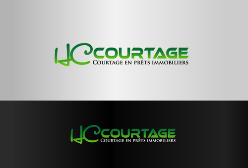
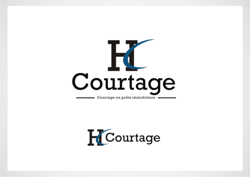
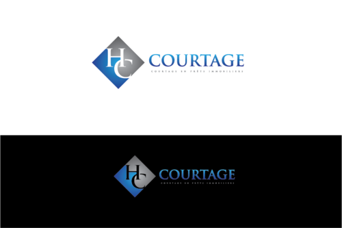
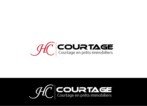
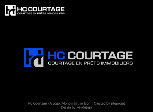
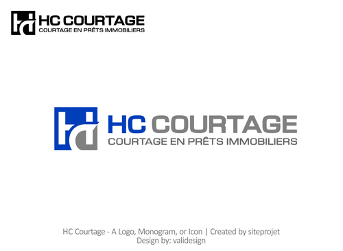
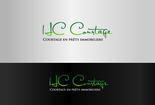
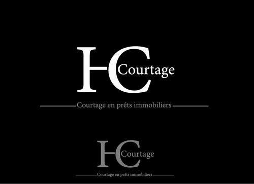
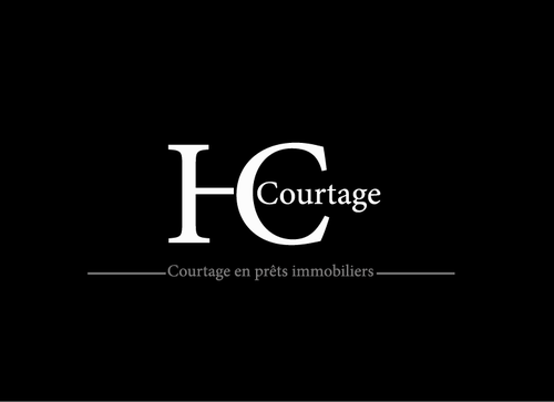
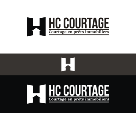
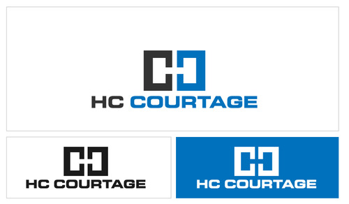
Logo for loans brokerage company
HC Courtage
Courtage en prêts immobiliers
Yes
A logo for a company doing brokerage for loans and private investments.
They get a request from a client who wants a loan to buy a house for exemple or who has some money to invest and they will try to get the best loan rate or investment offer from different banks for the client.
The logo must convey: serious, trust & professionalism
Please provide a black & white version and a variant of the logo without the slogan too.
Financial Services
Abstract Mark
![]()
Modern
Professional
not sure
Please provide a black & white version and a variant of the logo without the slogan too.
Related Contests